EN
Beauty salon branding
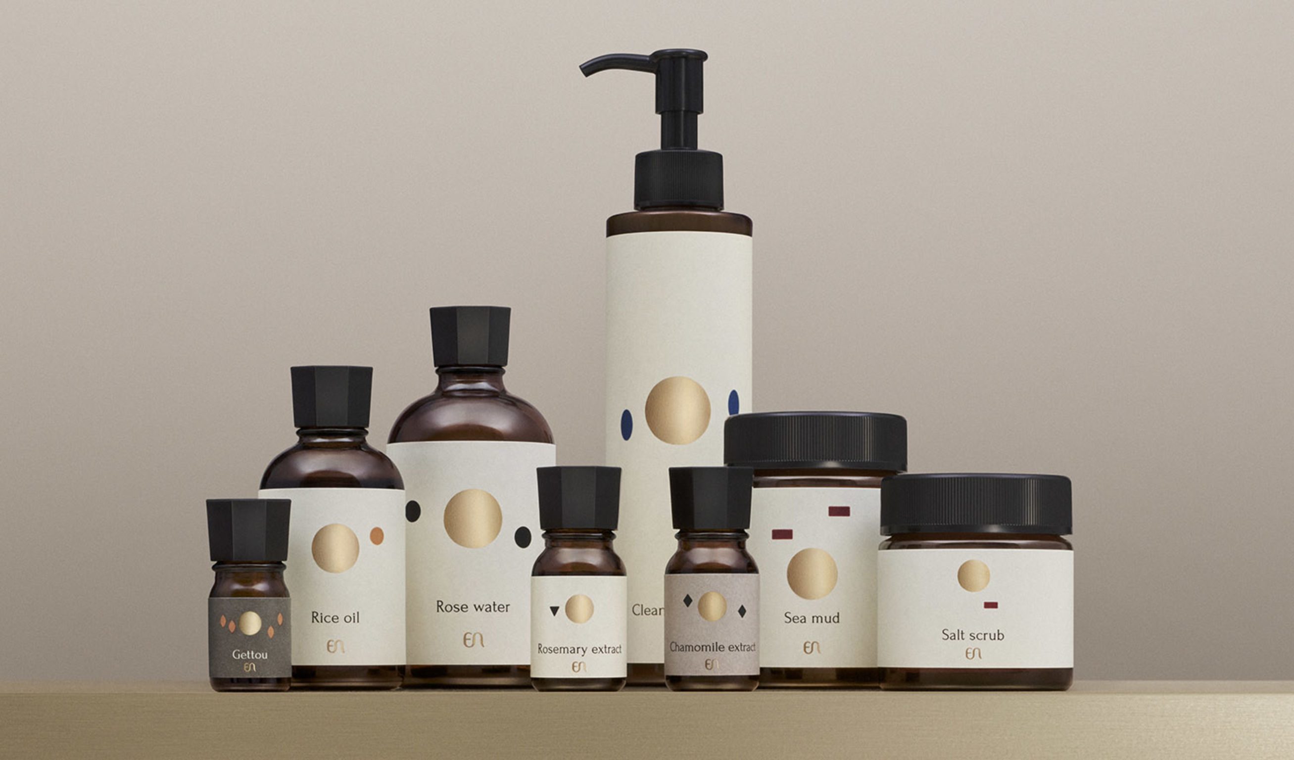
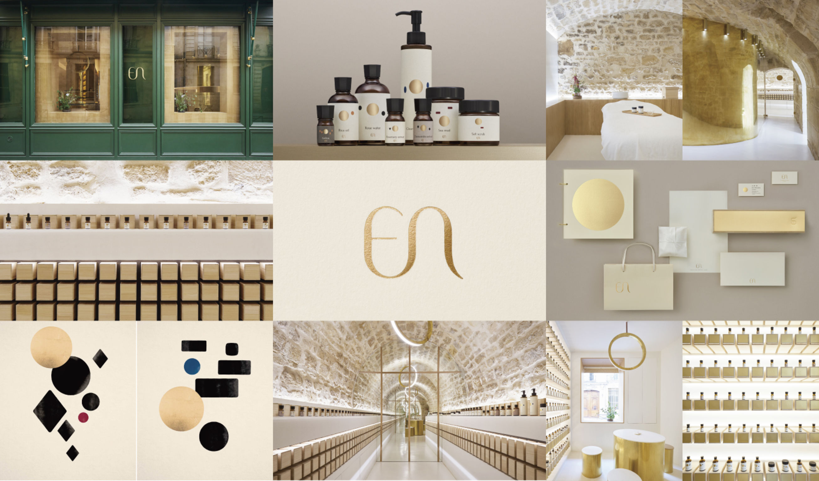
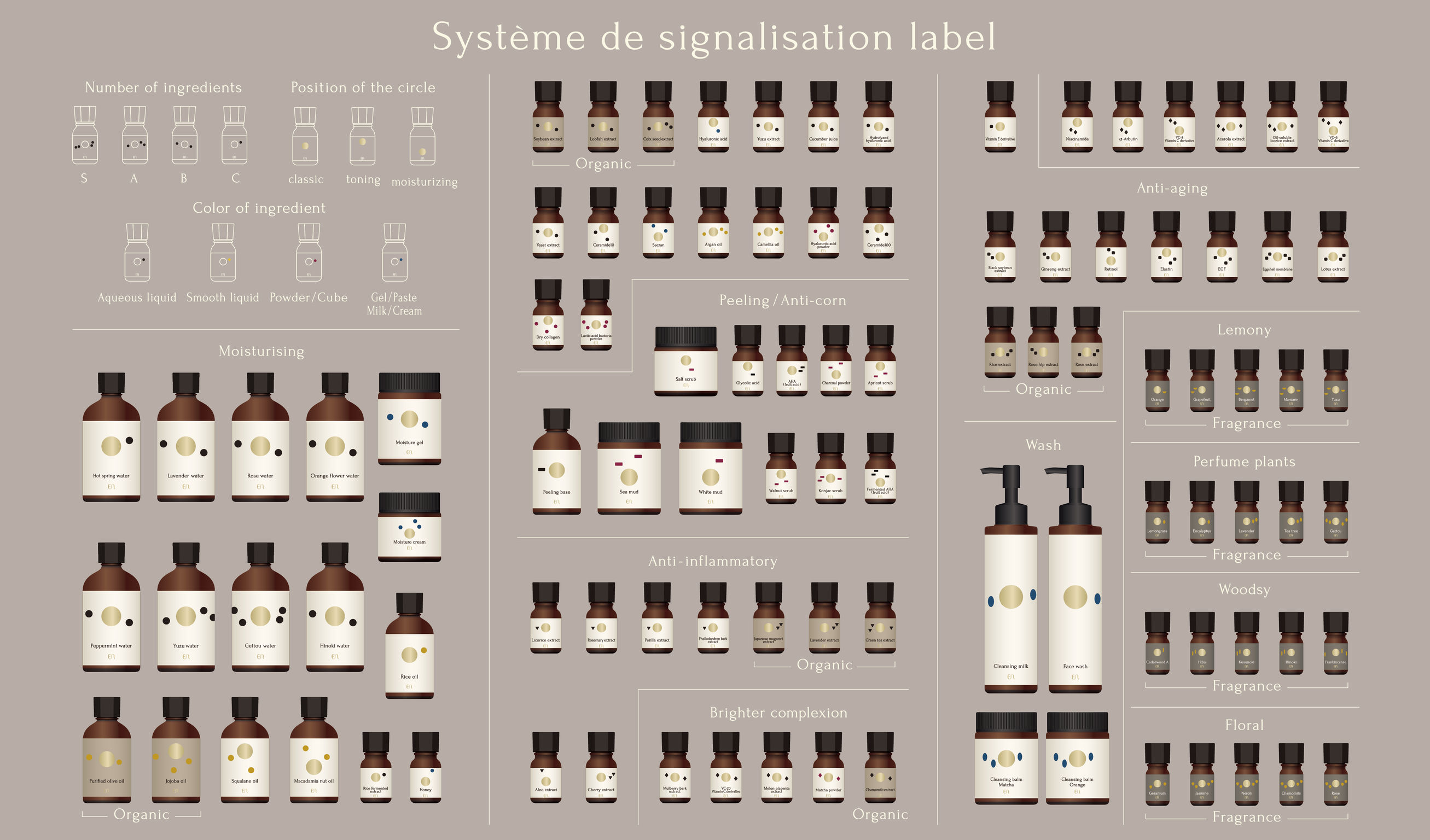
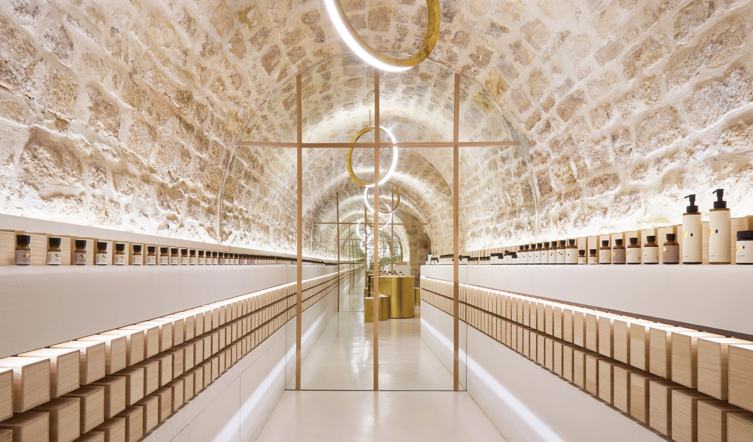
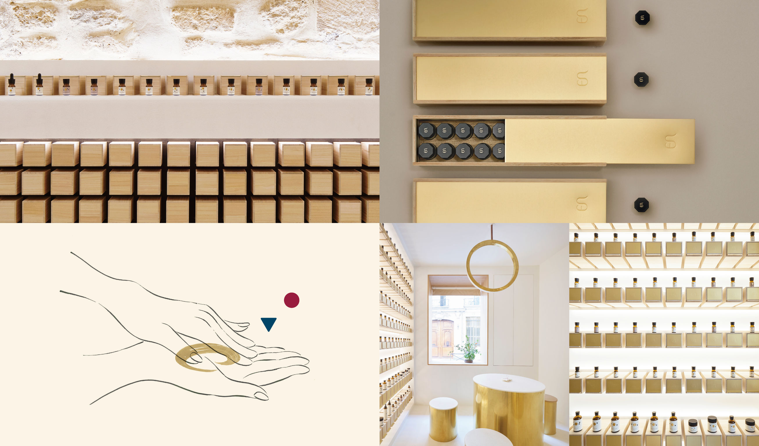
canaria Inc.'s mission was to create the brand design for EN, a haute-couture facial salon located in Paris. The name EN derives from the Japanese homonym meaning "a fateful encounter," and its character symbol is inspired by another homonym for "circle." The package design had to express that the contents were the raw ingredients in a yet-to-be created composition. The bottles were designed to have a distinct look that stood out from the typical bottle types used by other aestheticians. The golden circle is a main design element in the salon space, also used in the salon's "cave," where all bottles are stored and displayed.
Date of Launch
2018
Development Time
13 - 24 months
Target Regions
Europe
Target Groups
Consumer / User