EGGDROP identity branding, healthy sandwich franchise
2022

Share:

EGGDROP identity branding, healthy sandwich franchise

Brand identity

Goldenhind

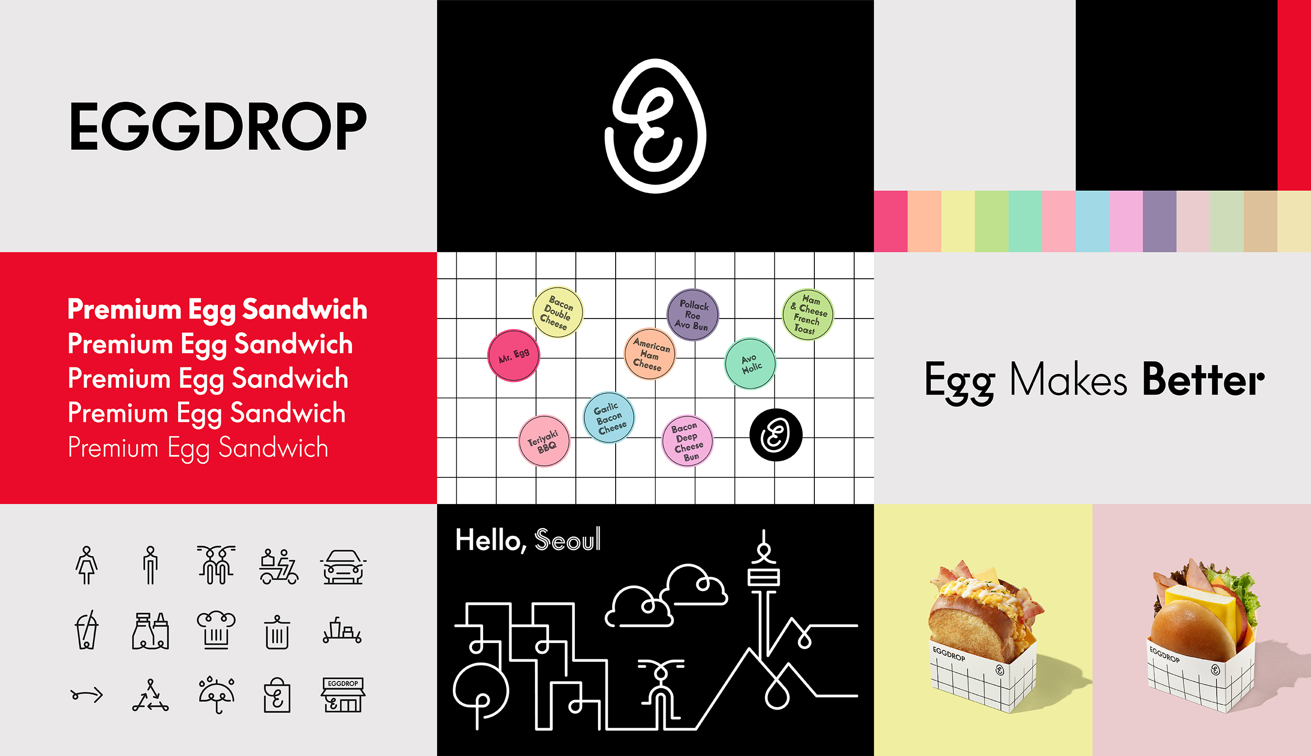
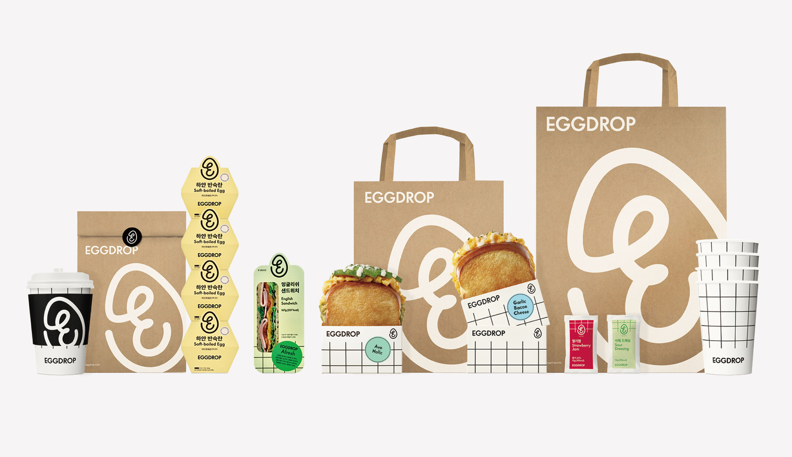
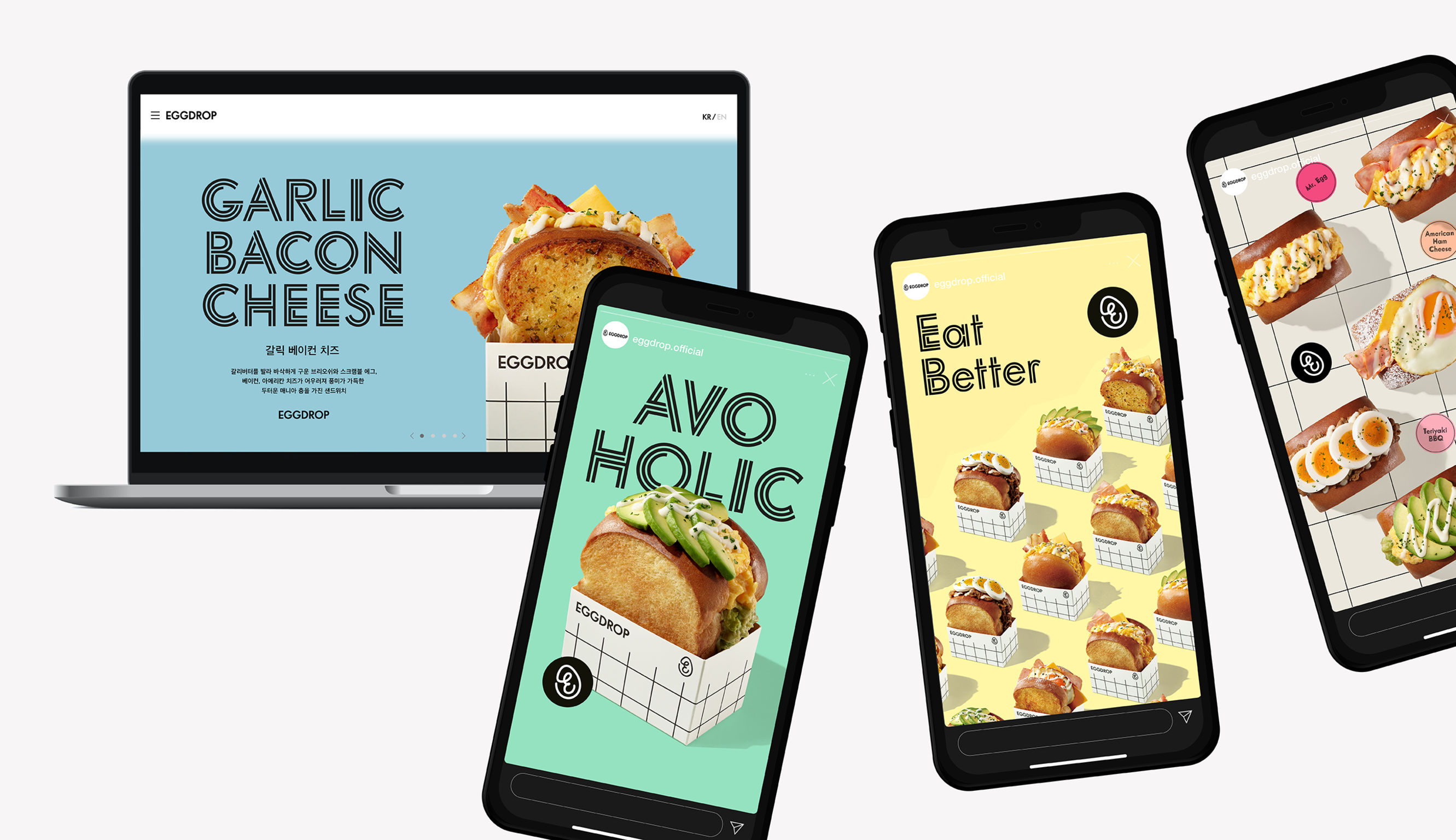
EGG DROP is a franchise brand of egg sandwiches offering healthy meals to modern city dwellers. The logo mark expresses the company's contrasting themes of urban identity and soft egg sandwiches through its curves and simple logotype. The City Grid pattern presents EGG DROP locations throughout the city and expresses an urban and well-organized system. The brand's key color conveys vitality, combined with black and white and vivid red to represent modernity.

Client / Manufacturer

Goldenhind

Seoul, KR
Design

Goldenhind

Seoul, KR
Date of Launch
2019
Development Time
13 - 24 months
Target Regions
Asia
Target Groups
Consumer / User

RELATED PROJECTS