Vigo
Sustainable City Branding & Strategy
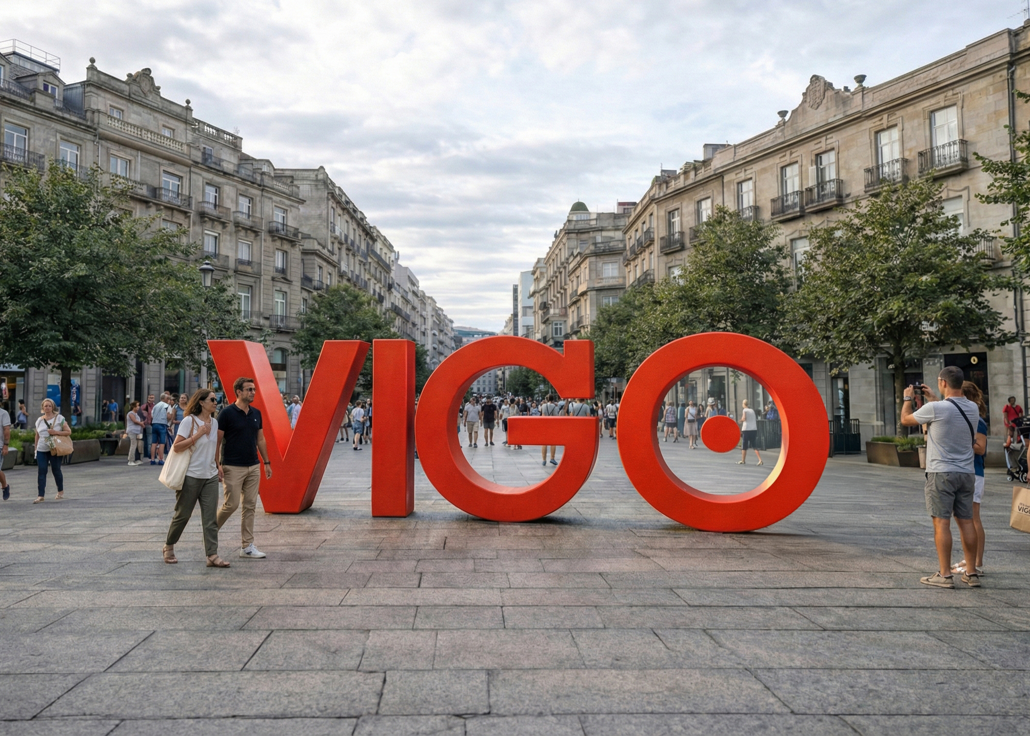
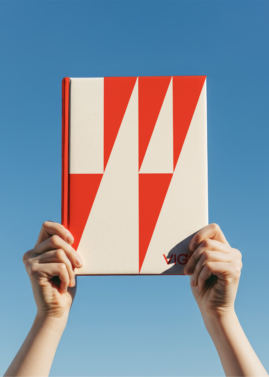
Vigo's rebranding unifies the city’s voice, merging the resilient "Non Se Rinde" spirit with eco-friendly communication. The visual system blends dynamic red triangles and the custom typeface "Alma de Vigo." It promotes a circular economy by using recycled materials such as marine plastic and sustainable inks, while supporting local traditions and gastronomy. This approach addresses environmental challenges and bolsters the micro-economy, establishing a foundation for sustainability.
This visually striking city marketing design leaves a lasting impression and offers visitors a sense of comfort. Unique is its multidimensional approach, which demonstrates how city marketing can achieve quality through spatial design and practical functionality.
WINNER STATEMENTReceiving the iF DESIGN STUDENT AWARD inspires me to continue thinking about design in a meaningful way. This recognition reinforces the belief that sustainability is essential for creating brands with purpose while honoring a brand's heritage and protecting our future.
UNIVERSITYSHIFTA, ELISAVA
Barcelona, ES