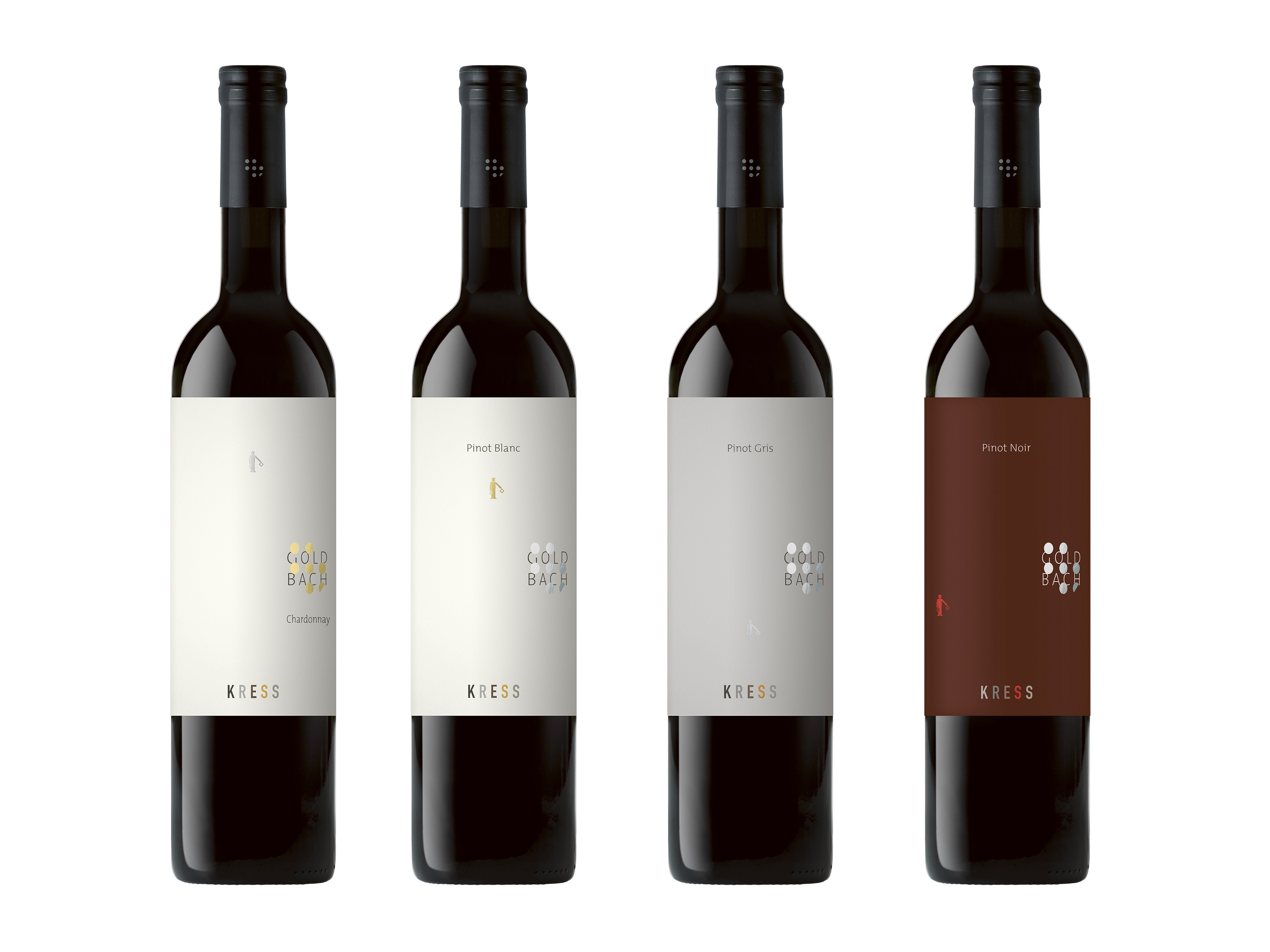
KRESS Goldbach Series
The corporate design of the KRESS vineyards is constructed on very variable levels – corresponding to the constantly varying product. Each label is designed independently, based on the interplay between the two key visuals: a modern interpretation of the double cross and a „semaphore character“. Since the Goldbach series plays a key role for the KRESS vineyards, the design of the labels should do both: be part of the overall corporate design strategy but also stand out. The labels are thus part of this concept, but additionally have a reduced and more uniform design, corresponding to the superior quality of this wine series.
portfolio.designer