Sekeen
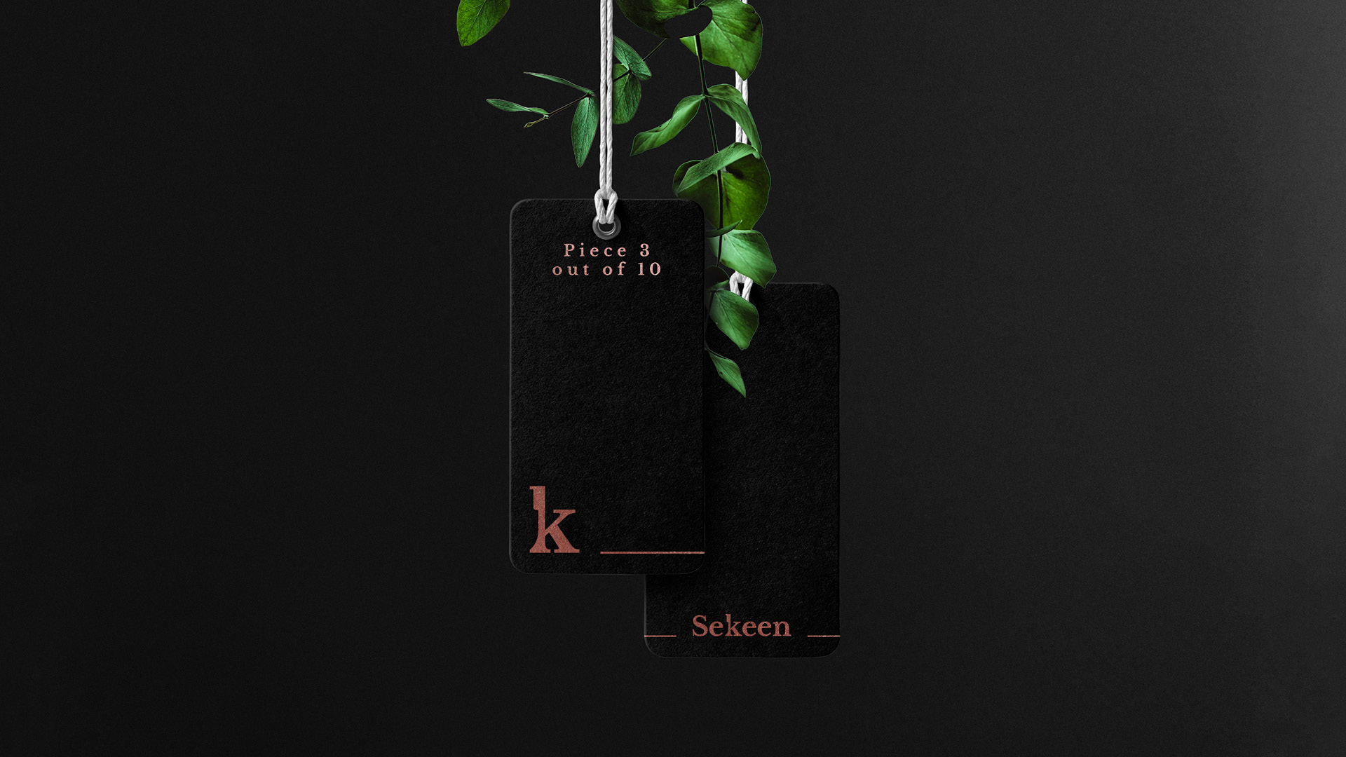
The Brand name “Sekeen” is Arabic for “Knife” and so the part taken out of the letter “K” in the design looks like a knife upside down. This letter was also designed to be used as an icon to make the brand stand out. The logo resembles Sekeen’s actual position in the Egyptian market. Prior to Sekeen there was a market gap for high-end knives. We envisioned the potential in the brand, conceptualized, researched and executed it, leading them to become the pioneer brand for fine knives. we branded the whole concept behind Sekeen , their packaging to be always delivered in an elegant box with a wax seal on it, their pintables and their website.
portfolio.designer