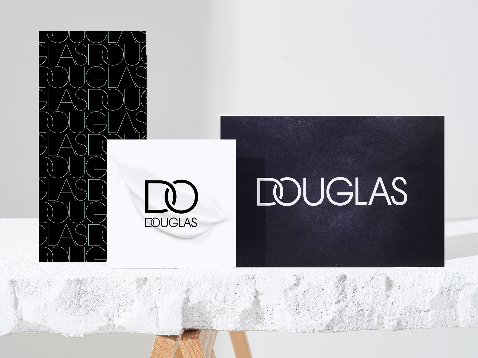
Douglas – Logo development
As part of its strategic realignment, Europe's leading beauty retailer Douglas has recast itself as a strong brand itself rather than being perceived merely as a distributor of major cosmetic brands. The logical consequence was a new visual identity that radically breaks with the established appearance of the past 50 years. The new font is sans serif, italic – and very distinctive thanks to striking details such as letters of varying widths. The ornamental initial letters can be used independently as the word "DO" – a subtle invitation for customers to take their own beauty into their own hands.
portfolio.designer