

Bechtle: Update required
Brand Relaunch
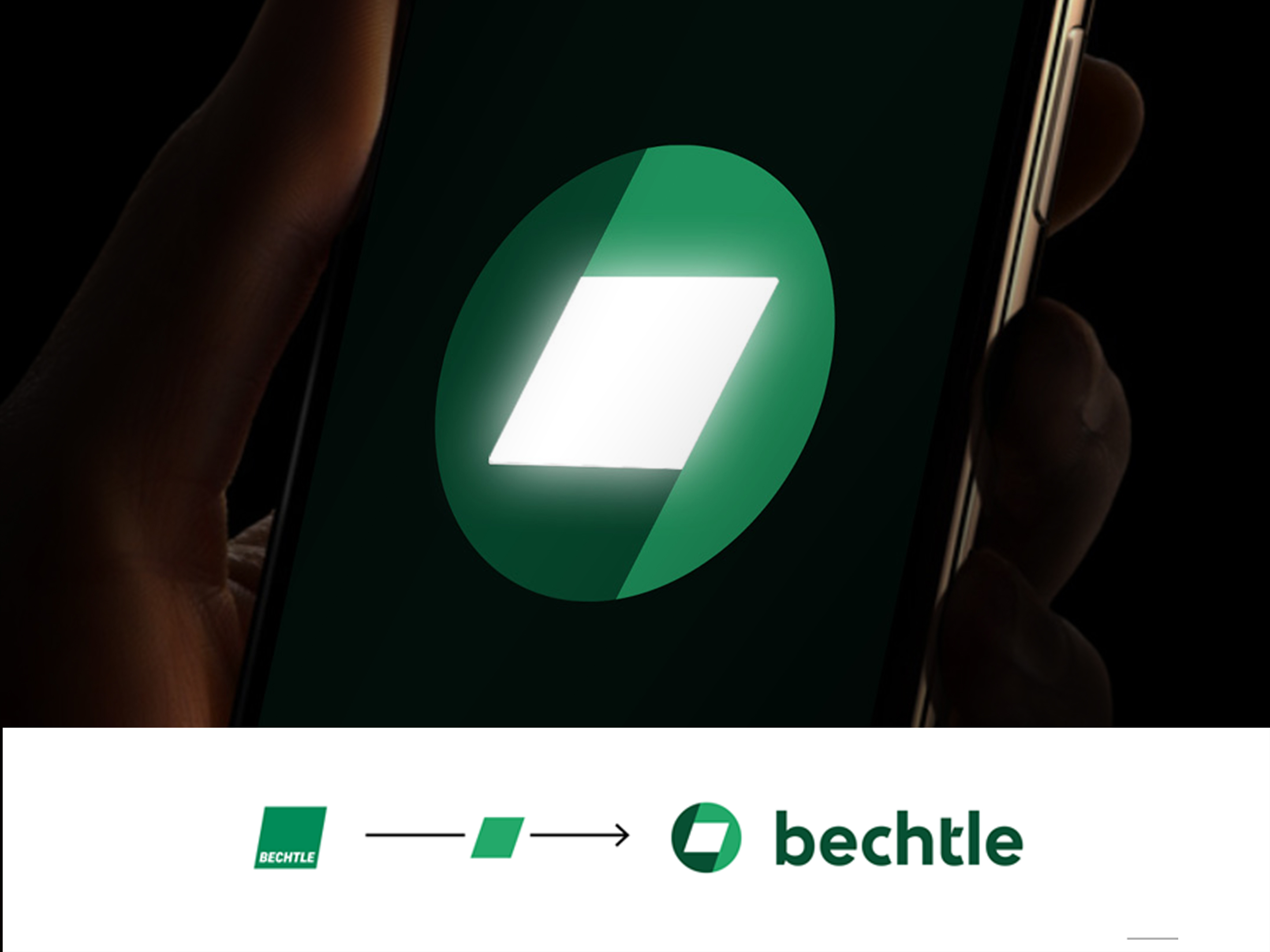
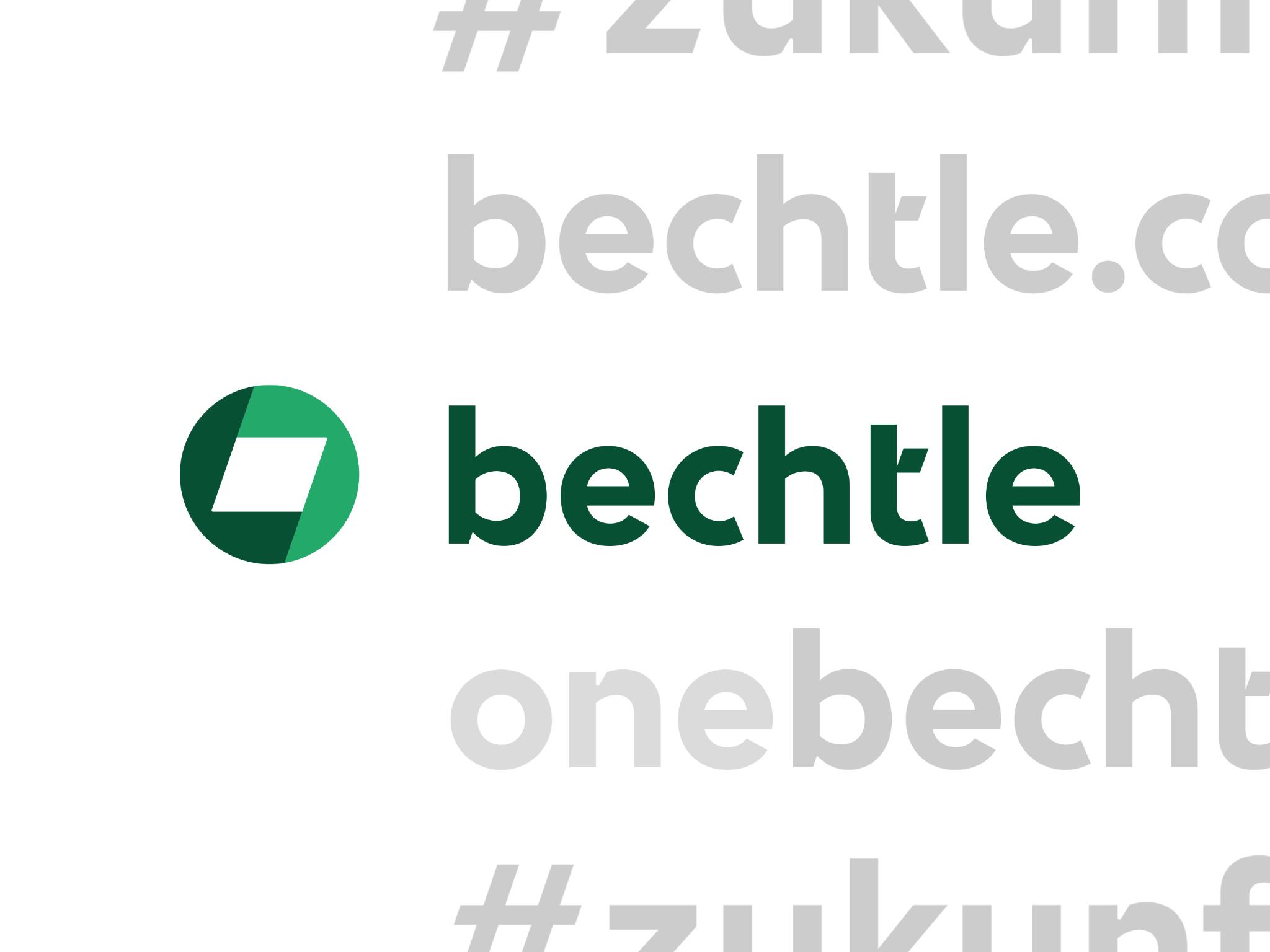
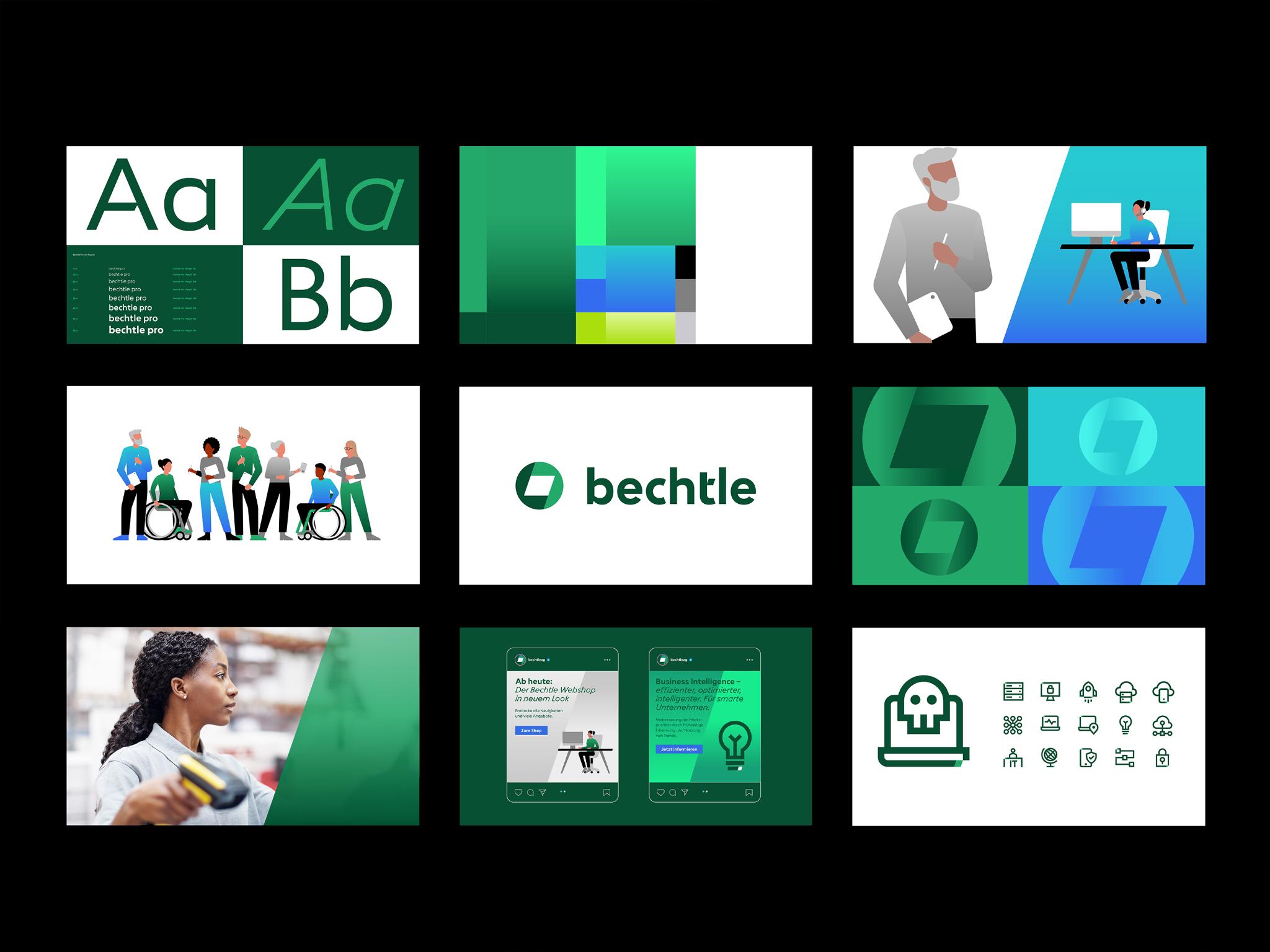
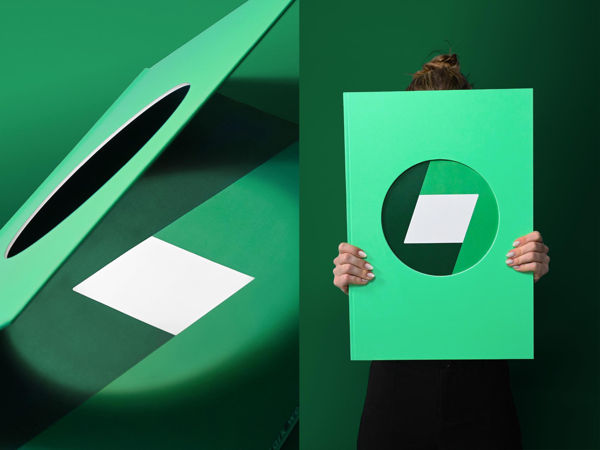
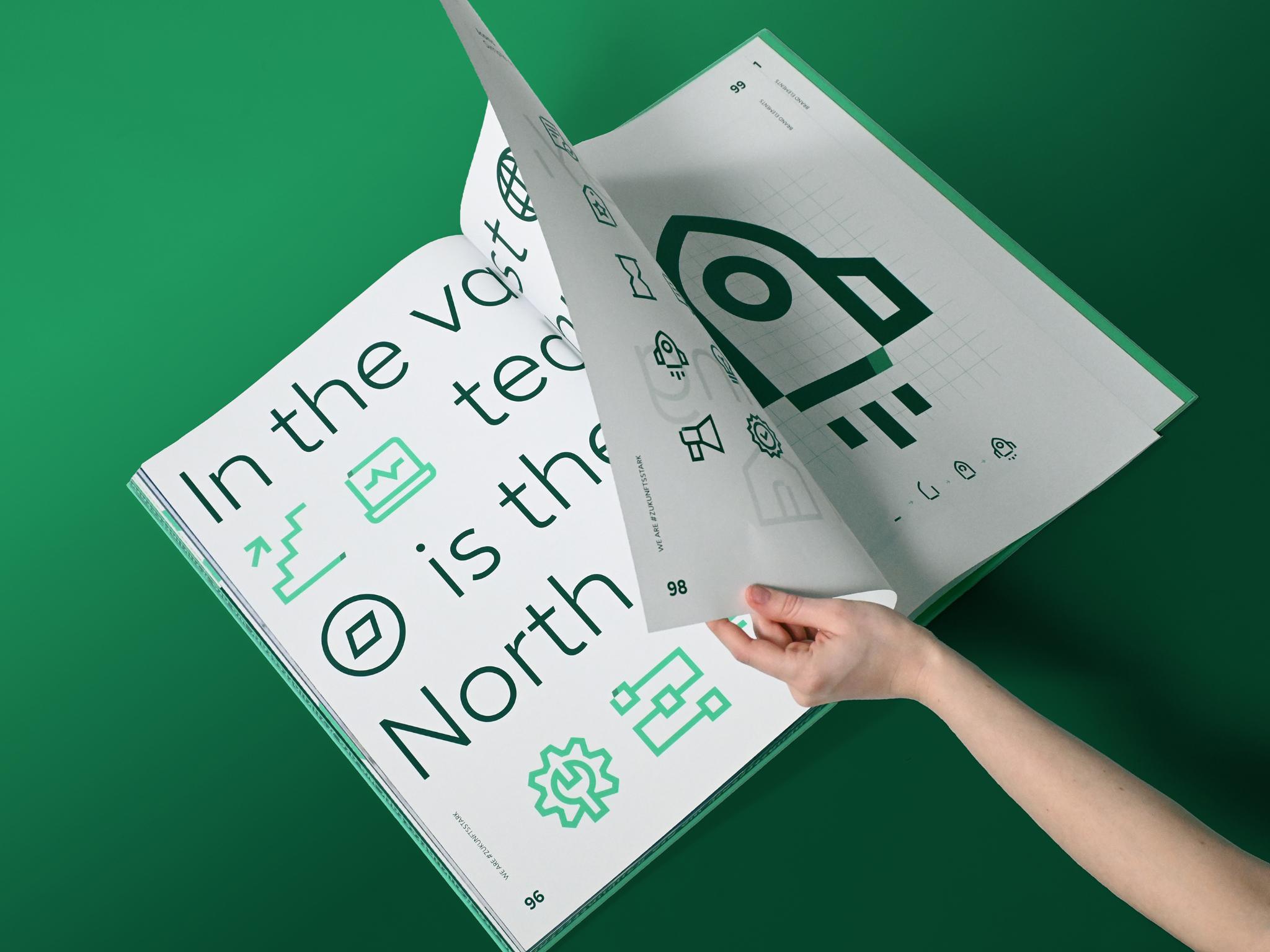
Bechtle is Germany’s largest IT systems house. After 40 years, the company refreshed its brand identity, aiming to project a confident ambition: taking a leading role in the European market. What makes Bechtle unique? Its people blend seemingly opposing qualities into a single, standout offer. Inspired by this, we reimagined the logo: Once a parallelogram tilted at 19 degrees, it is now formed from two overlapping circular segments – opposites merging into a simple, iconic symbol. It fuels emotional storytelling and drives the entire design system, appearing in the wordmark, layout system, icons, illustrations and the new custom typeface.
Client / ManufacturerDesign
Bechtle AG
Neckarsulm, DEPeter Schmidt Group
Hamburg, DELukas Cottrell, Ulrich Aldinger, David Driscoll, David Gottschalk, Michaela Jausen, Felix Koch, Jannika Sommer, Stephan HülsenDate of Launch
2024
Target Regions
Europe
Target Groups
Consumers / Users, Trade / Industry