BEEF
Magazine
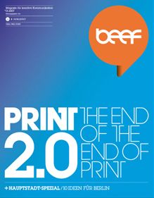
A typography for BEEF. The typographic concept for BEEF was developed as a homage to the great typographer Herb Lubalin. The pivot point is the avant-garde in all its forms. It was deliberately chosen as an unwieldy counterbalance to the prevalent design perception and as a metaphor for the "personal opinions" of the magazine creators. Along with all its graphic coolness, it offers huge potential with regard to forms and production possibilities. Old Letraset specimen books provided the inspiration for the typographic layout system - and the result symbolizes the anthological nature of the opinions expressed in the magazine.
Client / ManufacturerDesign