


BER-Erscheinungsbild
Corporate Design
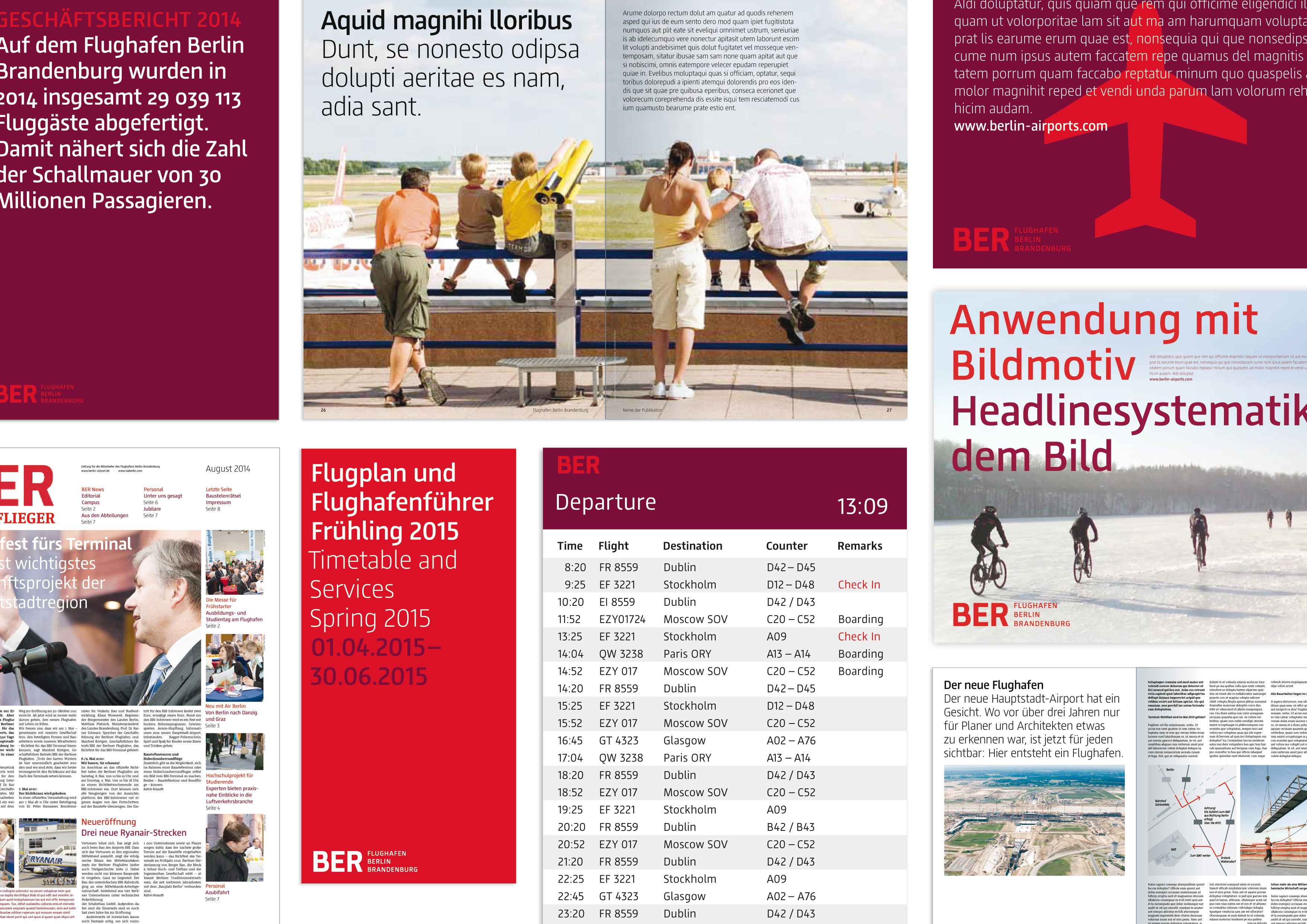
Logo: by using the official IATA code of the metropolitan area of Berlin for the logo, we replaced the clunky sounding “Berlin Brandenburg Airport” with the short and sharp “BER”. The media and Berliners say BER when they refer to the airport. Color scheme, fonts, pictograms: the (for an airport) unusual color pairing of crimson and orange-red correspond to the design attributes of the brand: clear and classic, yet full of surprising lightness. The same applies to the BER corporate font and the pictogram font. Altogether, the corporate design reflects the diversity of Berlin and its surroundings.
iF Gold Statement
Much discussed due to its initial difficulties, the graphical appearance of the new Berlin Brandenburg Airport is appealing in its reduction: BER. A house font designed especially for the occasion is consistently declined and imbued with strong colors, magenta and orange-red. Every image reflects the accustomed visuals of an airport and is nevertheless fresh, inviting a second look. A comprehensive, intensive corporate design that richly deserves an iF gold award.