

blank Corporate Identity
Corporate Identity / Branding
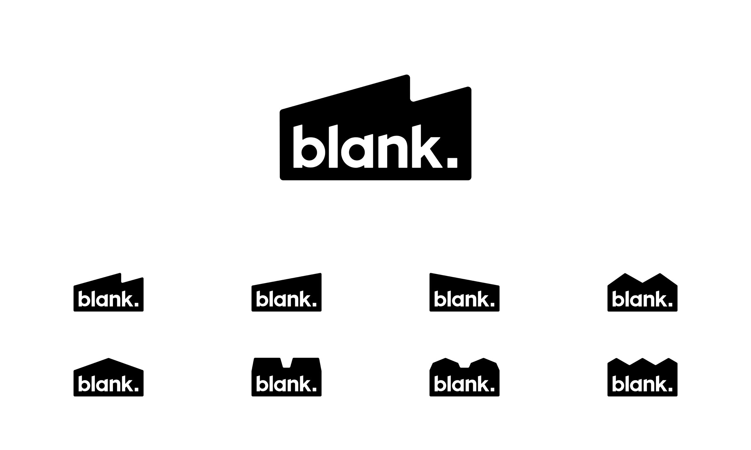
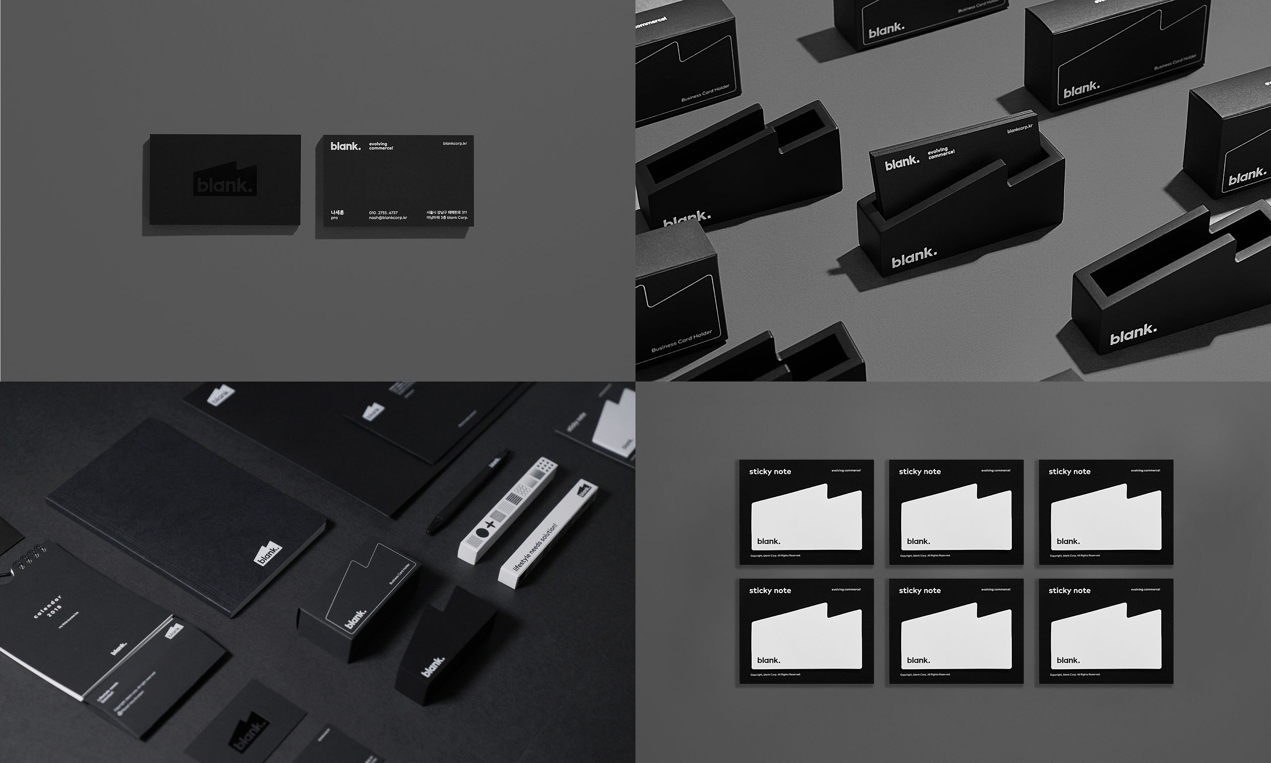
blank CorporationInitially a content business, BlankTV has meanwhile created its own lifestyle brand. Recently, the company wanted a redesign of its CI that dropped the "TV" in its name. The company sees itself as a "think factory," creating values for a better life based on innovation. The logo depicts a "think factory," the dot adds stability, and the square-shaped period implies "supplying a solution." Additionally, the rebranding includes a new font inspired by the logo, the blank sans font. To roll out the new blank brand name, different graphic designs were adapted for use with various elements ranging from name cards, signage to spatial design, thus creating a coherent image of what "being blank" means.
Date of Launch
2018
Development Time
Other duration: 7 months
Target Regions
Asia, Australia / Oceania, North America, South America
Target Groups
Consumer / User, Other target groups: employees of blank Corporation