

Blue Dash
Packaging Design of Cocktail
Shanghai Luolan Technology Co., Ltd.
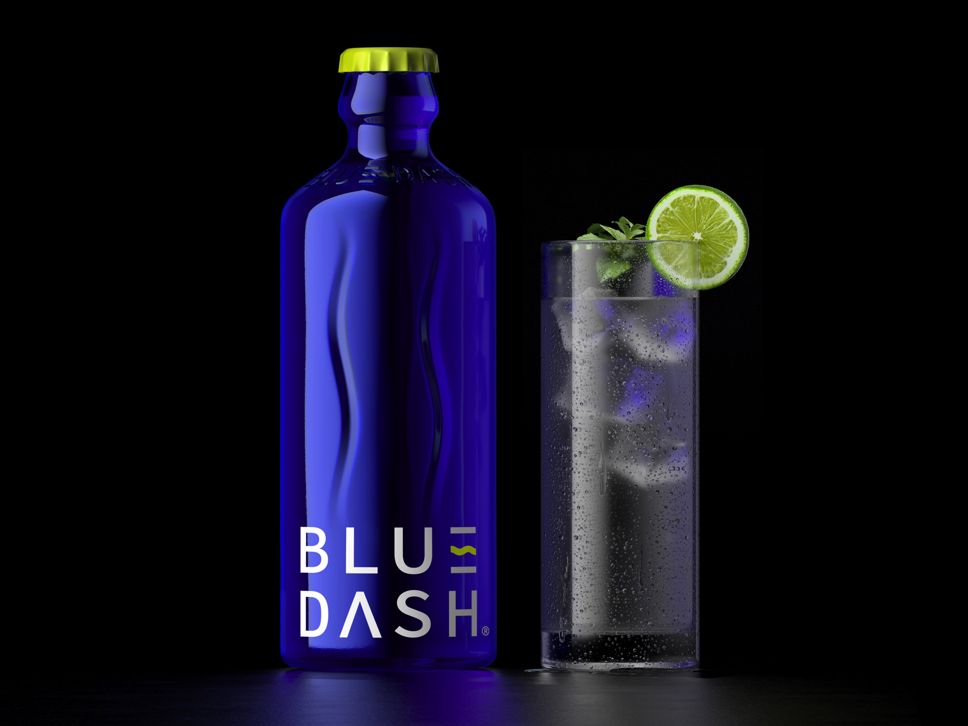
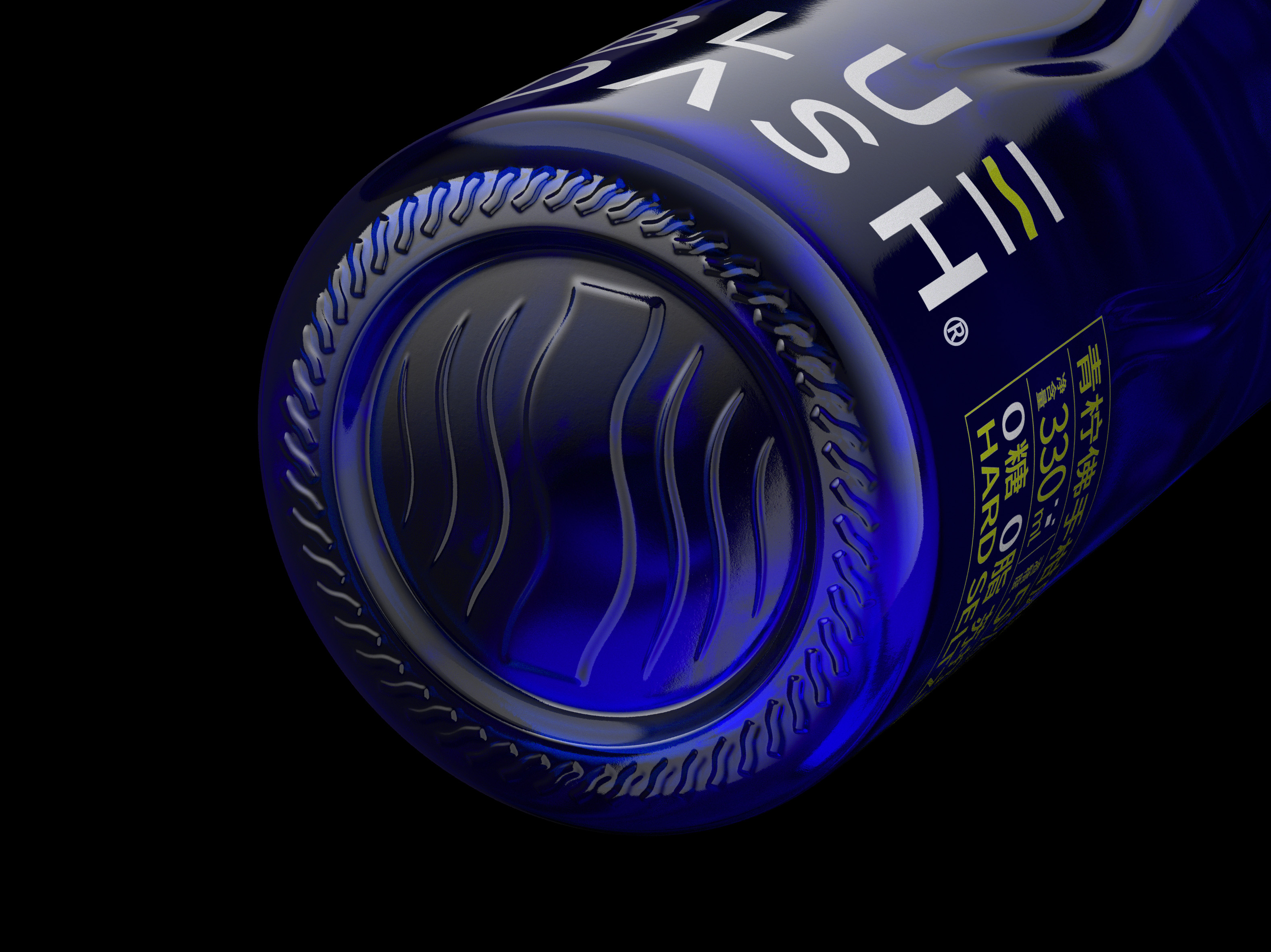
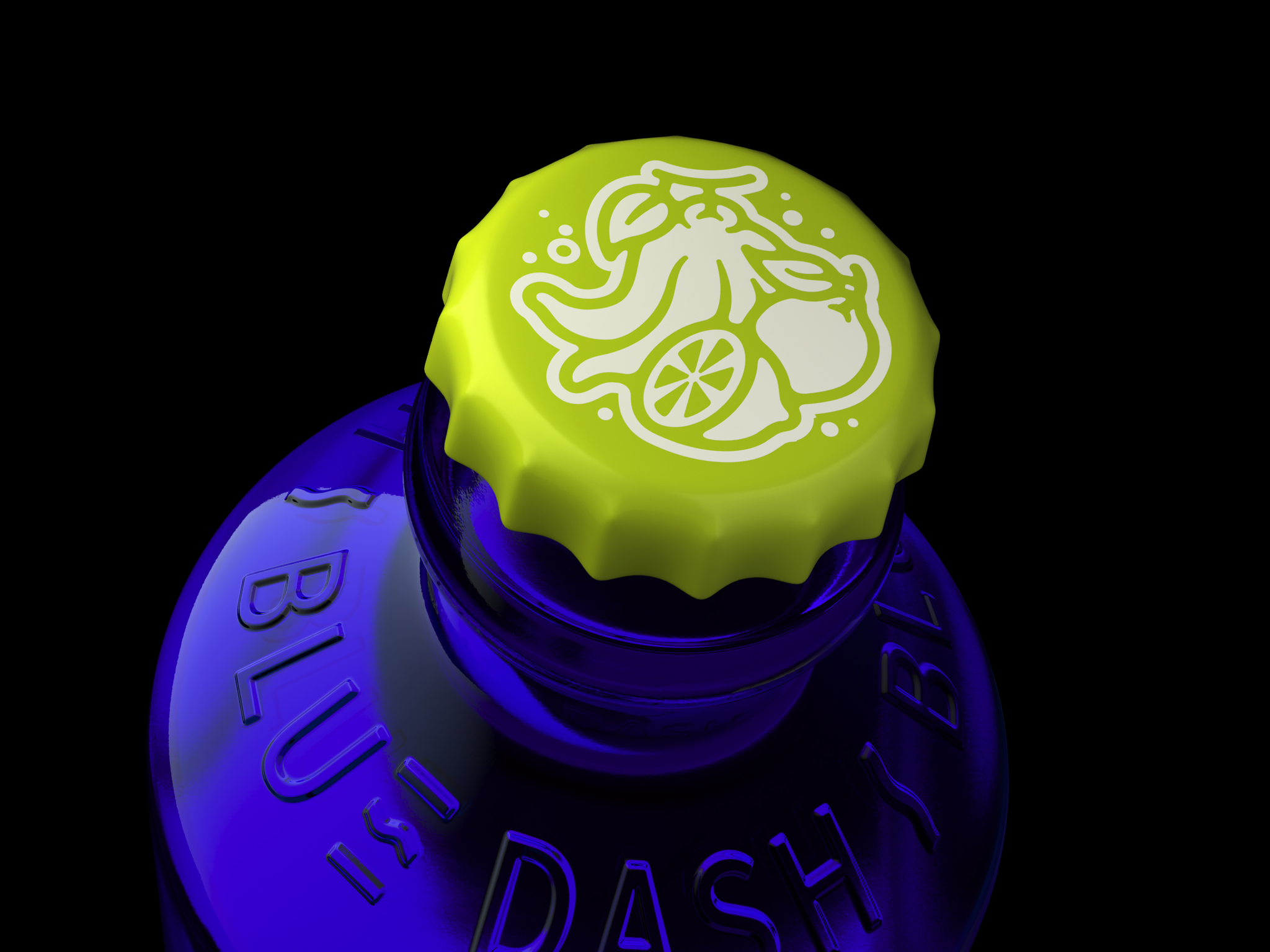
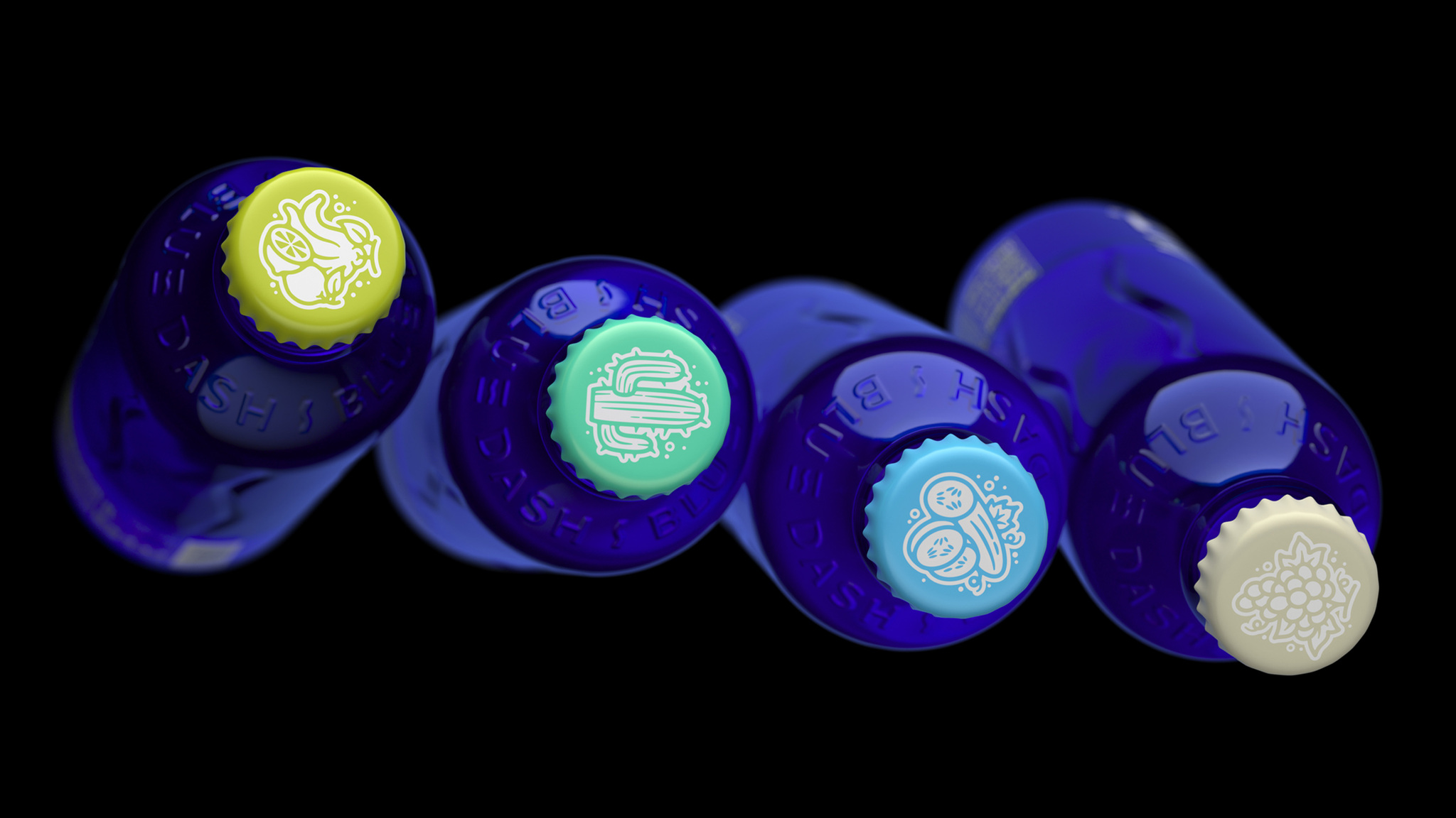
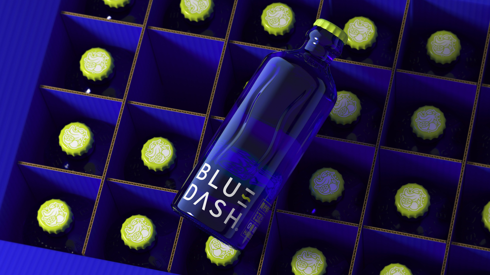
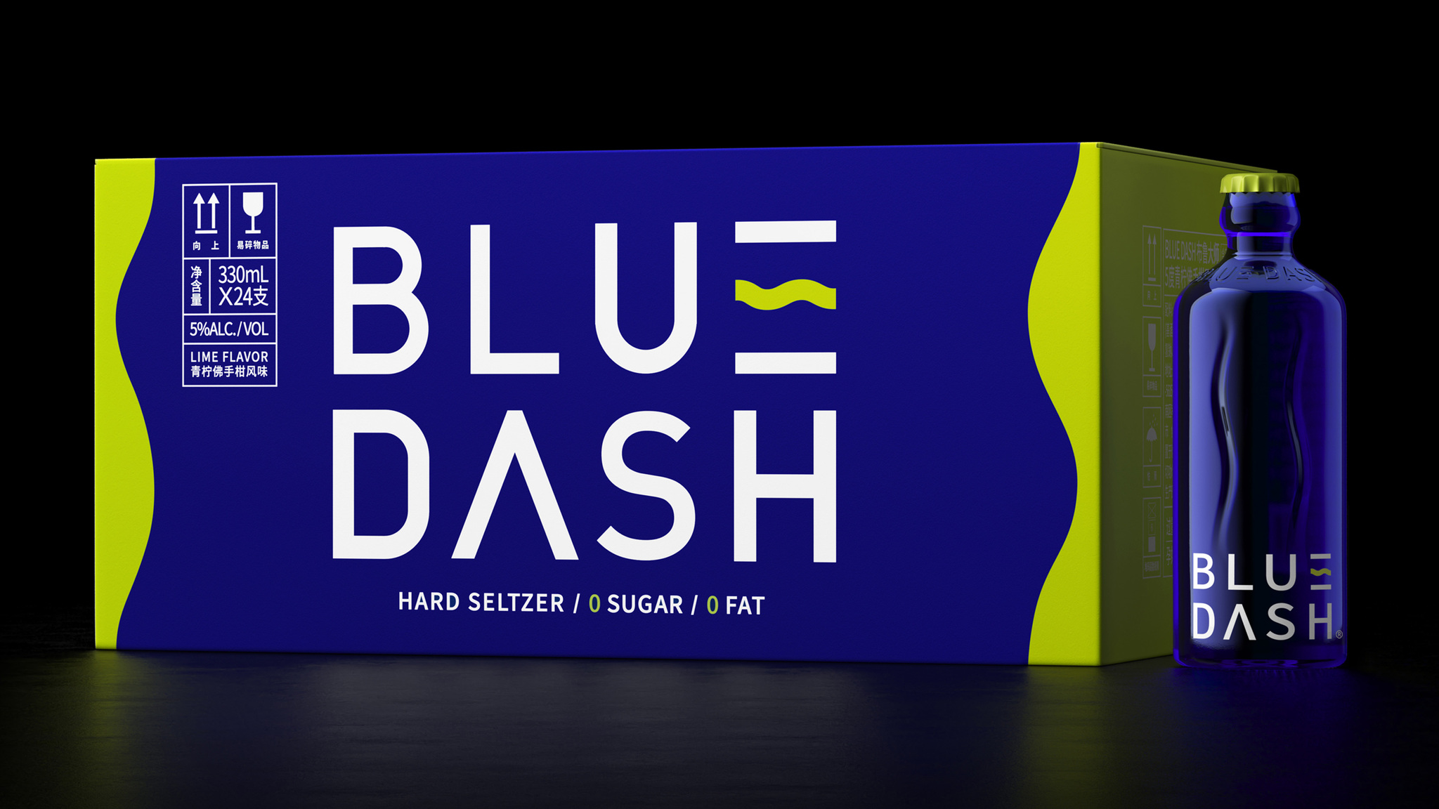
The "E" in the brand logo has undergone a transformation of the middle horizontal line at the beginning of the design. We have decided to use this transformation more thoroughly, using a concave shape on the bottle body to present this deformation curve, and also applying this curve at the bottom of the bottle. We focus on arranging the relevant information of the product in the lower part of the bottle, making the product look more minimalist and classic. we still made different color combinations and graphic designs in the bottle cap section to distinguish different flavors.
Client / ManufacturerDesign
Shanghai Luolan Technology Co., Ltd.
ShangHai, CN
ShenZhen Lingyun creative packaging design Co., Ltd.
Shenzhen, CNXiongBo Deng,RuiBiao ShenDate of Launch
2023
Development Time
up to 12 Month
Target Regions
Asia
Target Groups
Consumers / Users