

BLUE LAKE
Corporate Identity, brand
Blue Lake Restaurant
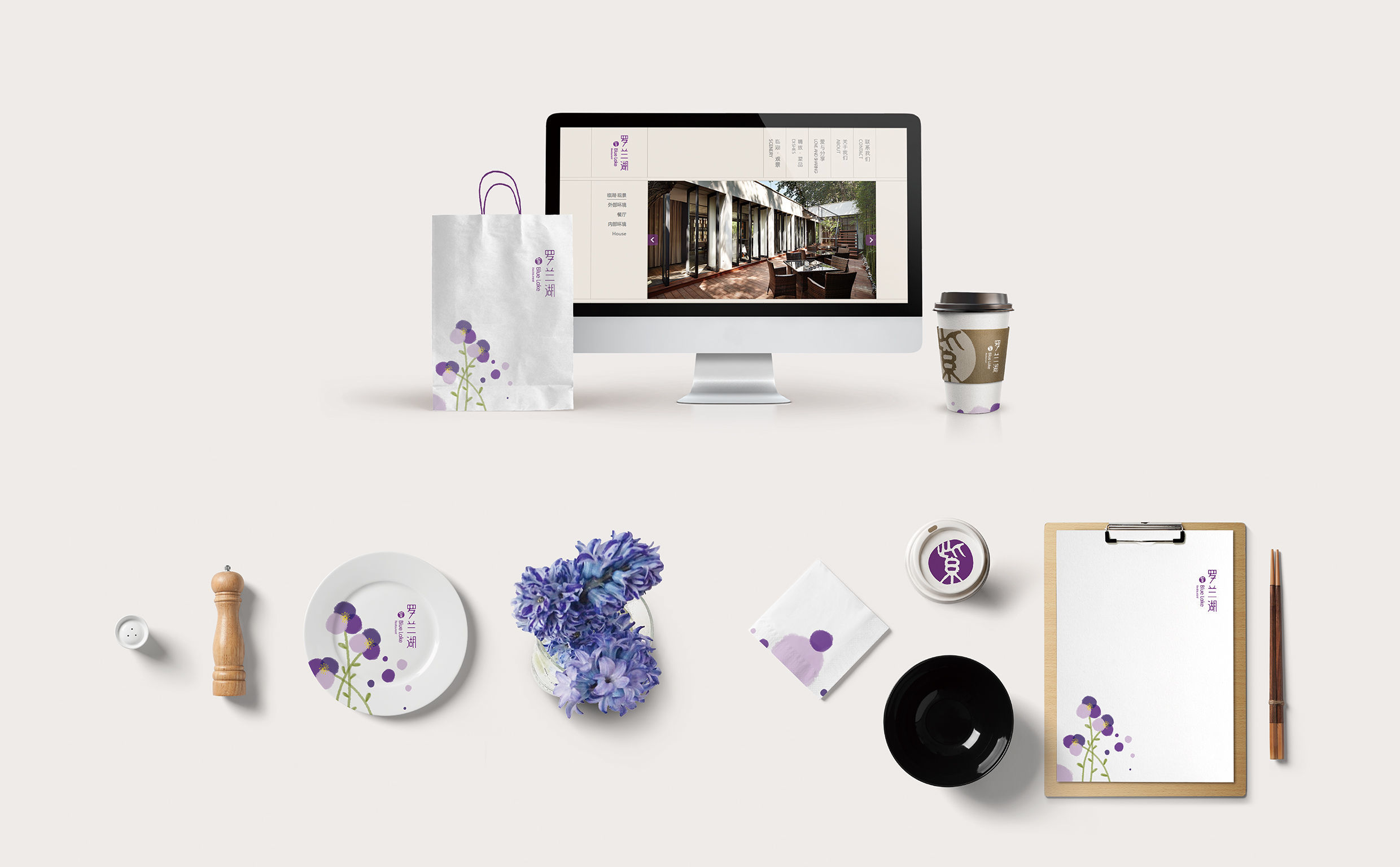
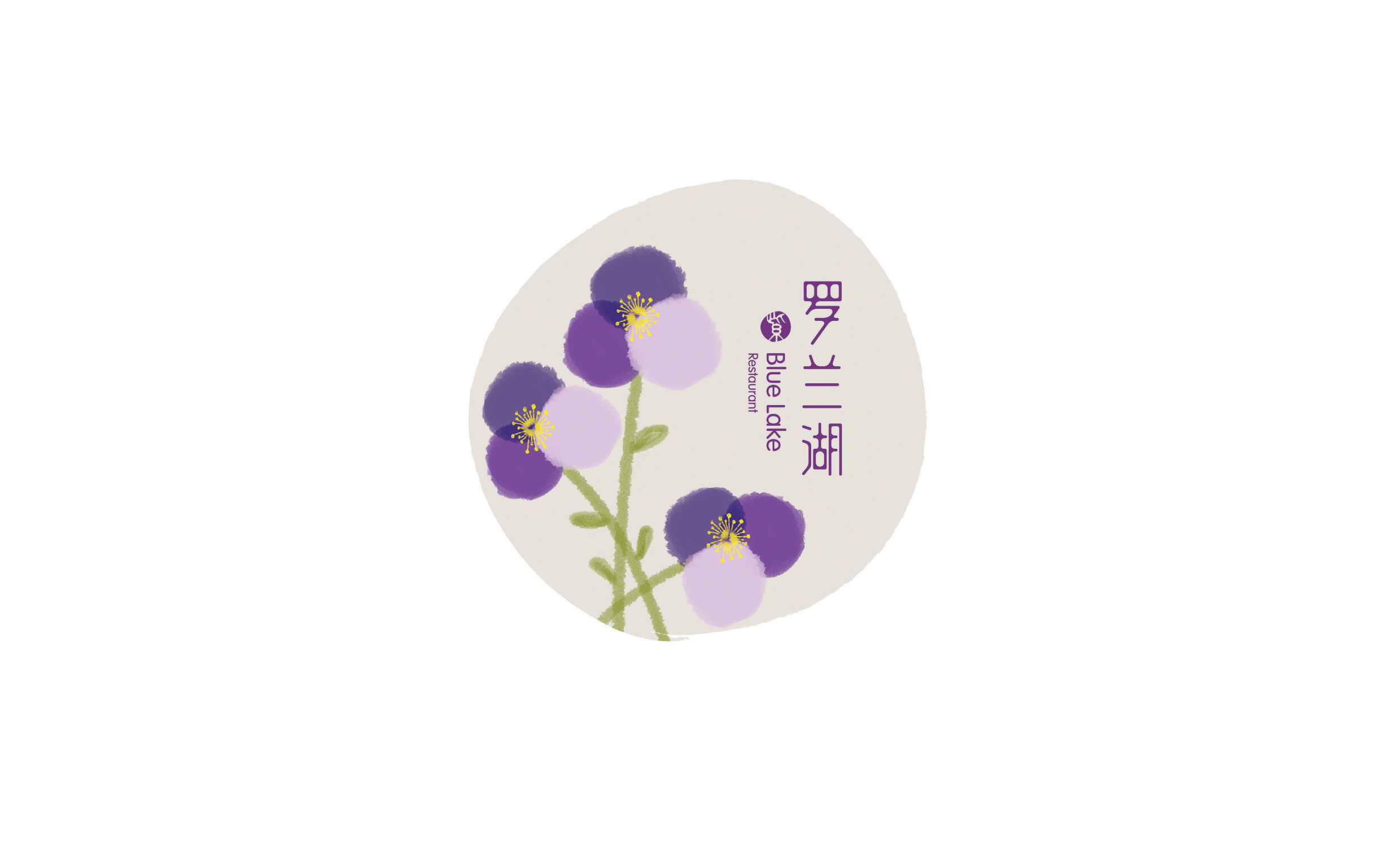
BLUE LAKE restaurant is sited by a clear lake amid a dense wood in a city park kept quiet amid the noisy ambient. The designer turns the “lake” and “purple” as an innovative starting point into a stamp graph to be embedded in the logo. Strokes of the Chinese characters are designed as two water drops to be mingled together. The font is designed as a “water-combining shape” with violet pedals saturated with light color. Through delicate vision, it embodies the Chinese philosophy of “implication.” As a non-perceptive color, purple displays a quiet and reserved style especially when faded, simply expressing a visual sense of tranquility and peace.
Client / ManufacturerDesign
Blue Lake Restaurant
Beijing, CN
Beijing Ziyang Partner Brand Design
Beijing, CNDate of Launch
2015
Development Time
up to 12 months
Target Regions
Asia
Target Groups
Consumer / User