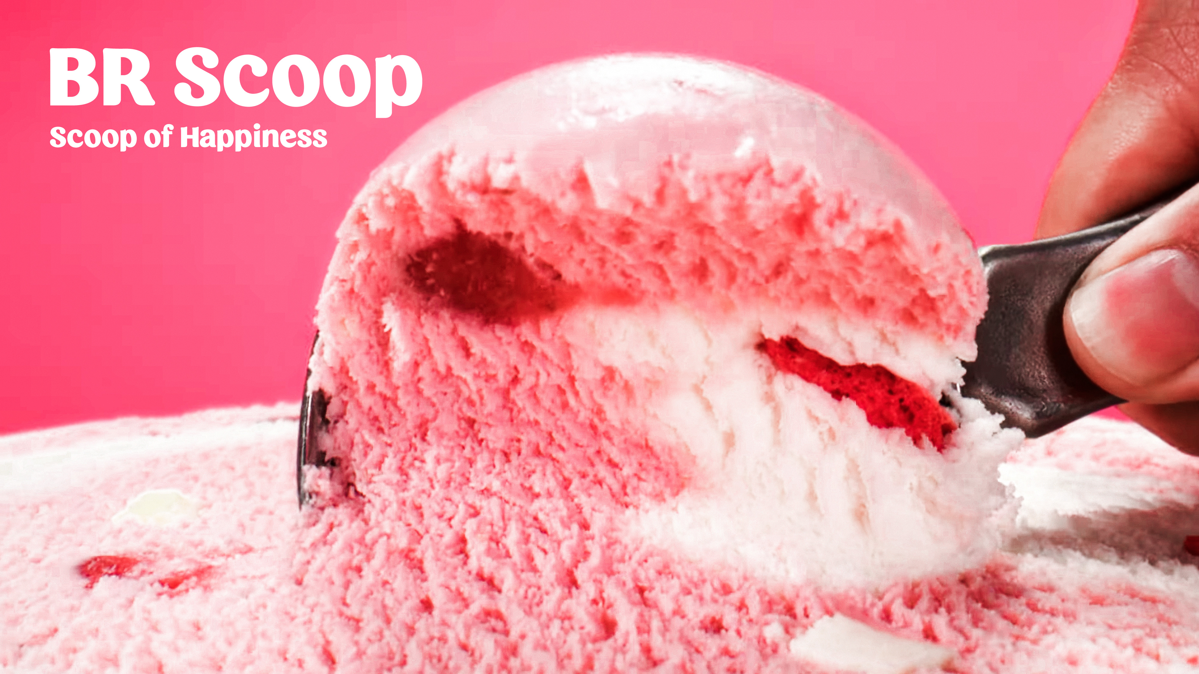
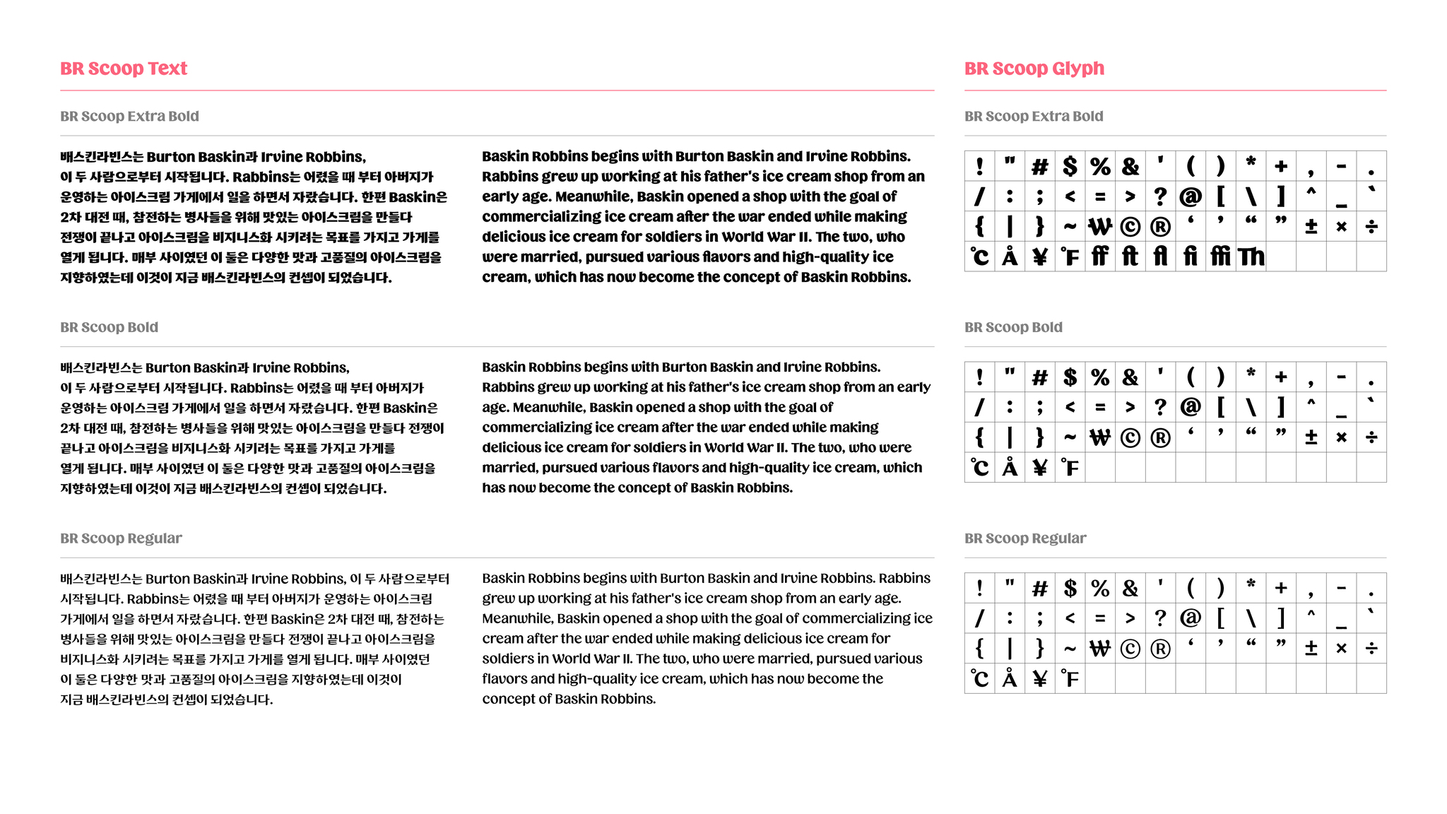
BR Scoop font : Scoop of Happiness
Brand Typeface
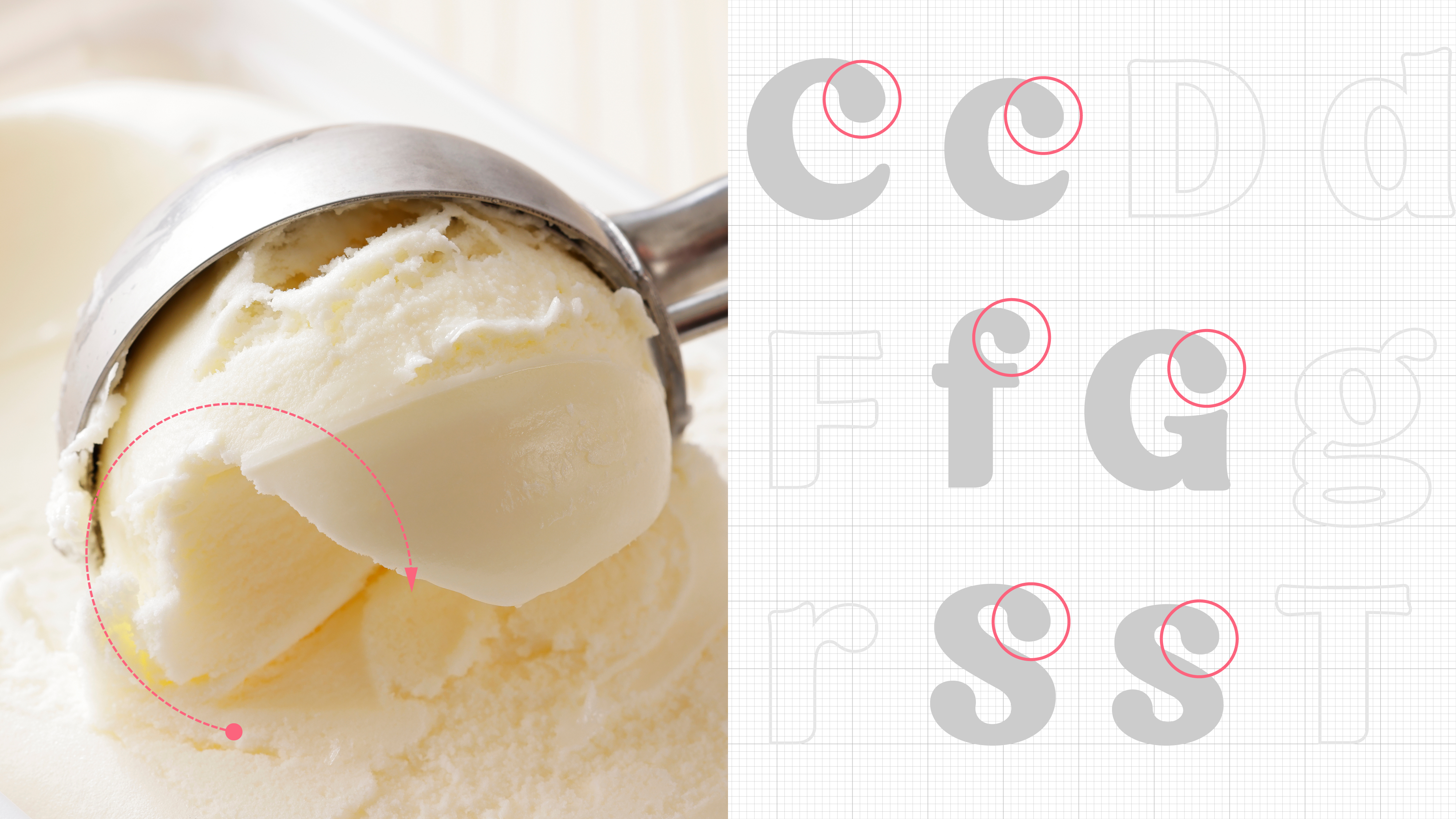
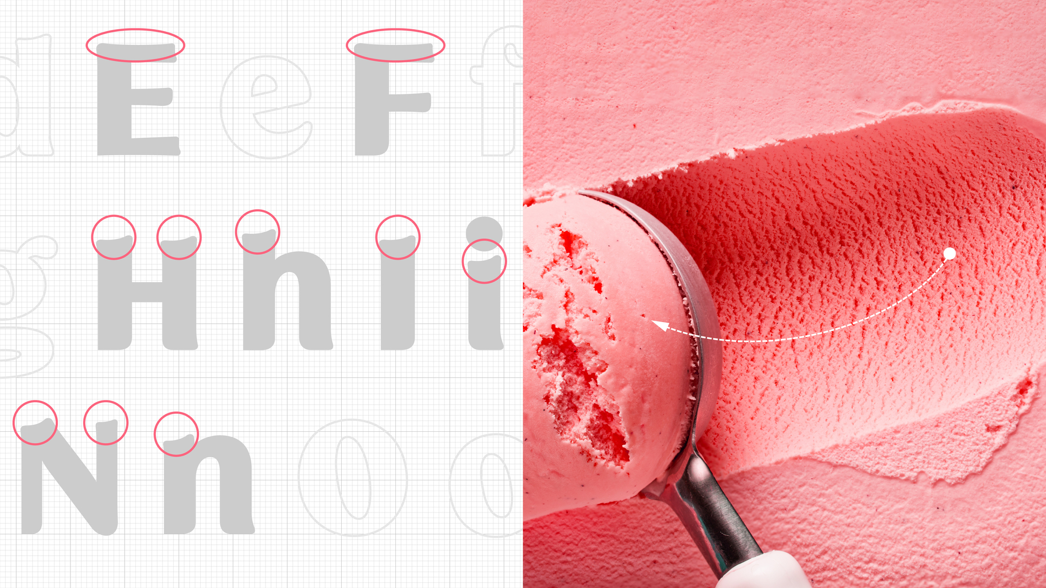
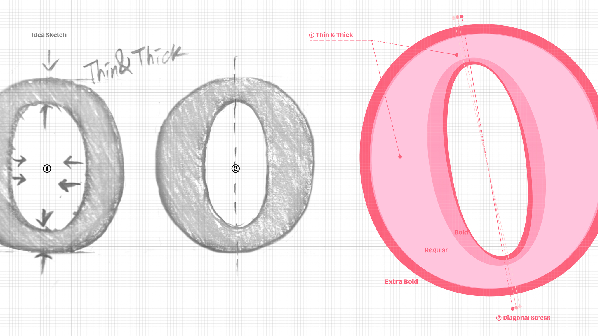
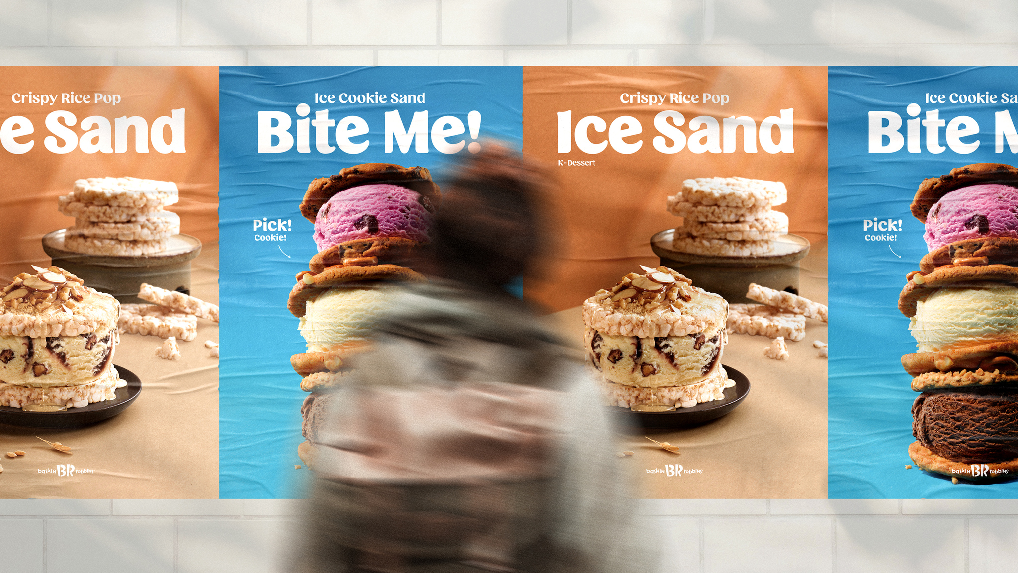
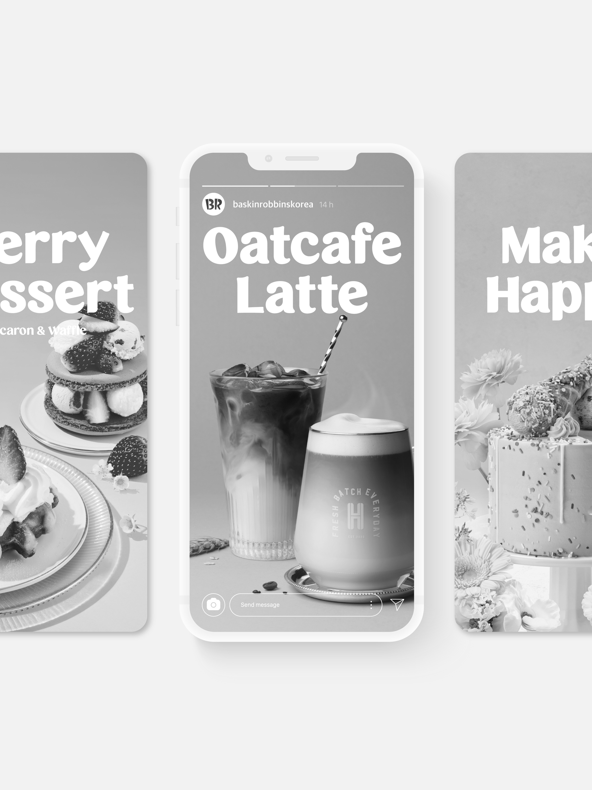
Ice cream is the identity of BR, which aims to make the world happy through ice cream. Based on this objective, we intend to deliver our brand's messages to everybody through font images together with text. Inspired by the image of scooping up ice cream, we have created the organically shaped BR Scoop font based on such keywords as "Happiness", "Ice cream", "Modern". This is BR's brand font that aims to deliver messages on the brand's identity, representing our wish for customers' happiness when delivering our delicious ice cream to them.
Client / Manufacturer Design
BR Korea
Seoul, KRBR Korea
Seoul, KRJeanne Kim, Jong sool Lee, Young hun Lee, Ye seul JeongSandolltium
Seoul, KRKyoung seok Kweon, Sun young Im, Seok hee Kong, Hee jin KimDate of Launch
2022
Development Time
up to 24 Month
Target Regions
Asia
Target Groups
Consumers / Users