BRIGHTEETH
Corporate identity
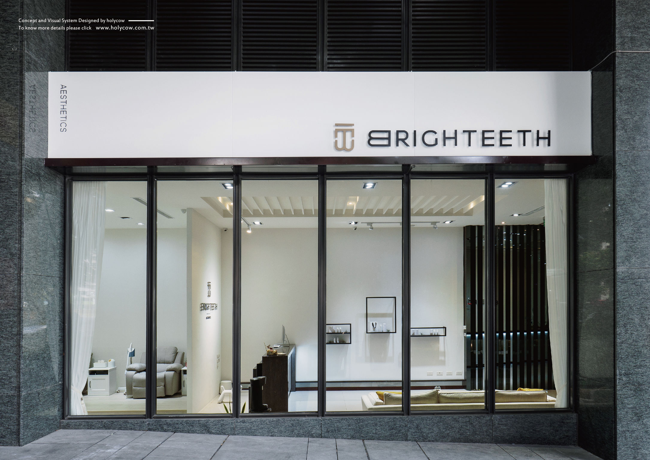
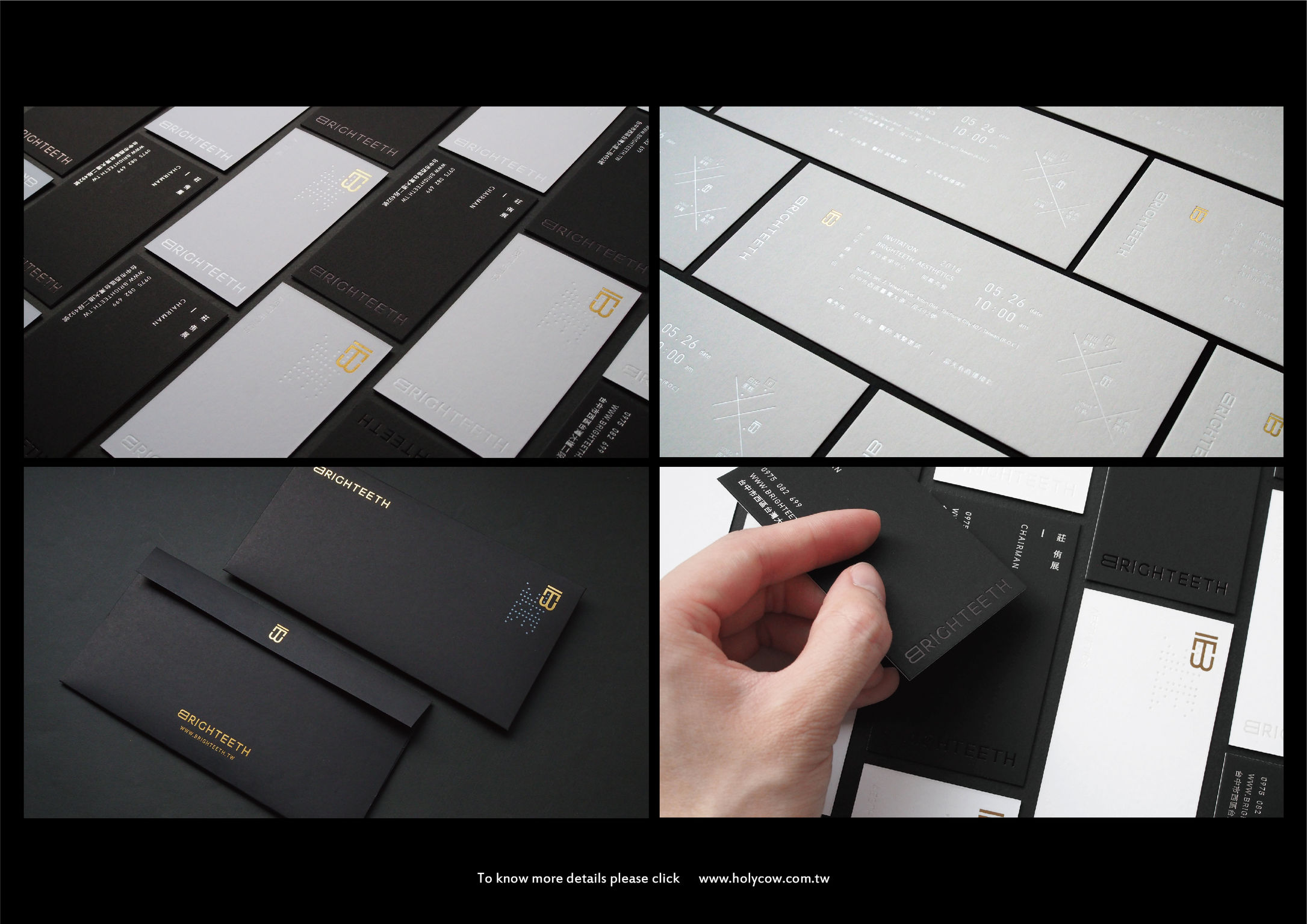
Having bright white clean teeth boosts a person’s self-confidence and gives them the most splendid, sparking smile. The Brighteeth center features a professional fresh and clean aesthetic designed with contemporary, premium materials. The brand name conjoins the words “bright” and “teeth” to underscore the benefit of having radiant white teeth. The logo design utilizes only the letters “B”and “T” as the basis of the company's overall brand identity.
Date of Launch
2018
Development Time
up to 12 months
Target Regions
Asia
Target Groups
Consumer / User