Burn Lab
Brand Idendity
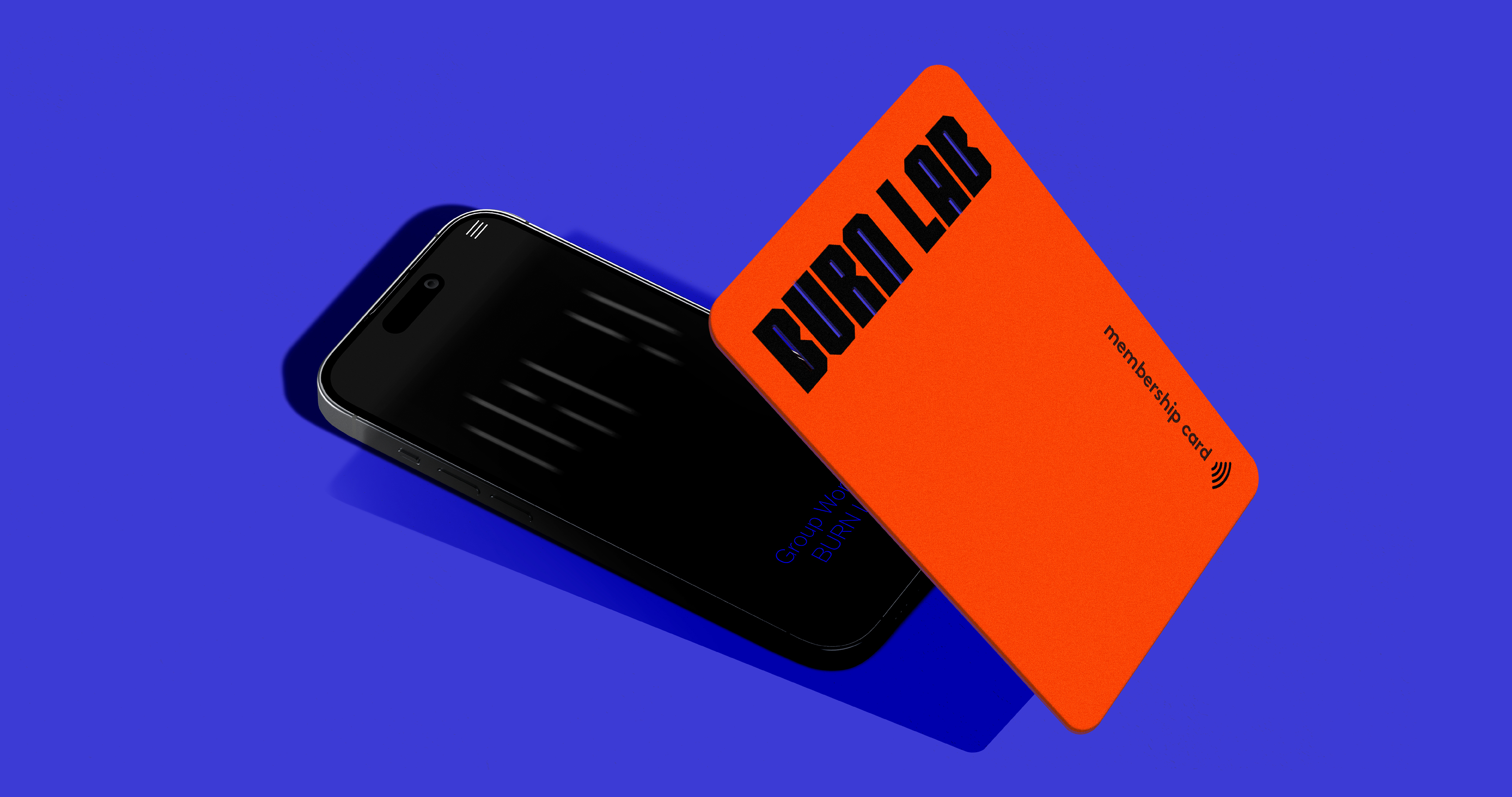
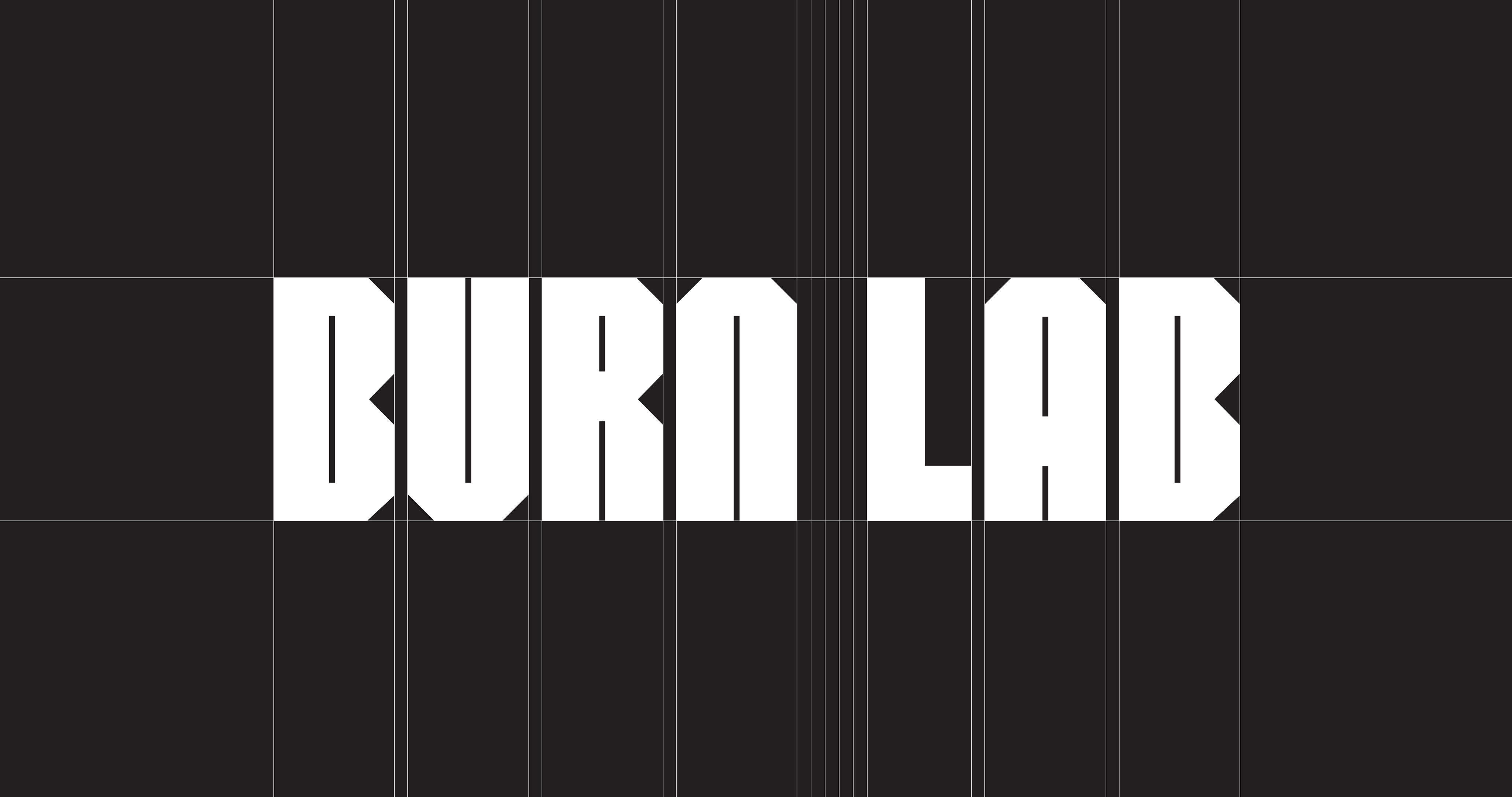
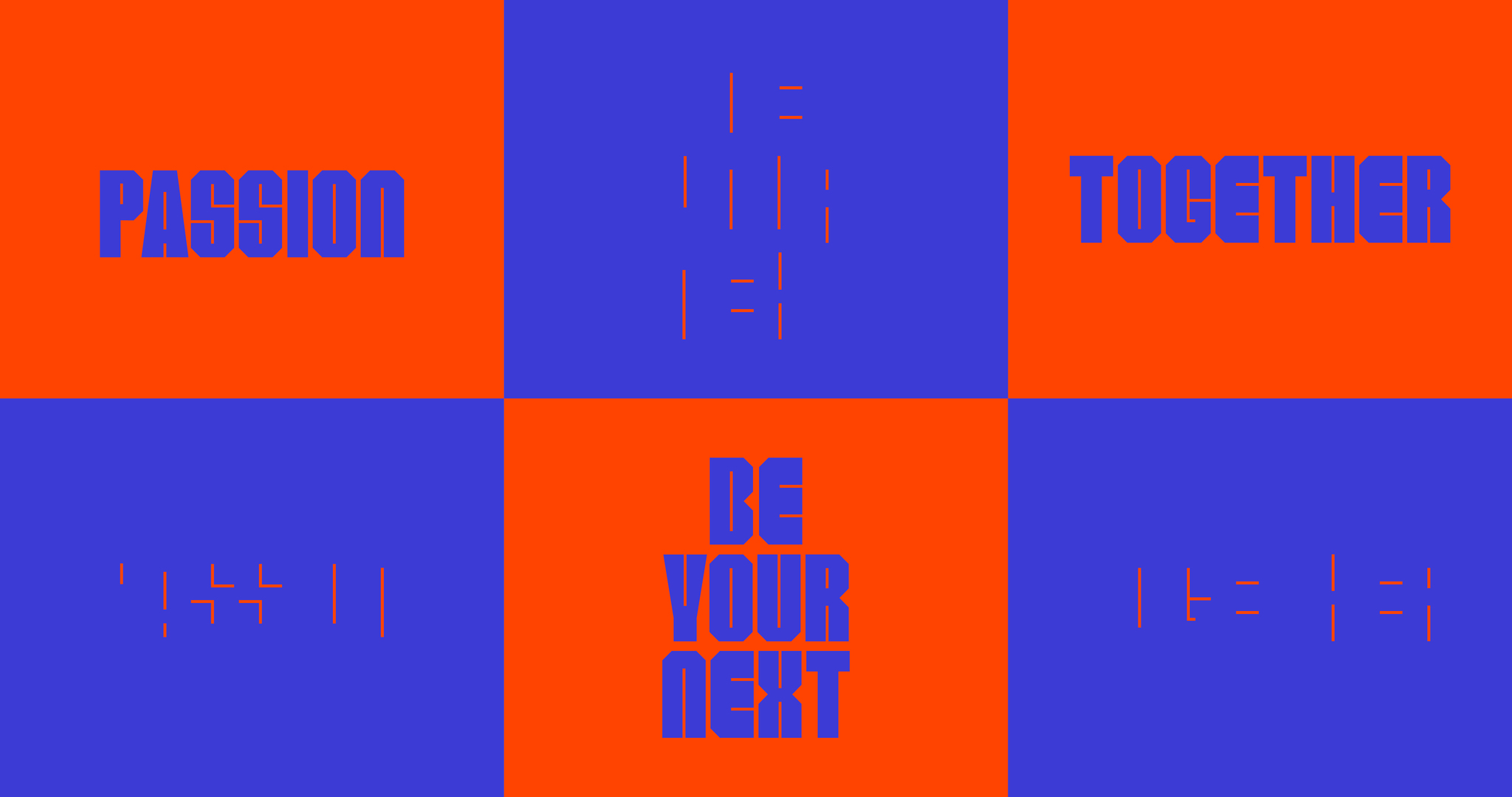
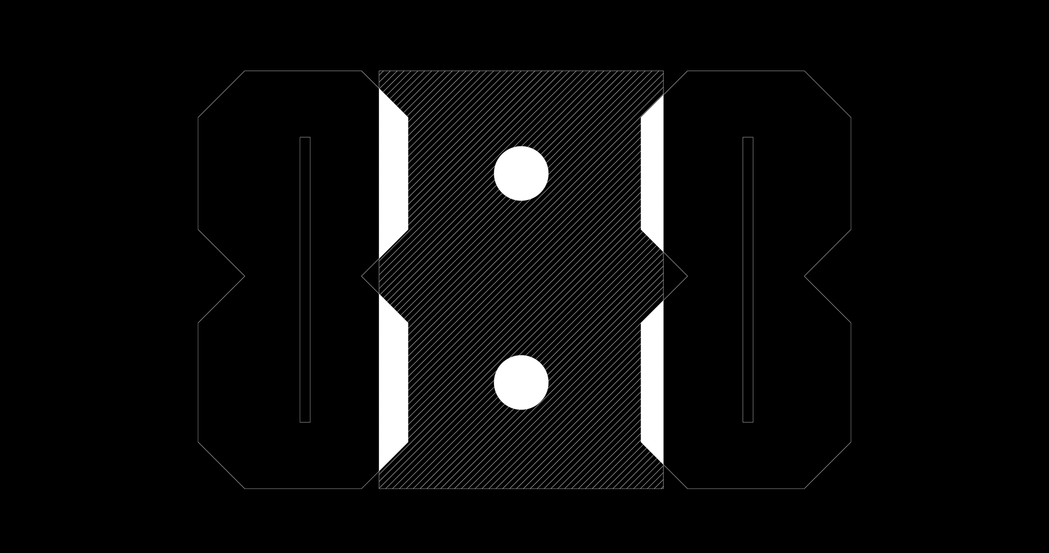
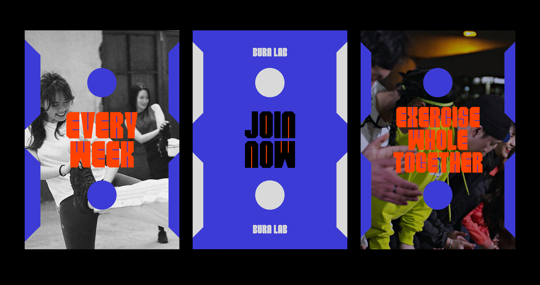
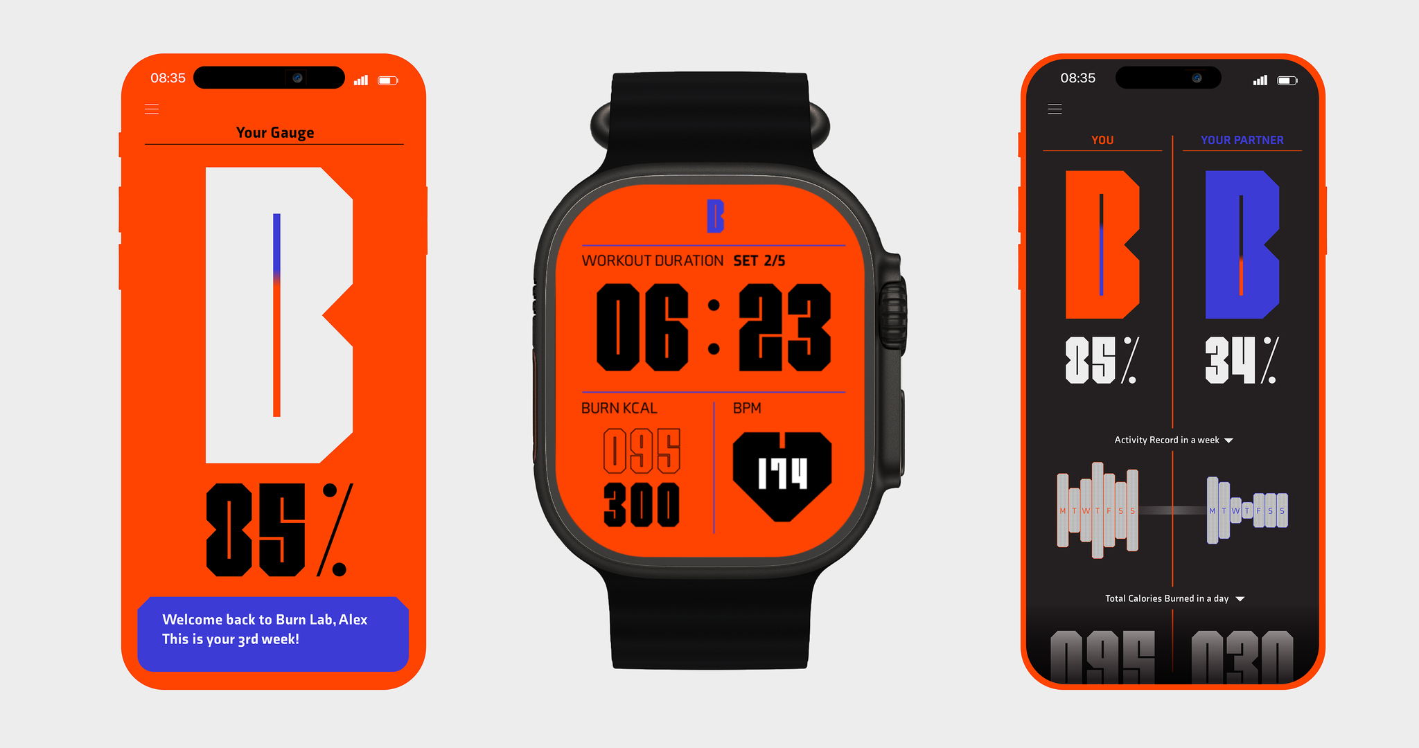
BURN LAB is a fitness brand that promotes a team exercise program where 8 women and 8 men can join forces. Its design elements capture the energy and spirit of fitness, with a bold type font in the logo reflecting the intensity of the workouts. The logo creatively reimagines the 'counter' element in 'BURN LAB', symbolizing the interconnectedness of each member in the balanced 8:8 team structure. Additionally, gauges, graphs, and visuals are integrated into the design to track exercise measurements. What sets it apart is the emphasis on balanced team participation, creative integration of design elements, and focus on tracking progress.
Client / ManufacturerDesign
A Cave
Seoul, KRFGW
Gyeonggi-do, KRGoya CHOIA Cave
Seoul, KRHeeju LEE, Seokhee JEON, Nara ON, BX TeamDate of Launch
2021
Development Time
up to 24 Month
Target Regions
Asia
Target Groups
Consumers / Users