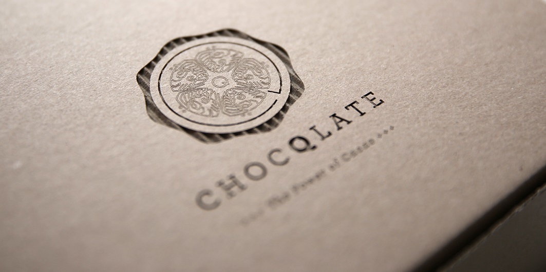

ChocQlate
Corporate Design, packaging design
4Qtrade GmbHAlready 3,000 years ago the Maya were aware of the power of cacao. ChocQlate revives this knowledge and creates a chocolate, which is a truly natural powerhouse due to natural ingredients. Genuineness and authenticity are shaping the design as well: the cross-section of the cacao fruit forms the logo and a Maya ideograph that means ”cacao” graces the five cells inside the fruit. They are encompassed by a Q, the most important characteristic of ChocQlate: quality. Rich colors truly declare the power of ChocQlate. A brand presence that is as unique and powerful as ChocQlate itself.
