CU
Brand identity
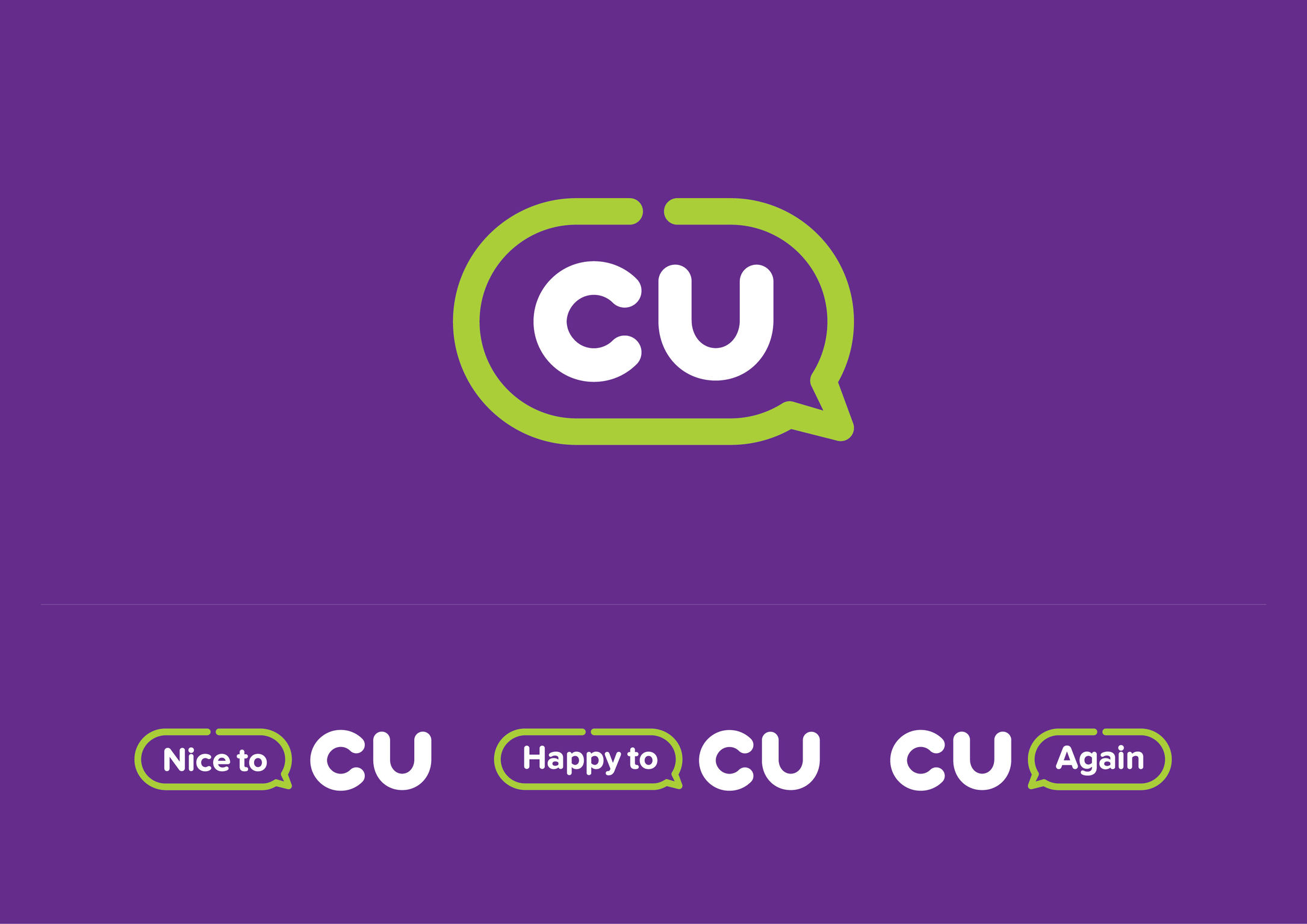
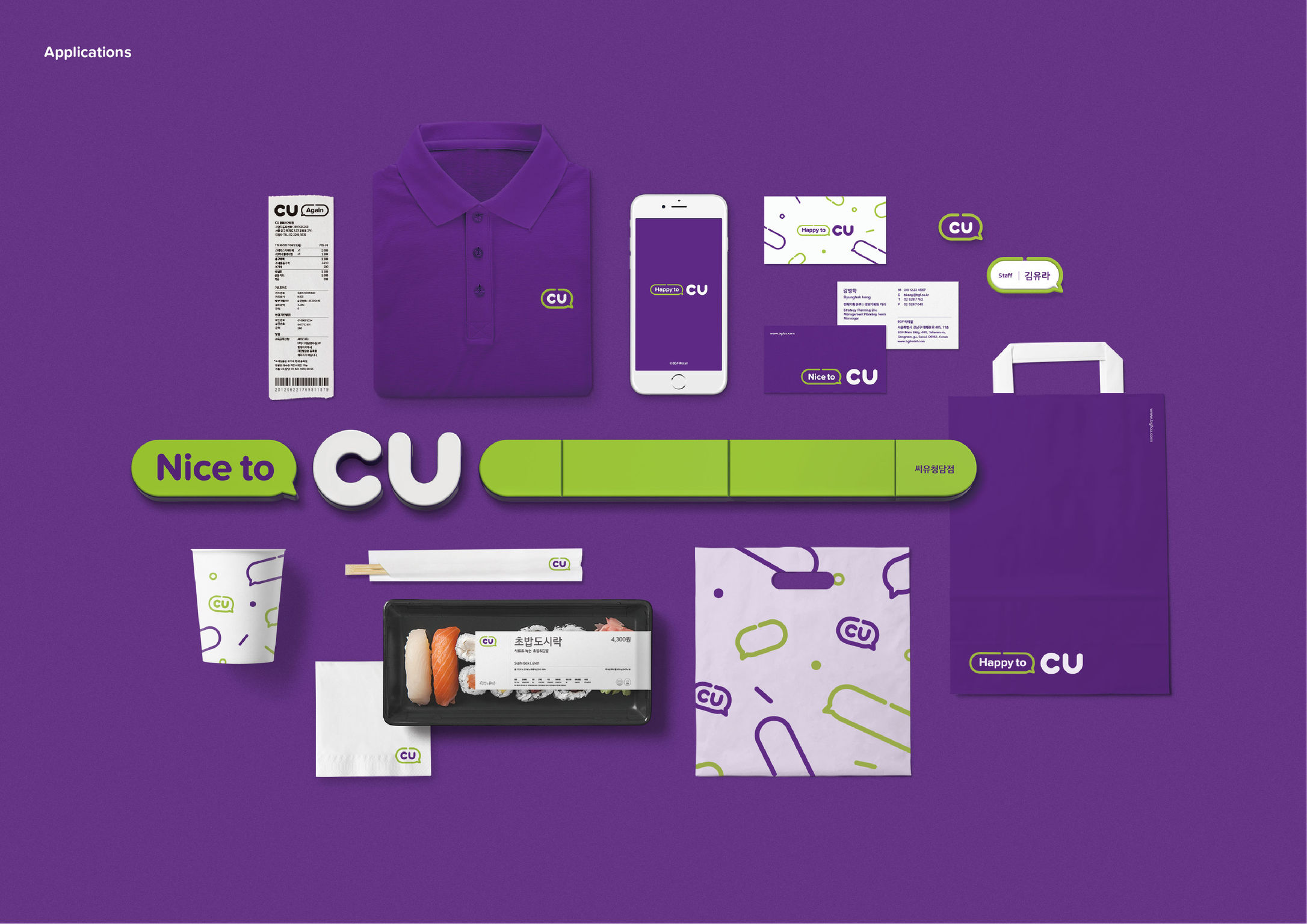
CU is the largest convenience store brand in South Korea. The brand's former logo used the comma as a design element to express everyday relaxation. However, the symbol did not deliver a clear brand image because its shape was easily confused with a speech bubble. The redesign uses the speech bubble as a new primary element to highlight the importance of communication with customers, adding an update to the comma from the previous logo. Taking note of the nature of the convenience store industry, designers created a brand identity whose goal is direct communication with the customer through messages like "Nice to CU" on its signboard, the retailer's most important contact point.
Date of Launch
2017
Development Time
13 - 24 months
Target Regions
Asia
Target Groups
Consumer / User