Cubix
Brand Design
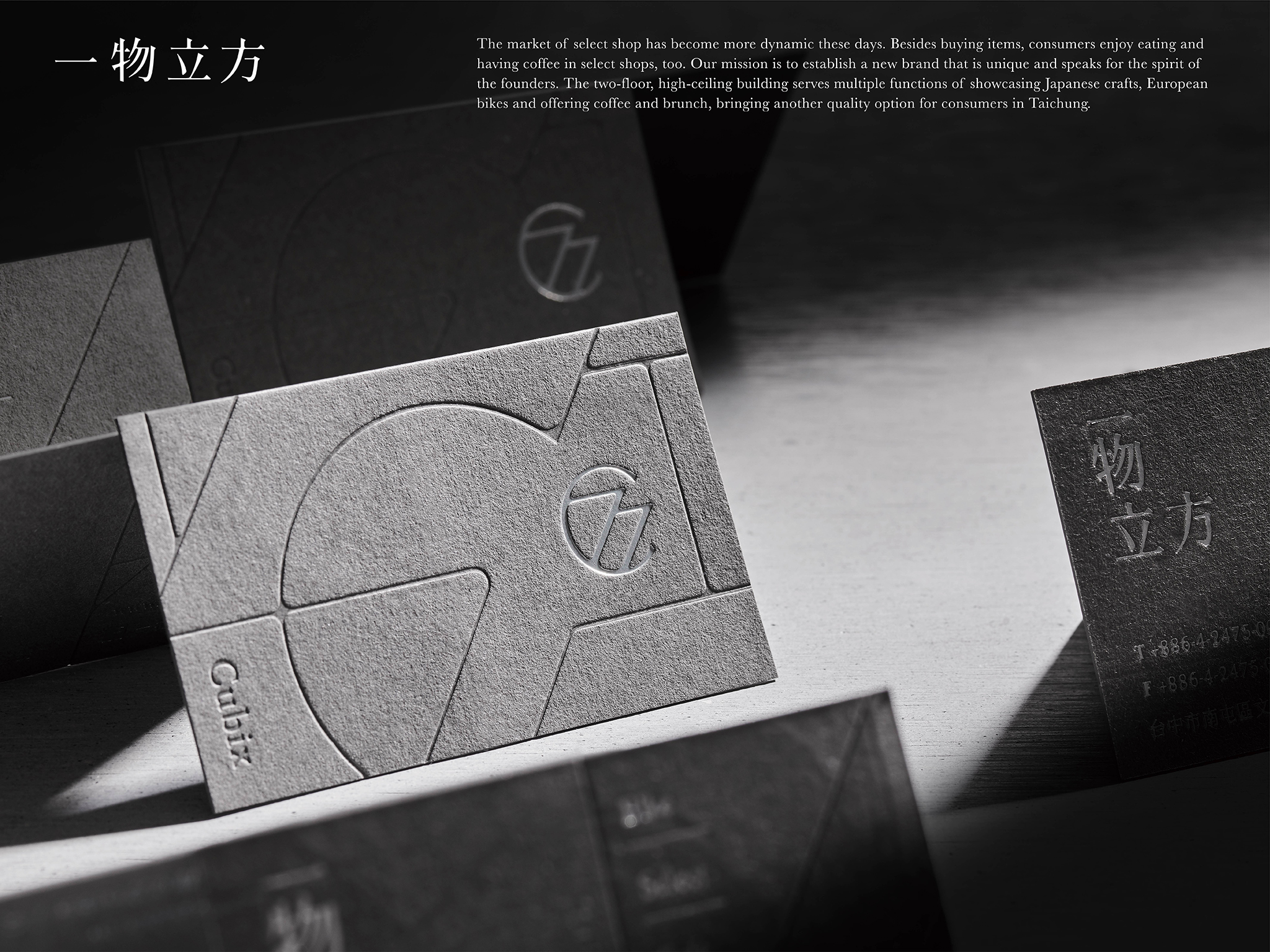
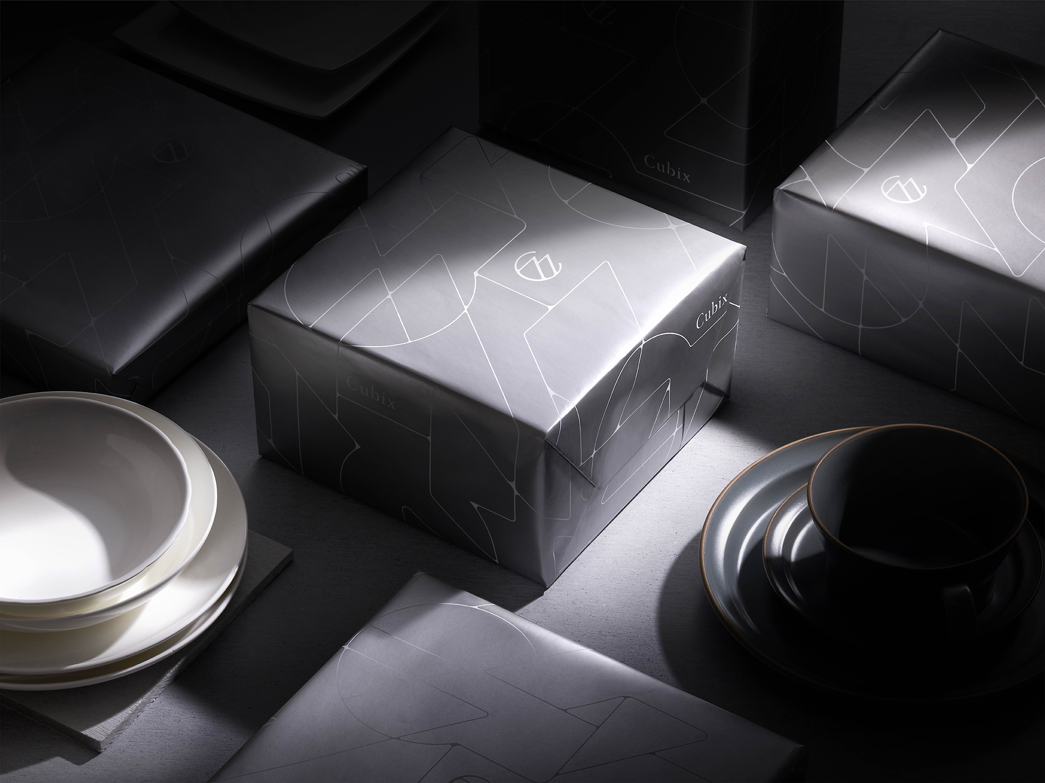
Like a gallery where ideas in the form of artworks are presented by curators, Cubix, a premium Japanese craft and European bike shop, was positioned as "a showcase of spirits" to highlight the ideas behind the items on offer. The designer extrapolated a "C" to stand for both space and a bike wheel, and combined it with the Chinese character "square" which means cube and objects. By adding a touch of calligraphy and choosing grey and metallic as the main colors, the brand image showed humanity and literature, followed by an extensional pattern that was derived from the logo. The design focuses on the fundamental concept of "items" and "space" which makes the brand unique and outstanding.
Date of Launch
2018
Development Time
up to 12 months
Target Regions
Asia
Target Groups
Consumer / User