Dai Loon Fong Restaurant
Restaurant brand design
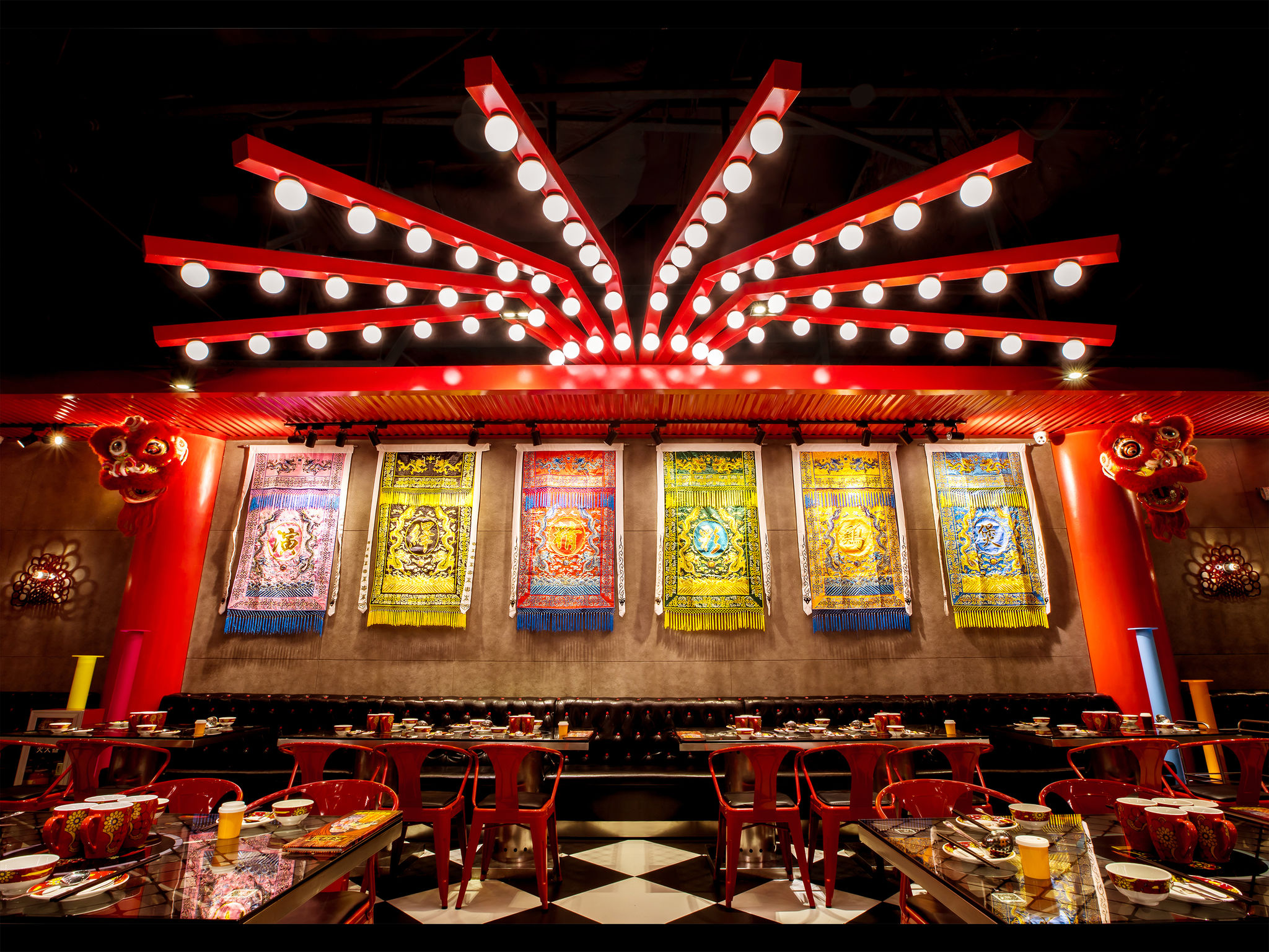
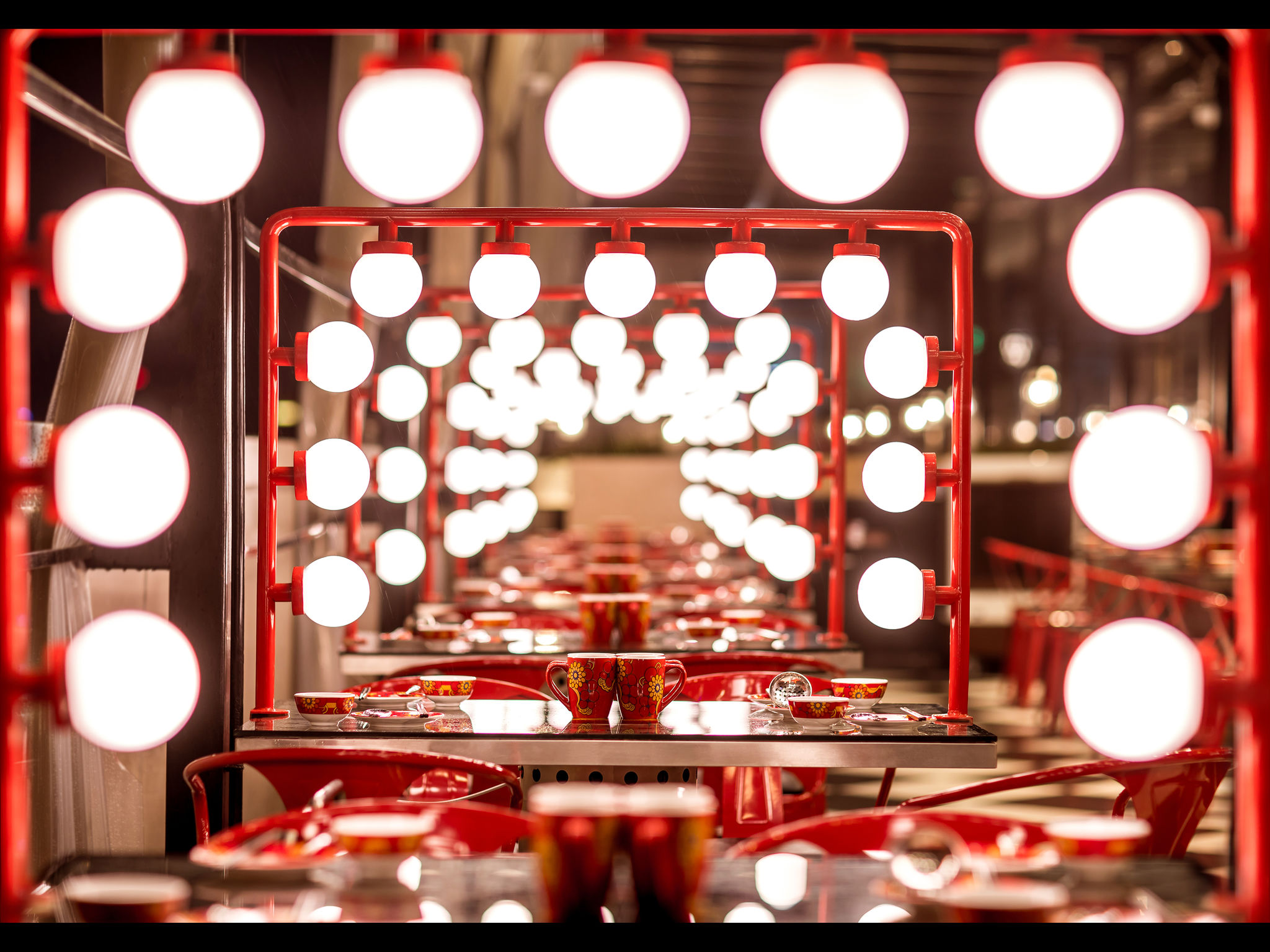
Dai Loon Fong Restaurant serves fusion-chicken hot pots. It also means a grand show of Cantonese Opera. We believe the brand identity of a restaurant is not only the delicacy, space esthetics and atmosphere, but also the elements the consumers can touch and use, the impression they have in mind. It’s a “total work of art.” In this project, strongly contrasted colors, “Chinese red, golden yellow and black,” are used to express a warm, festive atmosphere and some dramatic scenes. “Curtain wall,” “make up mirror table,” ”Crown-style wall lamp,” the installation arts … These elements we customized, finally creating what people call "Dai Loon Fong the Modern Theater" today.
Client / ManufacturerDesign
Dai Loon Fong Restaurant
Guangzhou, CNICO CREATIVE DESIGN Co., Ltd.
Hefei, CNXJD Lab Of Design
Guangzhou, CNDate of Launch
2015
Development Time
"Average 3 months"
Target Regions
Asia, "Chinese culture lovers"
Target Groups
Consumer / User