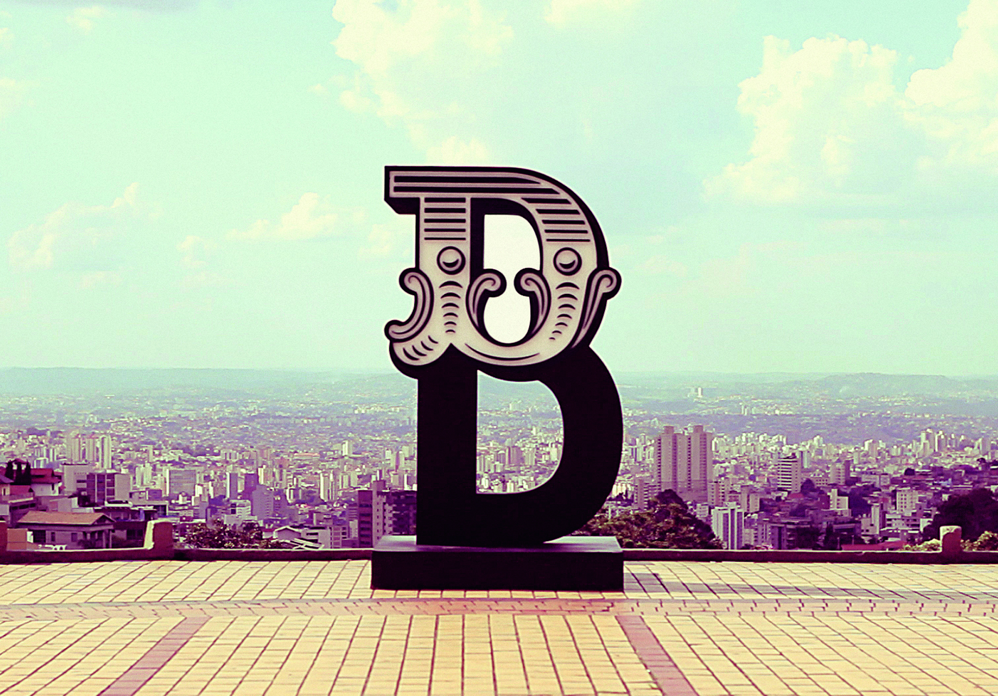
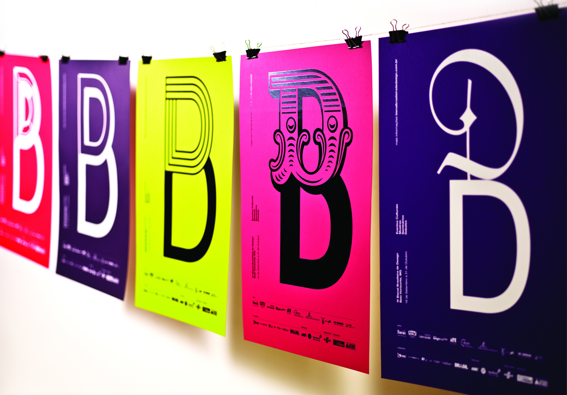


D+D=B
Visual Identity
Create the visual identity for the 4th National Design Biennial in Brazil. The event presented the theme Brazilian Diversity. We created a variable identity, in which two letters “D” (representing Design and Diversity) featured in different types, alternating to form a “B” (representing Biennial). The variations represent the different topics featured in the shows: jewelry, furniture, among others, emphasizing the theme of the Biennial: Brazilian cultural diversity. To promote the event around the city, urban signage called “B” totems were set up pointing out a path that unveiled the Biennial exhibition sites. Video: http://vimeo.com/63927199
iF Gold Statement
The simplicity of the idea forming the B-logo for the Brazilian design exhibition of two D’s – representing diversity and design – has such a recognizable and unique quality that is actually very hard to find. It is a reinvention of typefaces one may never use as they are completely outdated. By combining them with a clean Swiss style, it takes on a new life of its own. The visual quality of the logo is extremely strong while totally simple and pure.
Client / ManufacturerDesign