

Deufol AG
Annual report 2010
Deufol AG
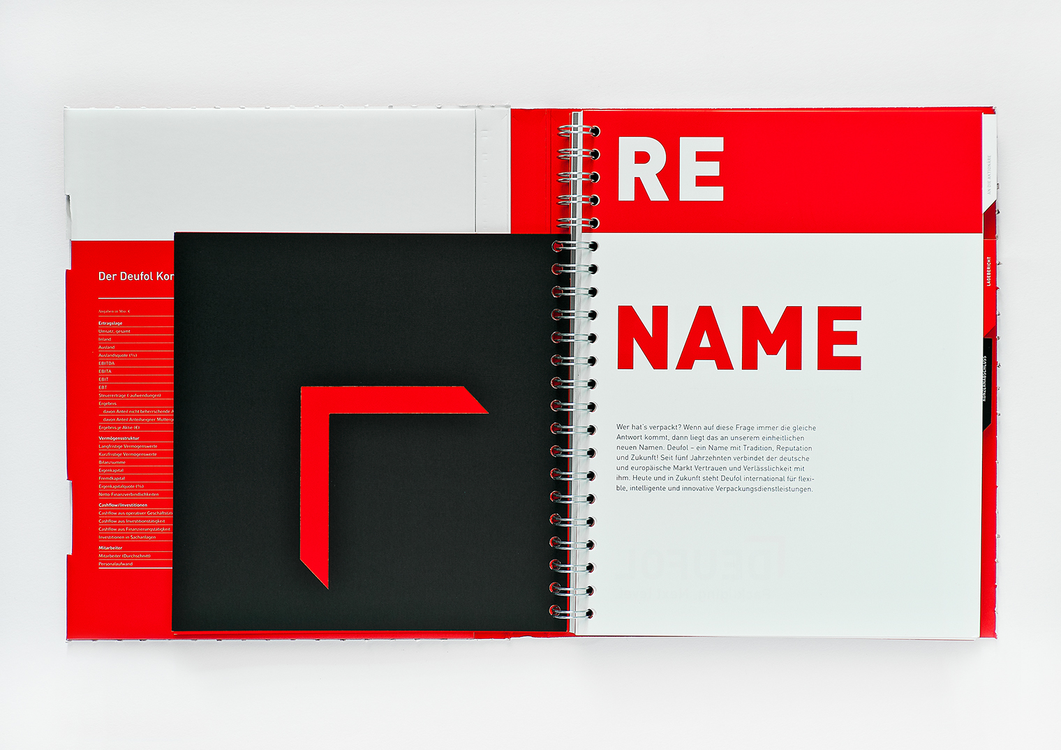
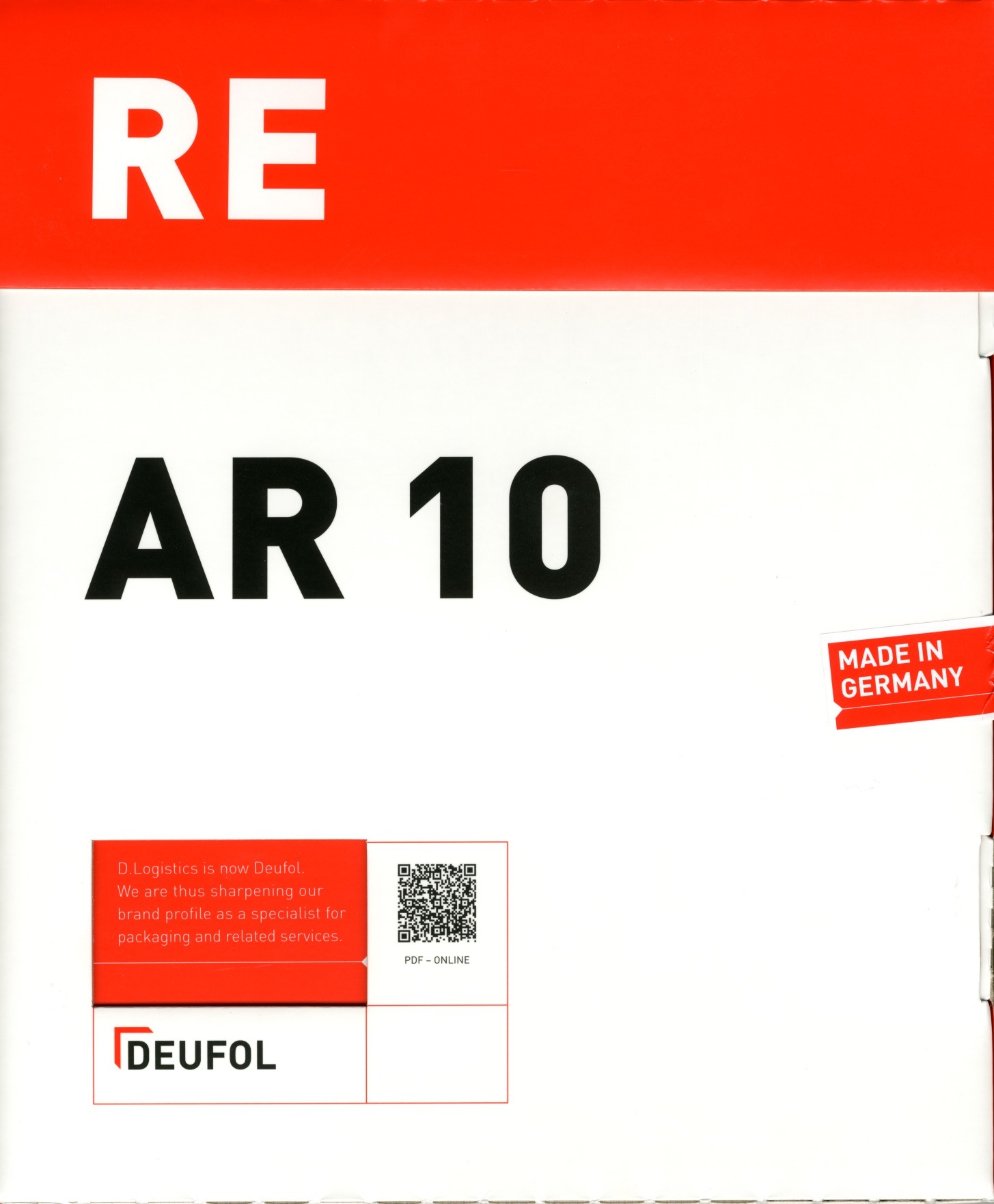
Extensive typography and a shortened format visualize the main theme RESTART. With a bold and simple design the report tells the story of the re-naming from D. Logistics to Deufol. That is what the exceptional cover underlines, too. The graphic design cites the logos abstracted packaging symbol, the CD colors black, red and white shape the overall impression. With its courageous and creative adaptation of the very simple corporate design the report shows a very high level of graphic design and an independent, sectoral expression. This report is unaffected, powerful, distinct absolutely authentical.
