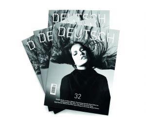
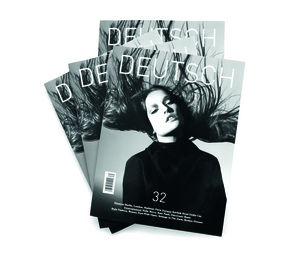


DEUTSCH MAGAZINE
Magazine
DEUTSCH MAGAZINE Art Generation GmbH
Precision with a stiff dose of emotional appeal. So although the DIN typeface continues to be used, this is only in headlines and only in the light version: for the sake of consistency, it is also used in the logo. This looks less aggressive and more in keeping with the lifestyle theme whilst still affirming the magazines traditional virtues, in combination with an Antiqua font, which is easier on the eye. A centered layout conveys the cultural approach of the magazine. By varying the way the elements are combined, cultural resonances come to the fore in the layout.
Client / ManufacturerDesign
DEUTSCH MAGAZINE Art Generation GmbH
Düsseldorf, DE