


Dim Sum 8
Corporate identity and rebranding
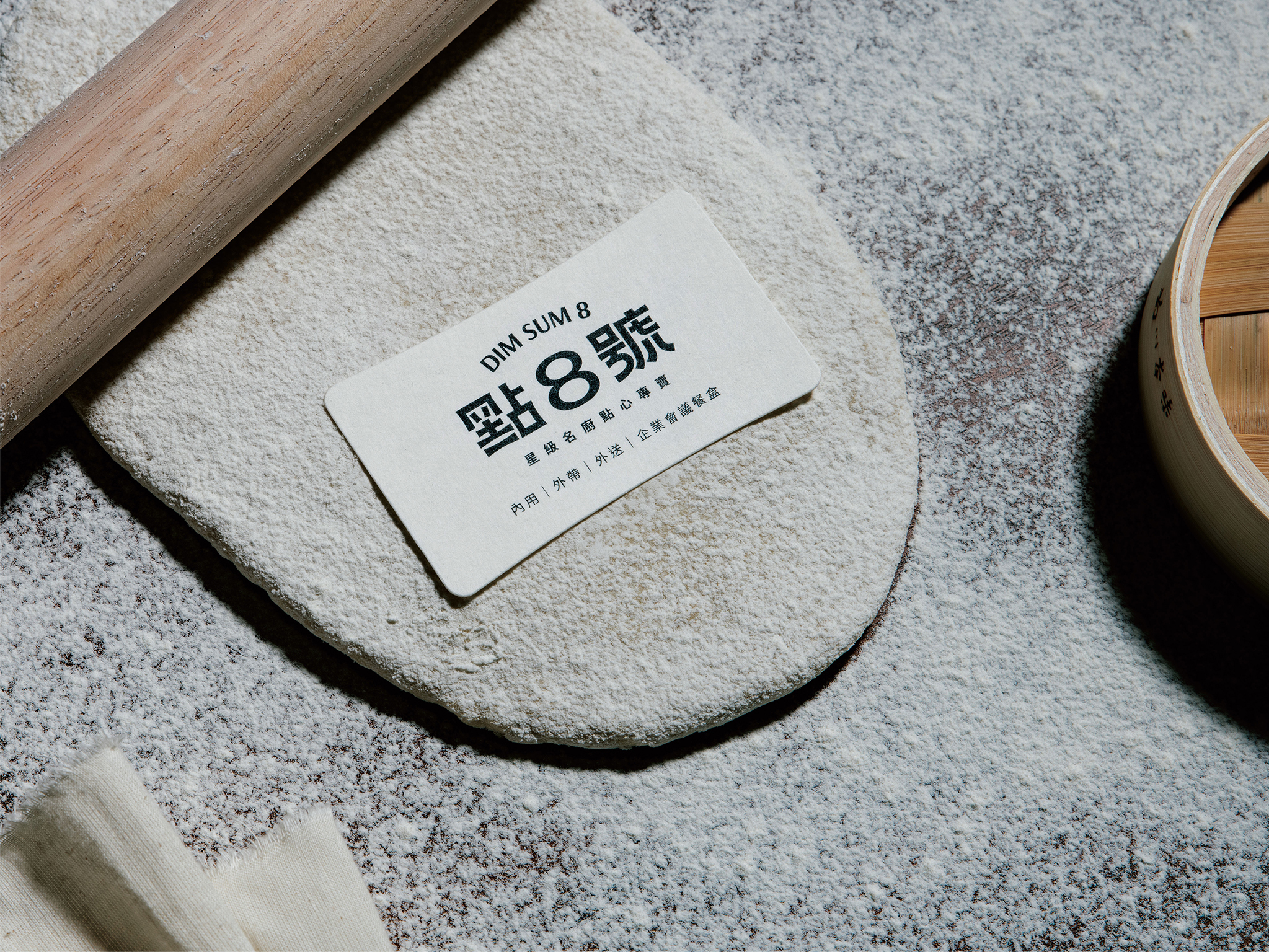
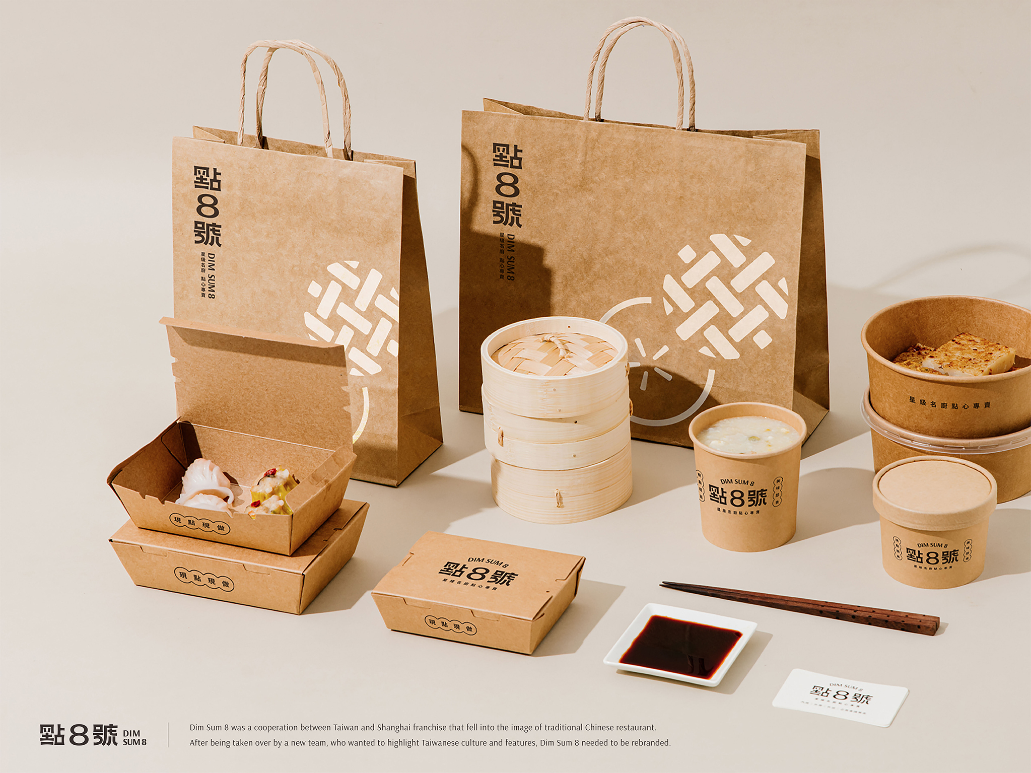
Dim Sum 8 used to fall into the stereotype of Chinese restaurants, and it needed a fresh look after being taken over by a new team with skillful chefs who wanted to modernize the dishes. Thus, to emphasize the profession and modern language, the designer applied the image of chefs kneading dough to create a new logo with extended and elastic outlines that implied more fun and fresh tastes. The image was also incorporated into business cards with dough-like die-cutting. Visual identity was applied to the interior, menu and packaging as well to create an overall visual language of the re-branded Dim Sum 8.
Date of Launch
2019
Development Time
up to 12 months
Target Regions
Asia
Target Groups
Consumer / User