Dr.Jart+ new evergreen packages
collateral packages
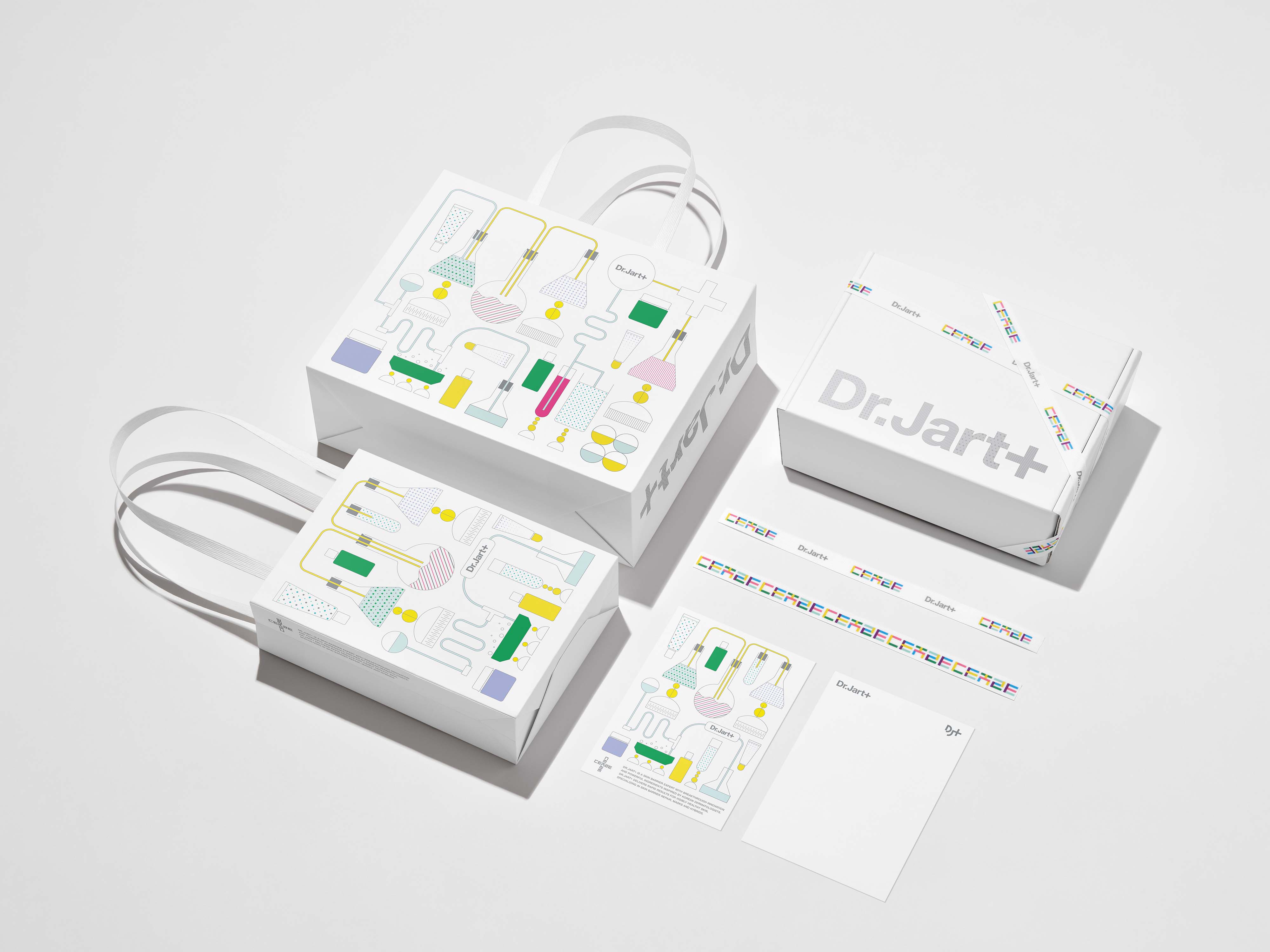
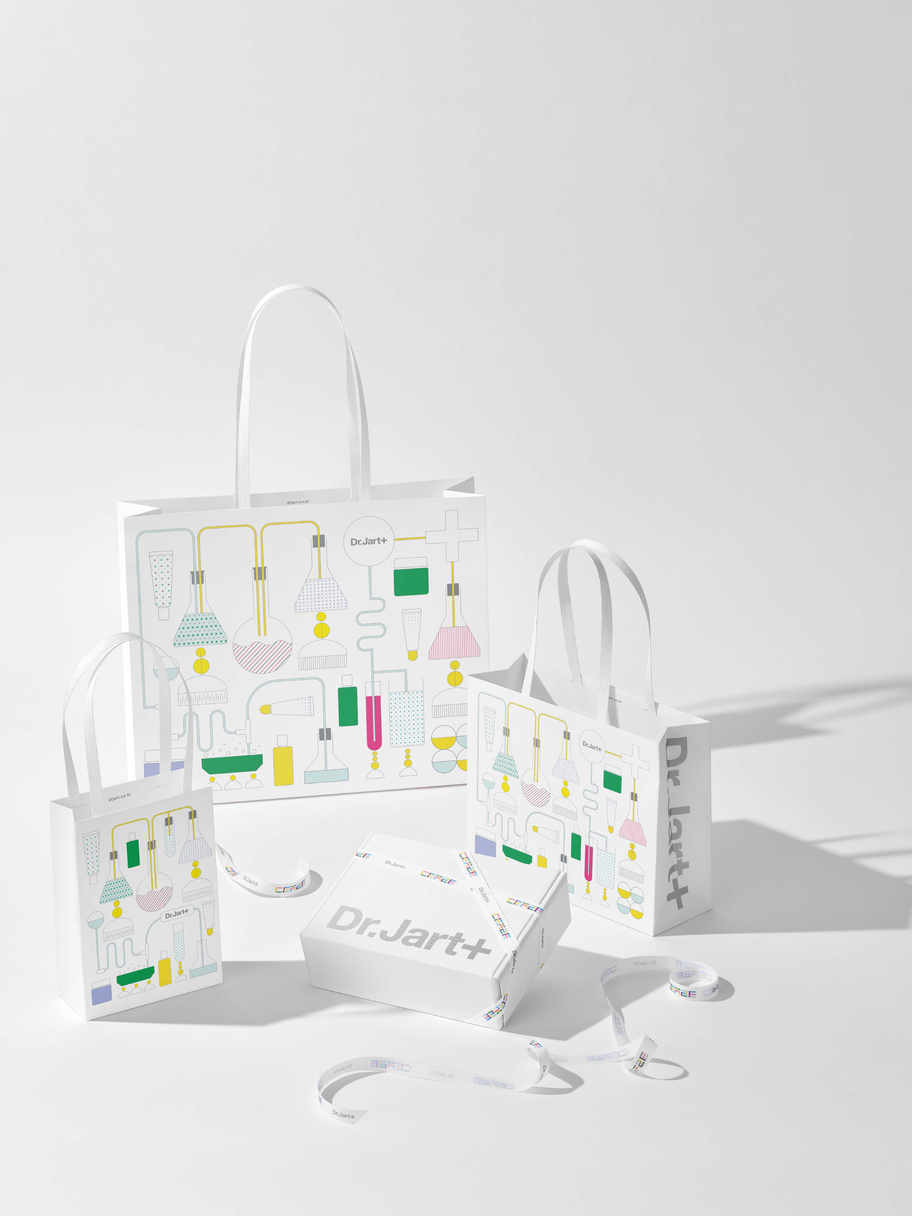
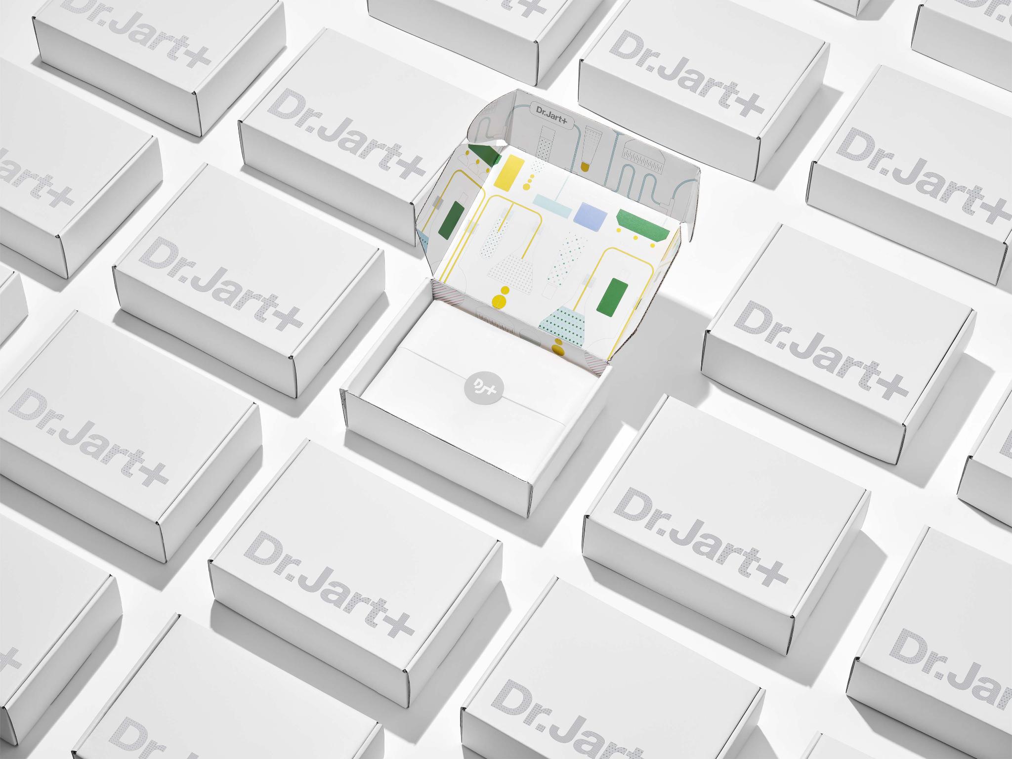
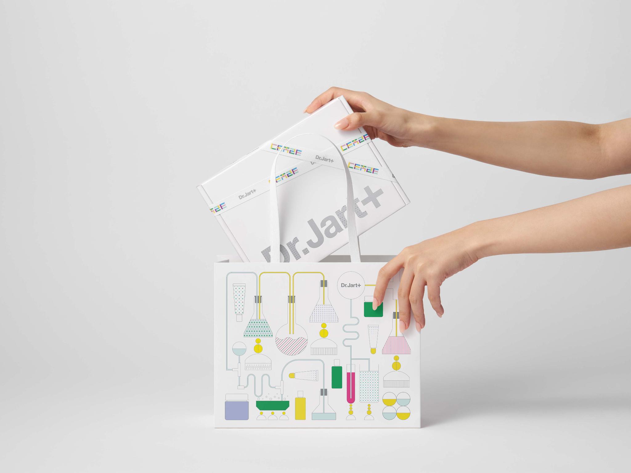
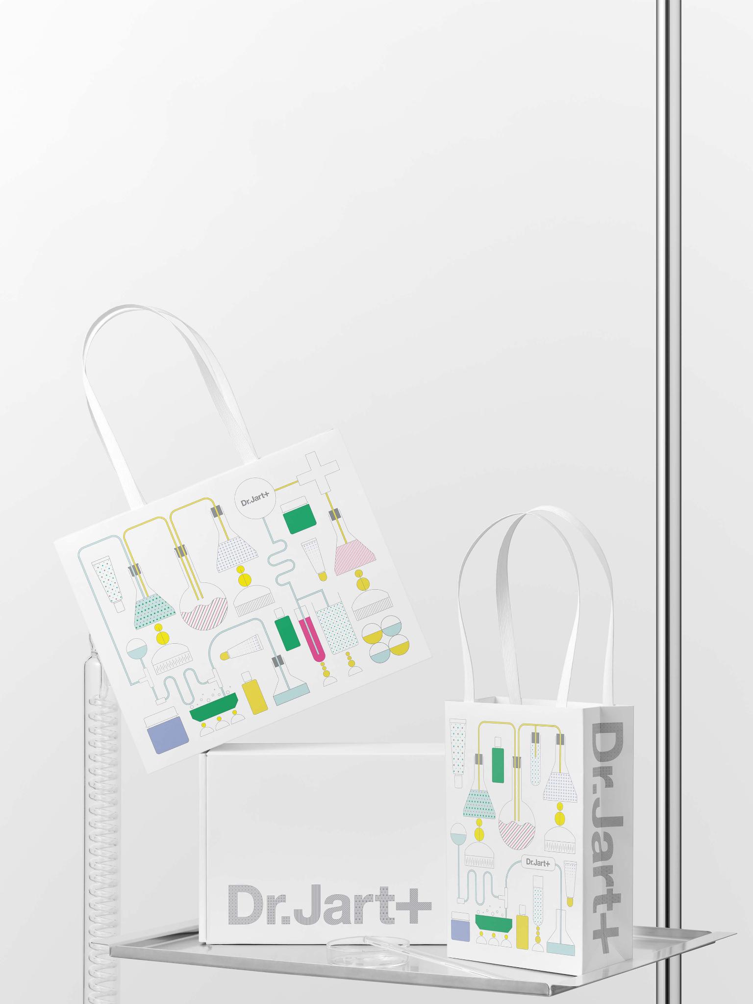
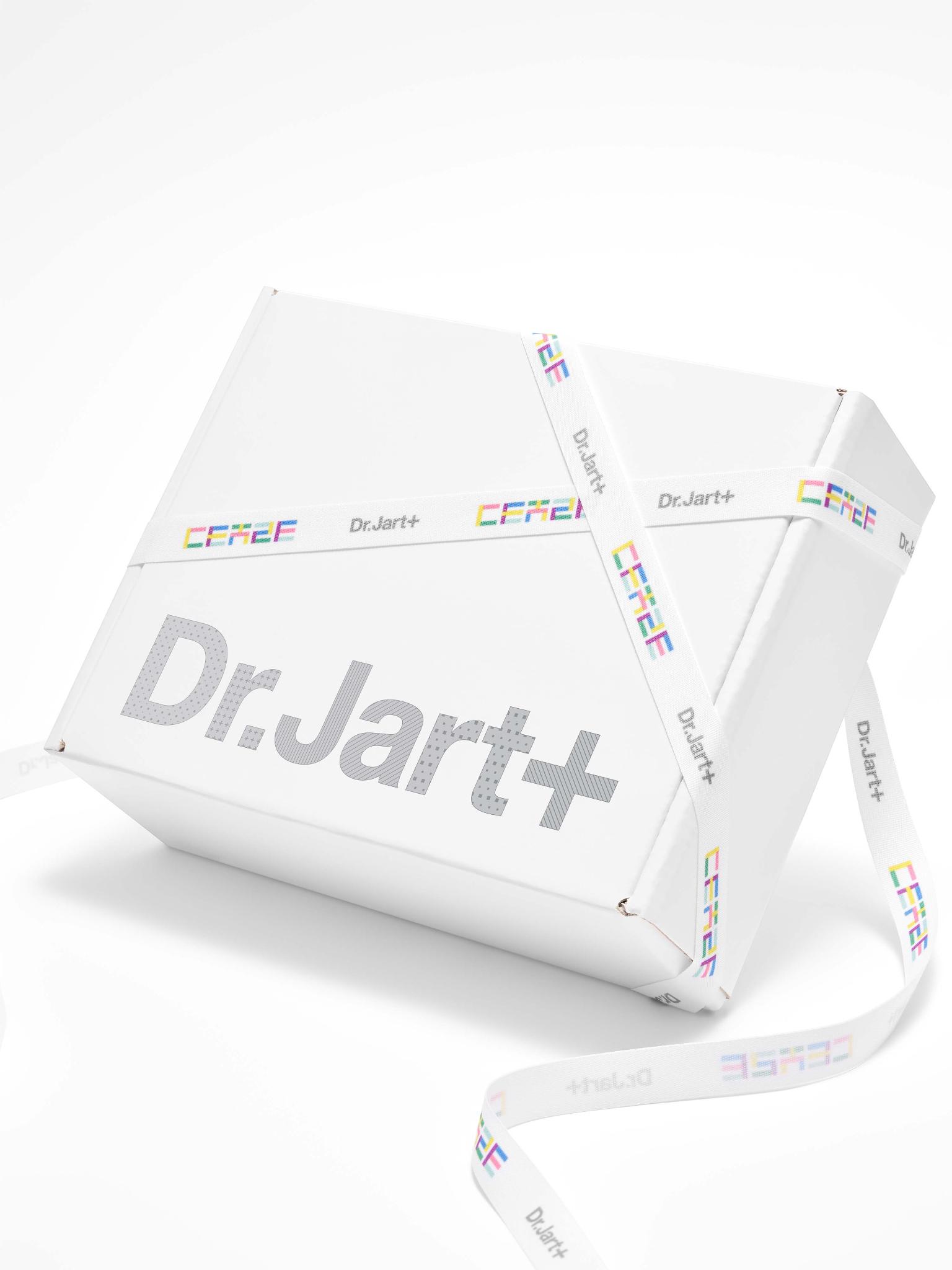
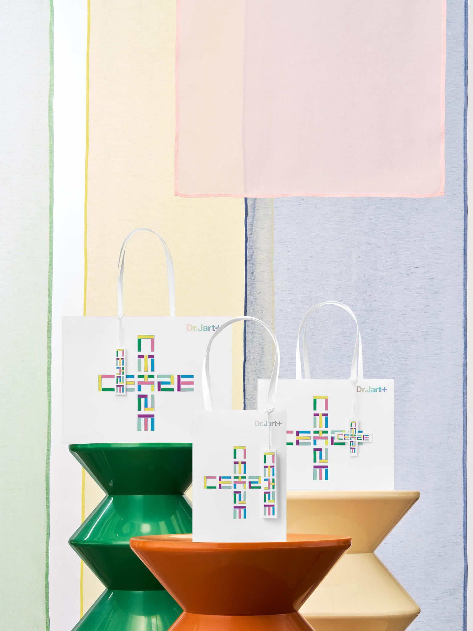
Dr.Jart+ reinforces its identity as a skin barrier expert through a dual design system rooted in Korean heritage and scientific innovation. One direction reinterprets Hangul consonants into geometric forms paired with the “+” symbol, expressing cultural authenticity and global universality. And draws on the traditional Korean color system, Obangsaek, for deeper K-culture storytelling. The second direction reimagines the brand’s high-tech lab identity through witty 2D graphics of laboratory tools, enhanced by franchise colors. Together, these systems elevate Dr.Jart+’s evergreen packaging, reinforcing on our Korean derm-inspired position.
Client / ManufacturerDesign
Dr.Jart+
Seoul, KRDr.Jart+
Seoul, KRDate of Launch
2026
Target Regions
Asia, Australia / Oceania, Europe, North America, South America
Target Groups
Consumers / Users, Trade / Industry, "Including internal employees"