Einbecker Relaunch
Label design
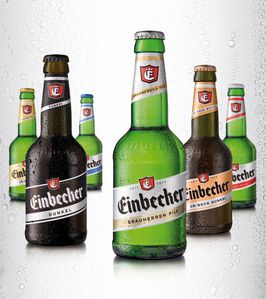
The Einbecker brewerys Brauherren Pils bottle has a unique shape, but the same is not true for the label as many premium beers look like this. In contrast, the Bockbeer labels are bright and original but with too much air of tradition and hints of yesteryear. All the products needed to be revised, so as to be recognizable as the premium product range of the brewery. The point of reference here was the Bocks look, although that also needed to be reworked to become more modern and fresh, whilst still retaining its cool superiority. From stuffy tradition to masterful supremacy.
Client / ManufacturerDesign