

Feeling 18
Corporate Design
Feeling 18
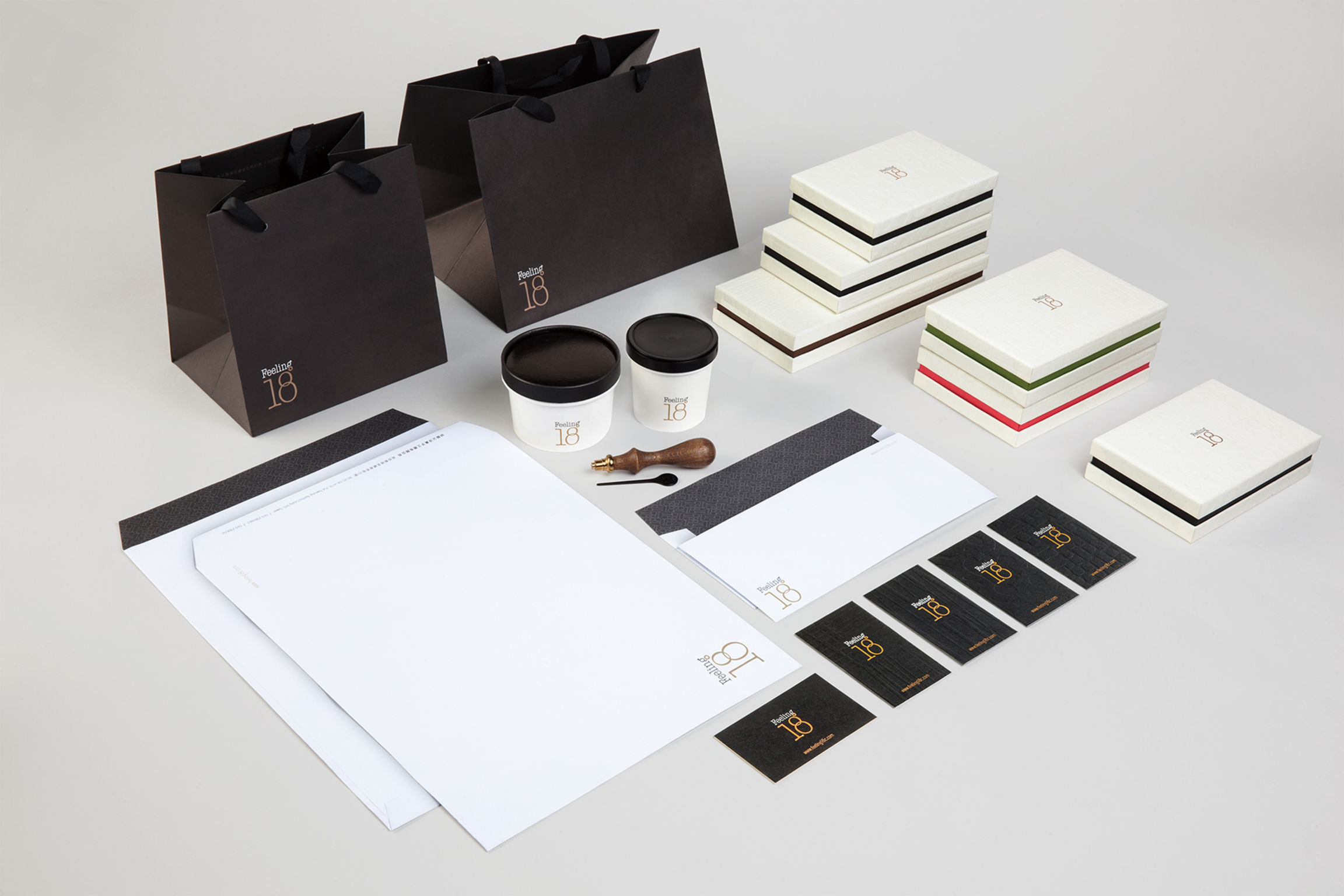
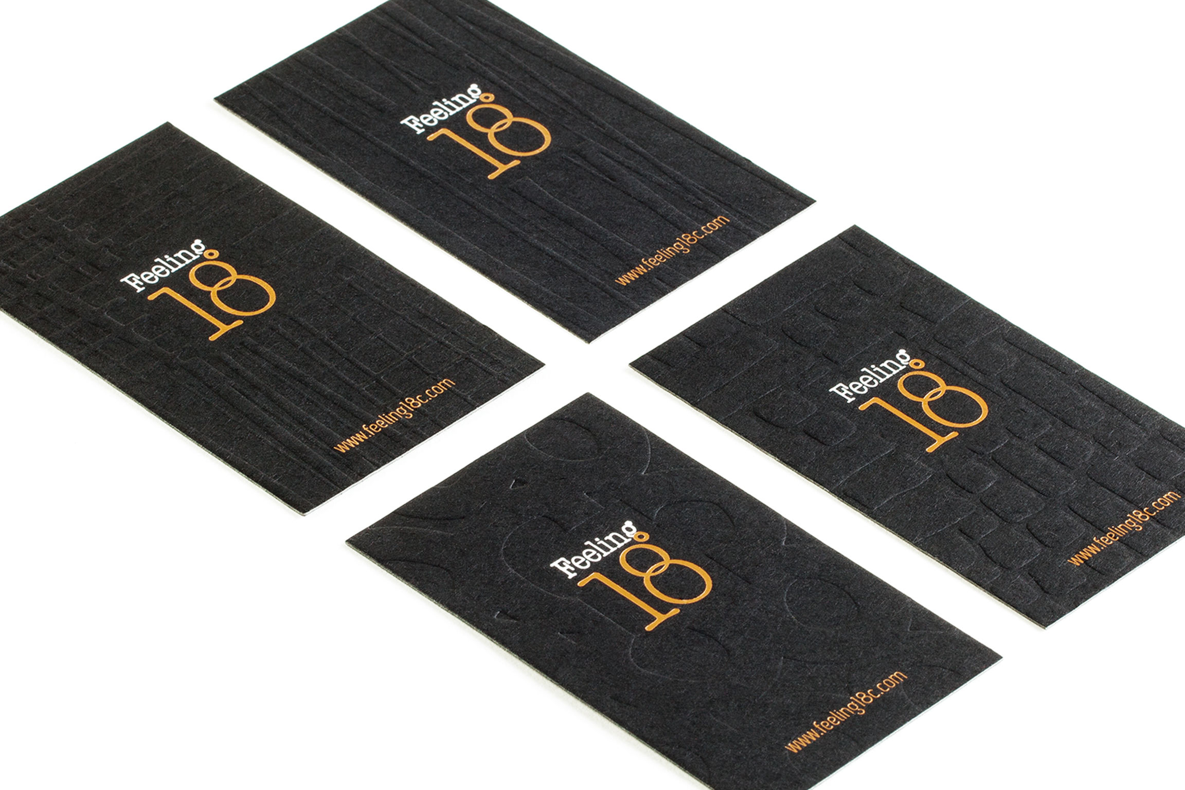
Chocolate at 18 °C releases the finest aroma and taste. Feeling 18, an artisanal chocolate brand that delivers products of premium quality, connects people through love and joy. The logo is comprised of “g” and “°”skillfully woven together. Feeling 18 is delicious and recreates the youthful emotions of being 18 years old. It uses two “O”s to form the number 8 symbolizing a link between two people. Other visual elements include the different shapes of chocolate as well as the numbers 1 and 8. Black color gives the brand an elegant feeling, while gold highlights the brand’s premium image.
Client / ManufacturerDesign