finalart design
Corporate design
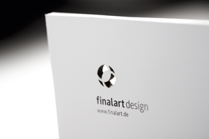
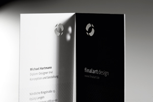
Derived from the human eye, the finalart logo shows a three-dimensional lens which can be seen in two different ways: opened to the bottom, it symbolizes our reference to the clients background and, opened to the top, our reference to the clients individual purposes and needs. The corporate design only uses black and white to be focused and concise. However, because of the cut out logo different backgrounds integrate different colors and structures within the corporate design to visualize our diversity. As a result, clients and friends play with our stationery and try out a variety of surfaces and positions to create exciting combinations.
Client / Manufacturer Design