

Großmann Architekt
Corporate Design
Michael Großmann Architekt
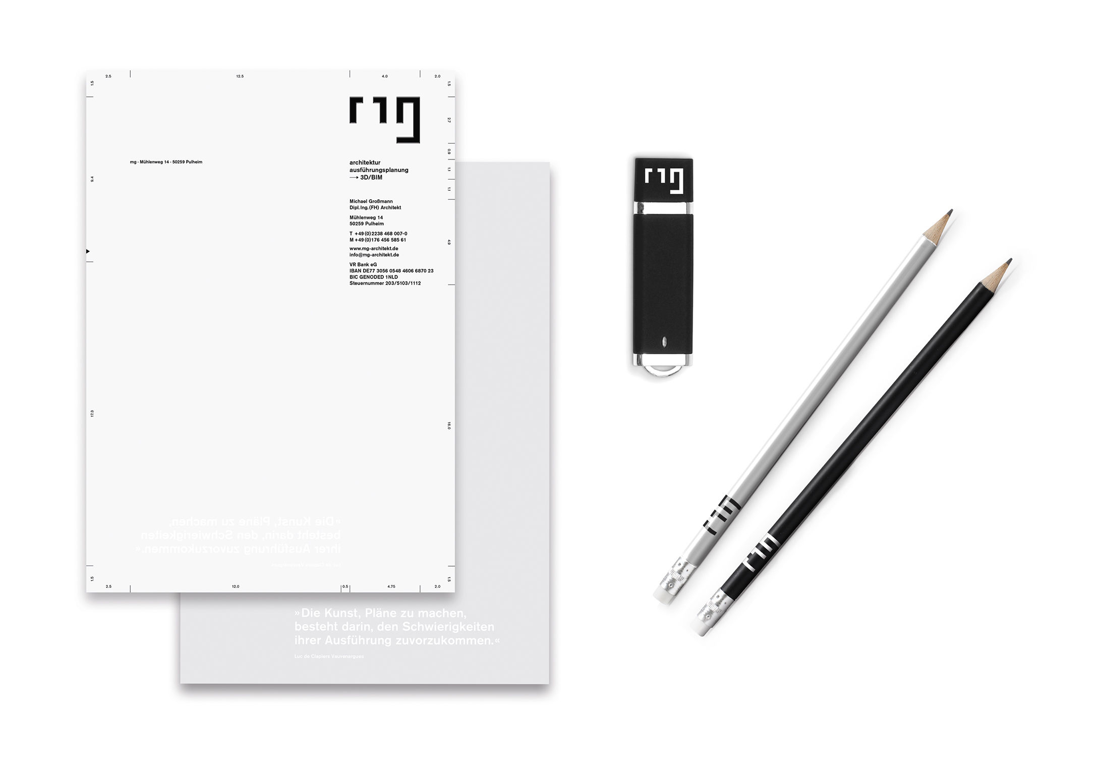
The corporate design of the architect Michael Großmann communicates professionalism and competence, while the logo consisting of the initials "mg" has the appearance of a ground plan. Further elements of a construction plan – such as lines, hatchings, measurements and typographical elements – visualize the architectural context. The sole color used in the reduced corporate design is black. High and deep embossing of the logo creates a 3D effect that not only refers to the 3D technique used but furthermore stands for the architectural theme.
Client / ManufacturerDesign
Michael Großmann Architekt
Pulheim, DE
Lockstoff Design GmbH
Grevenbroich, DEDate of Launch
2015
Development Time
up to 12 months
Target Regions
Europe
Target Groups
Public Sector / Government, "Architekten/Baufirmen"