


Gyeonggi1000 font
Typography and branding
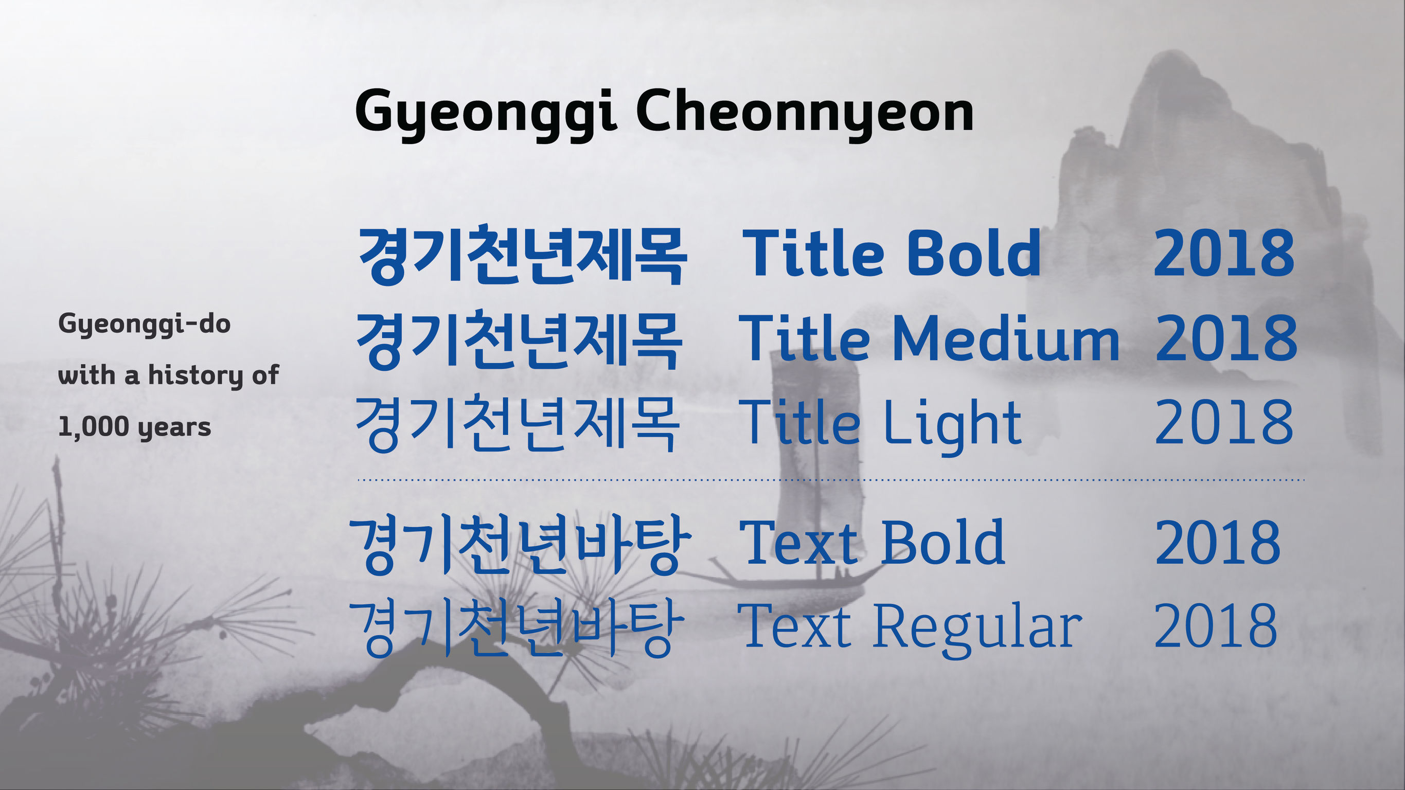
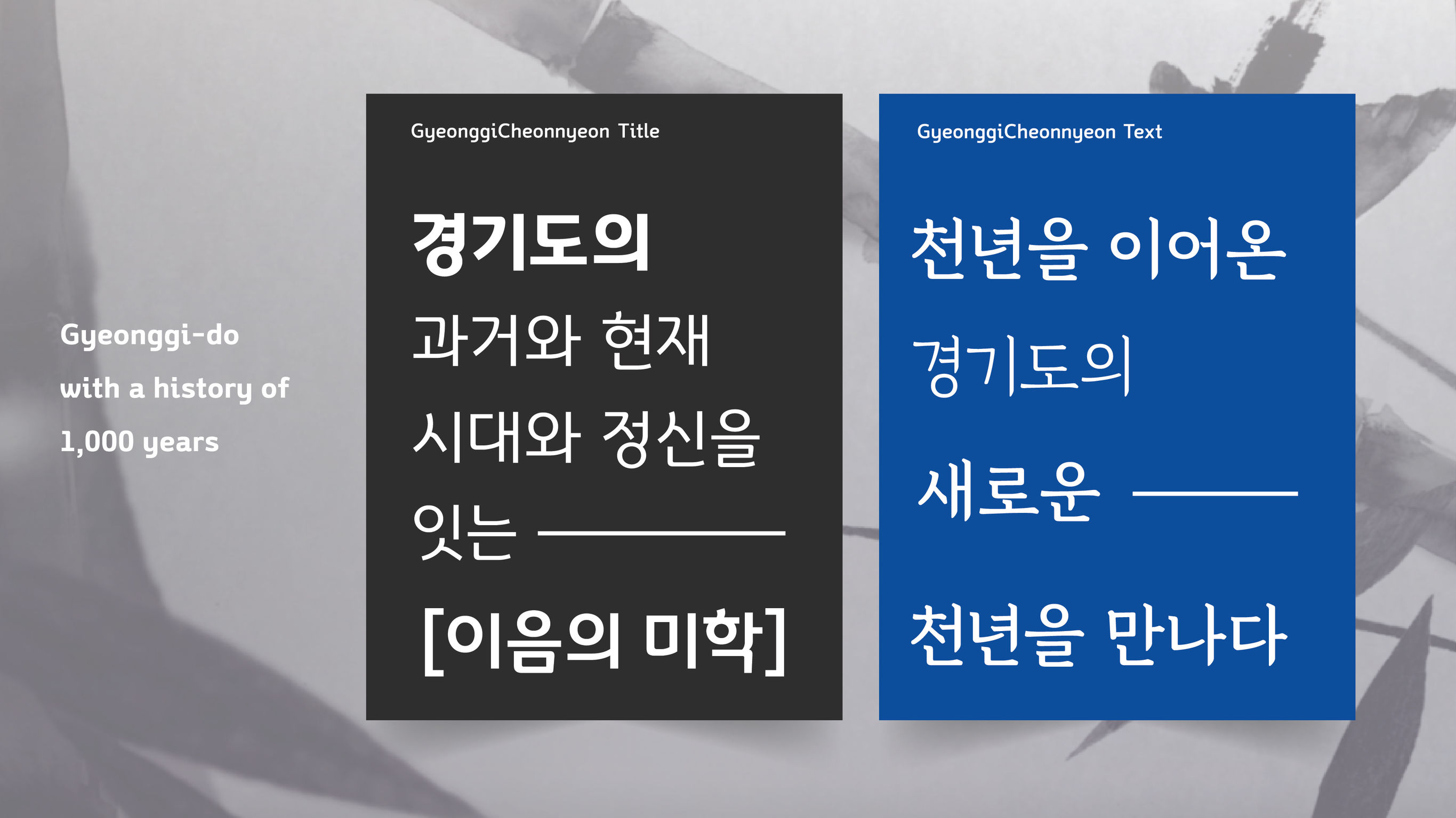
To underline Gyeonggido's status as Korea’s most populous province and to expand its identity, the local government created a unique font for marketing purposes: Gyeonggi1000font. The concept behind the font is the word, ‘E-um’. ‘E-um’ occurs at the start of the word Gyeonggido, so it embodies the 1,000-year history of Gyeonggido (The name Gyeonggi was first recorded in 1018 during the Hyunjong Era). ‘E-um’ also represents the joining of the Korean peninsula geopolitically and the resilient strengths of its inhabitants. Gyeonggi1000font not only represents the past 1,000 years, but also what’s to come for the next 1,000. The font includes six styles to accommodate various uses.
Client / ManufacturerDesign
GyeongGi Provincial Government
Suwon-City, KRPYJ & Typography Laboratory
Seoul, KRDate of Launch
2017
Development Time
up to 12 months
Target Regions
Asia, Specific country/region: Republic of Korea
Target Groups
Consumer / User, Public Sector / Government, Specific sub-group: Any citizen of the Republic of Korea