

H wie Heitlinger
Corporate design
Weingut Heitlinger GmbH
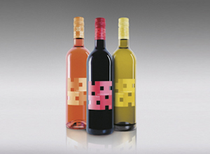
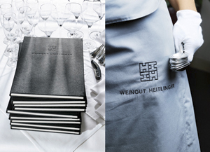
Viniculture between creation and tradition: thats winemaking by Heitlinger. The H as in Heitlinger is the basis for the logo and the design of the bottle labels hence becoming the branding of creative, stylish and artistic viniculture. It embodies the courage to do something new without forgetting the own roots. This spirit can be found throughout the entire brand communication of the vineyard and the restaurant that is part of it (e.g. on the website www.weingut-heitlinger.de).
Client / ManufacturerDesign