

hans otto theater potsdam
Corporate Design
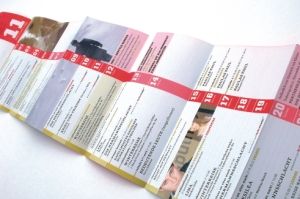
Motion, changing perspectives and confusion – these are the three main concepts underlying the latest corporate design for season 2004/2005 of Hans Otto Theater Potsdam. Motion is visualised by the variability of the logotype. The word “theatre” is divided in different ways: each medium serves as a stage with the logotype exiting to the right and entering on the left. Double exposure of the images unites two perspectives and is synonymic with actor-audience interaction. The typographic concept interferes the reading process by making use of unusual divisions. This leads to an increase in attention. These three concepts combined with the striking corporate colour, six contrasting colours and a uniform grid system offer a wide range of variation. And at the same time allow for a high degree of recognition.