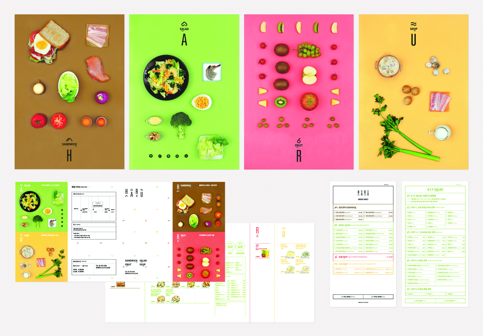
Cookies and the protection of your data

We use cookies to improve the functionality of the website, to offer you a better website experience and to provide social media features. You give your consent by clicking on “Accept all Cookies” or as part of your individual settings. Please find detailed information on the use of cookies on this website in our Data Privacy Statement.

Functional Cookies

These cookies are necessary for the operation of the site and enable security-relevant functions. In addition, we determine whether you want to remain logged in and to make our services available to you when you change between this and other websites.

Statistical Cookies

These cookies are used for analyzing user behavior on our website with the aim of improving user navigation. All data collected is evaluated anonymously. Further information is available on our data protection site.

Marketing Cookies

These cookies are used to deliver relevant advertising or to limit how many times you see an ad. Marketing cookies can share that information with the advertiser (third-party cookies). The legal basis for the data processing is the consent of the user.

HARU
HARU
HARU
HARU
HARU
HARU
HARU
HARU
HARU
HARU
HARU
HARU
HARU
HARU
2014

Share:

HARU

Brand identity design

ordinarypeople

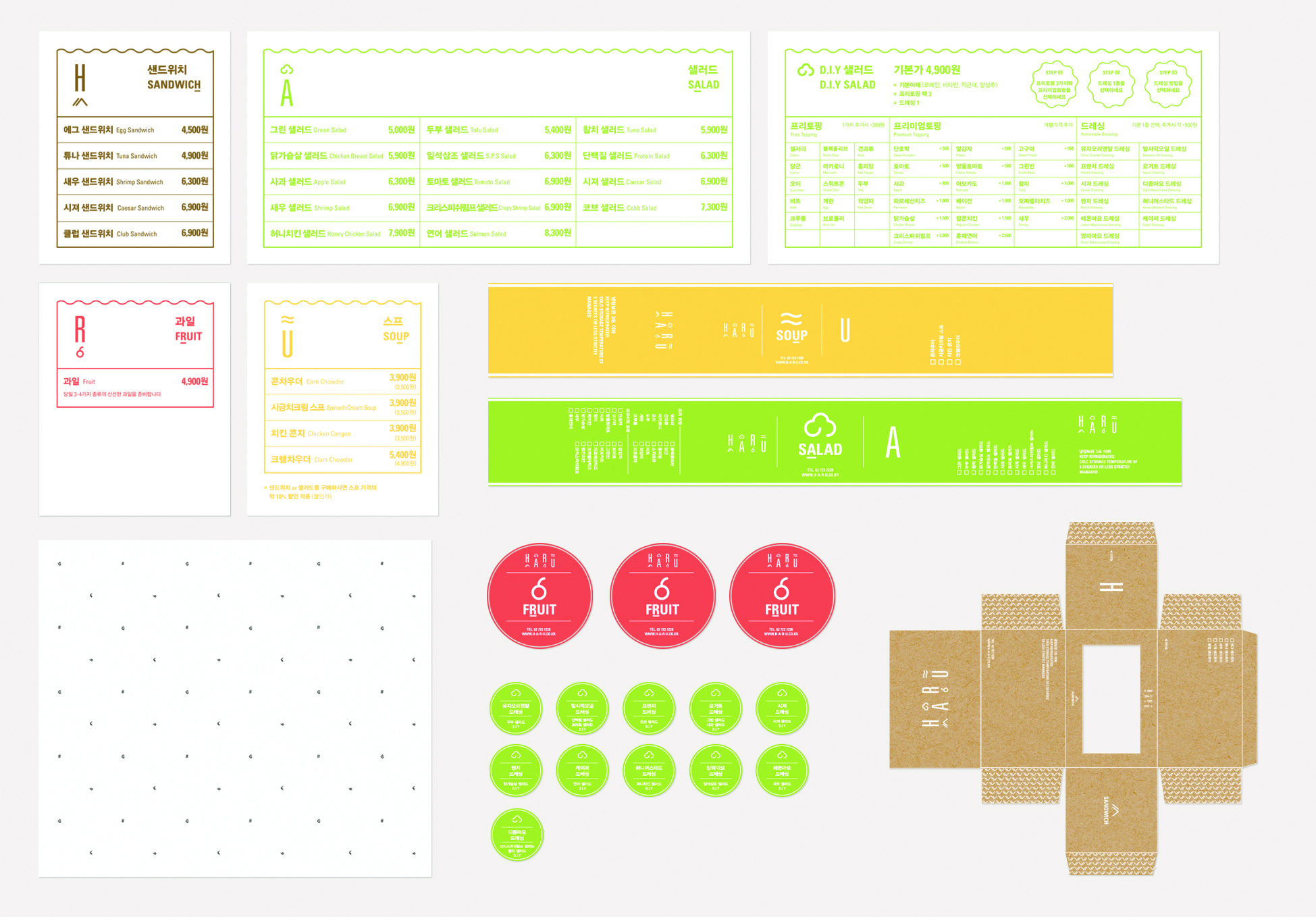
Brand identity design project for a franchise brand, HARU: sandwich, salad, fruit and soup – each gave one letter to form the brand’s name, HARU. The brand aims to provide a nutritionally balanced and healthy meal every day for busy workingmen. Each menu item could be one part of a meal, or it could simply be the meal itself. We felt that this particular aspect should play a role in developing the brand identity. With this in mind, we took the approach that a brand identity is not just a uniform symbol, but a combination of elements. Repeatedly, these elements were pulled apart and reassembled on various printed matter and packaging.

RELATED PROJECTS