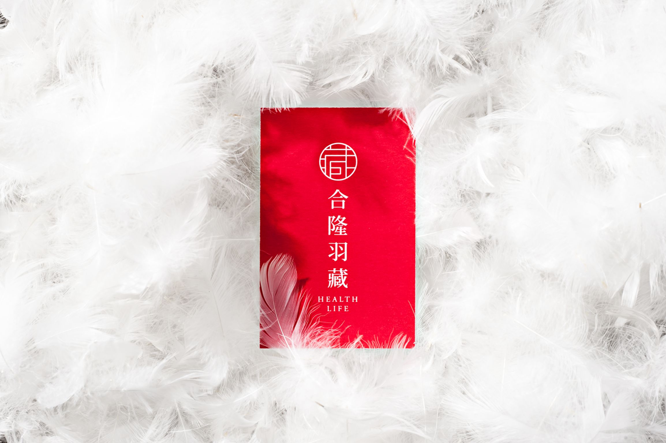


Health Life Brand Design
Bedding
Hop Lion Feather Works Corp.
Health Life developed their logo from the Chinese word “treasure” based on the concept of "Miniature Curio Cabinets" (from the Chinese Qing Dynasty cabinet), signifying that high-quality products should be stored carefully. Furthermore, traditional Taiwanese and Oriental styles were manifested in the font style that draws on paper-cut window decorations. Employing the elegant and quiet traits of oriental women, the Health Life oriental brand is unique in the market.
Client / ManufacturerDesign
Hop Lion Feather Works Corp.
Taipei, TW
Process Ltd. (Taipei) Brand Design and Strategy
Taipei, TWDate of Launch
2016
Development Time
up to 12 months
Target Regions
Asia
Target Groups
Consumer / User, Trade / Industry