Cookies and the protection of your data

We use cookies to improve the functionality of the website, to offer you a better website experience and to provide social media features. You give your consent by clicking on “Accept all Cookies” or as part of your individual settings. Please find detailed information on the use of cookies on this website in our Data Privacy Statement.

Functional Cookies

These cookies are necessary for the operation of the site and enable security-relevant functions. In addition, we determine whether you want to remain logged in and to make our services available to you when you change between this and other websites.

Statistical Cookies

These cookies are used for analyzing user behavior on our website with the aim of improving user navigation. All data collected is evaluated anonymously. Further information is available on our data protection site.

Marketing Cookies

These cookies are used to deliver relevant advertising or to limit how many times you see an ad. Marketing cookies can share that information with the advertiser (third-party cookies). The legal basis for the data processing is the consent of the user.

Het Klooster
Het Klooster
Het Klooster
Het Klooster
2008

Share:

Het Klooster

Visual identity

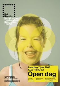
The new corporate identity is based on experiencing cultural moments. Yellow was chosen as the basic colour because it symbolises theatre lighting - the spotlight which shines on both student and artist. The adapted formal language refers to ancient church windows, emphasising the character of the old convent building. Various compositions consisting of circles with a stained-glass look were designed. These circle compositions are used for various applications in the corporate identity, creating a sacred, creative, spiritual and inspiring feeling.

Client / Manufacturer

Het Klooster

Woerden, NL
Design
Fabrique Communications and Design

Fabrique Communications and Design

Delft, NL

RELATED PROJECTS