

Holsten Relaunch
Label design
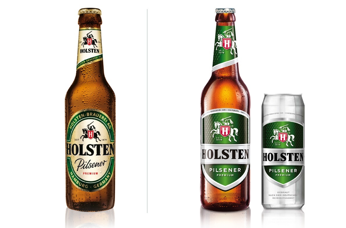
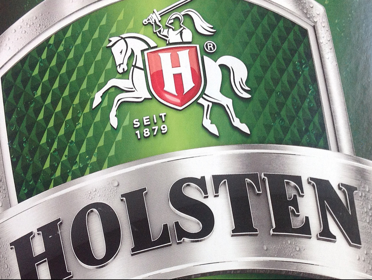
Carlsberg Deutschland Markengesellschaft mbHUp-to-date, younger, even more fresh. The shield as the one-of-a-kind property of the new design is found on all products, at the center of it all the knight with an impressive performance, clear and precise carbon-structure serves as label backdrop. To sum it up: the new Holsten design is unique, differentiating, premium and very, very self-confident. Furthermore, the new Holsten label design is the trigger and hub for the new copy strategy “Ecken. Kanten. Holsten.” You can’t translate a state of mind, but to make it comprehensible: “Rough. Edgy. Holsten.”
JURY STATEMENT Design
Packaging Design - selected by Dr. Alexander Schubert A true relaunch: clear, recognizable and also successful in the marketplace.
Client / Manufacturer