

Huatu
Brand identity
Huatu Training Co., Ltd.
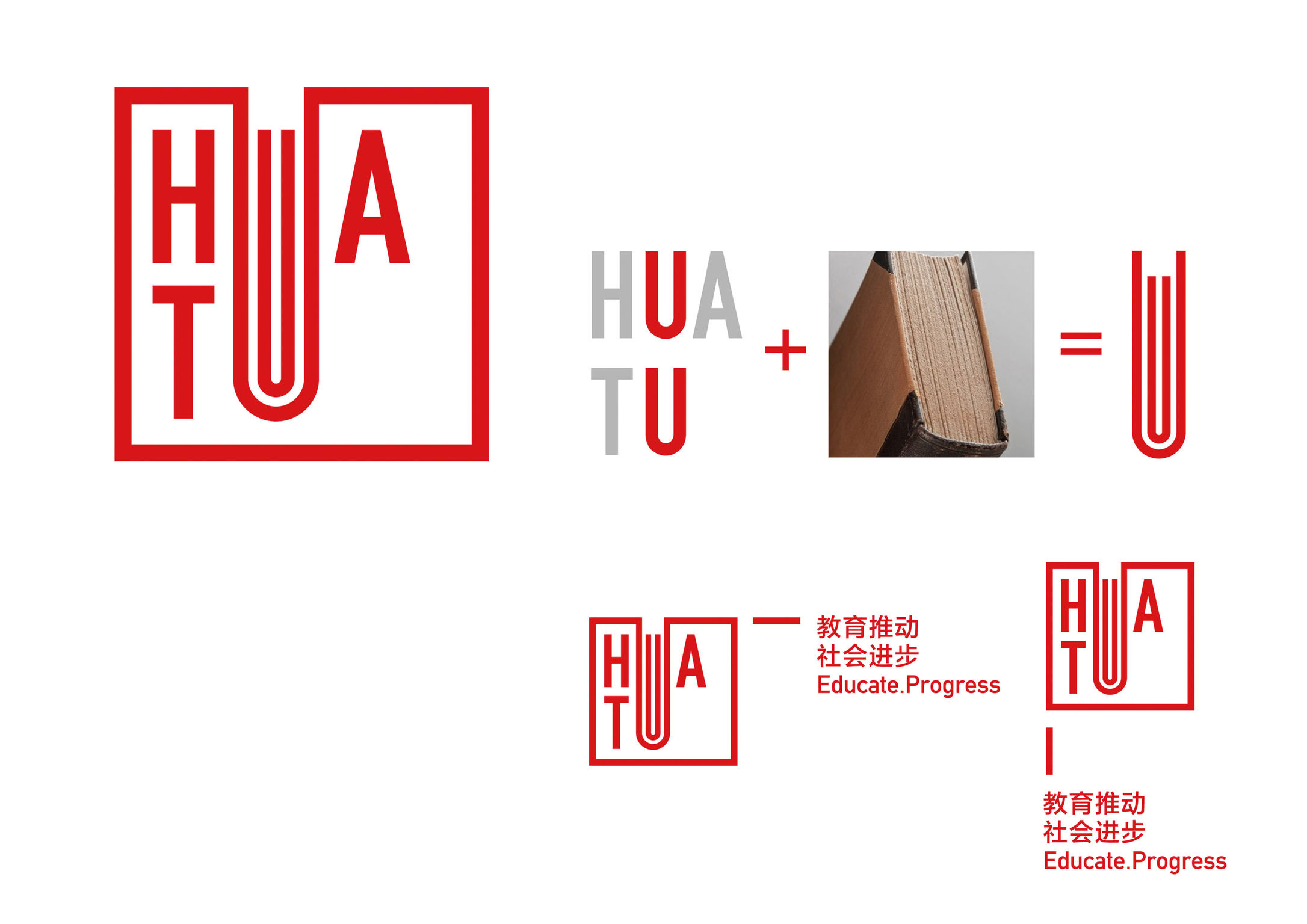
Huatu Training is an education brand in China. The striking simplicity of the logo mark makes it easy to remember. The two overlapping words, “Hua” and “Tu”, highlight their common denominator, namely the letter “u”. Amplifying this letter interestingly resembles a book (the essence of the business). To further stress the attributes of the industry, we applied the shape of a Chinese thread-bound book in the visual application, reflecting a strong sense of Chinese culture and form.
Client / ManufacturerDesign
Huatu Training Co., Ltd.
Beijing, CN