

HUNTER'S MOON
Visual Identity design
Nonghyup Moguchon Inc.
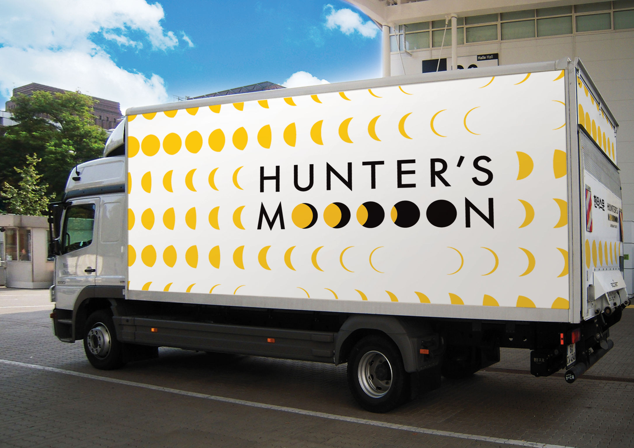
HUNTER'S MOON is meat-menu oriented casual dining pub brand. HUNTER'S MOON claim to be a hideout of the citizen, attend to seek a new vitality and taste away from the monotony of everyday life. HUNTER'S MOON's design directly visualize the symbolism that will be delivered under the name. It expressed the image of the moon to change daily from the crescent moon until the full moon. It provides a distinctiveness of a place to enjoy the evening in the moon motif. In order to emphasize moon motif, minimal and modern typeface is used. Contrasting colors black and yellow is used to provide a concept of night and light.
Date of Launch
2014
Development Time
"6 months"
Target Regions
"South Korea"
Target Groups
Consumer / User