Hwa Ae Rak & Hong Cheon Ung
Health food branding
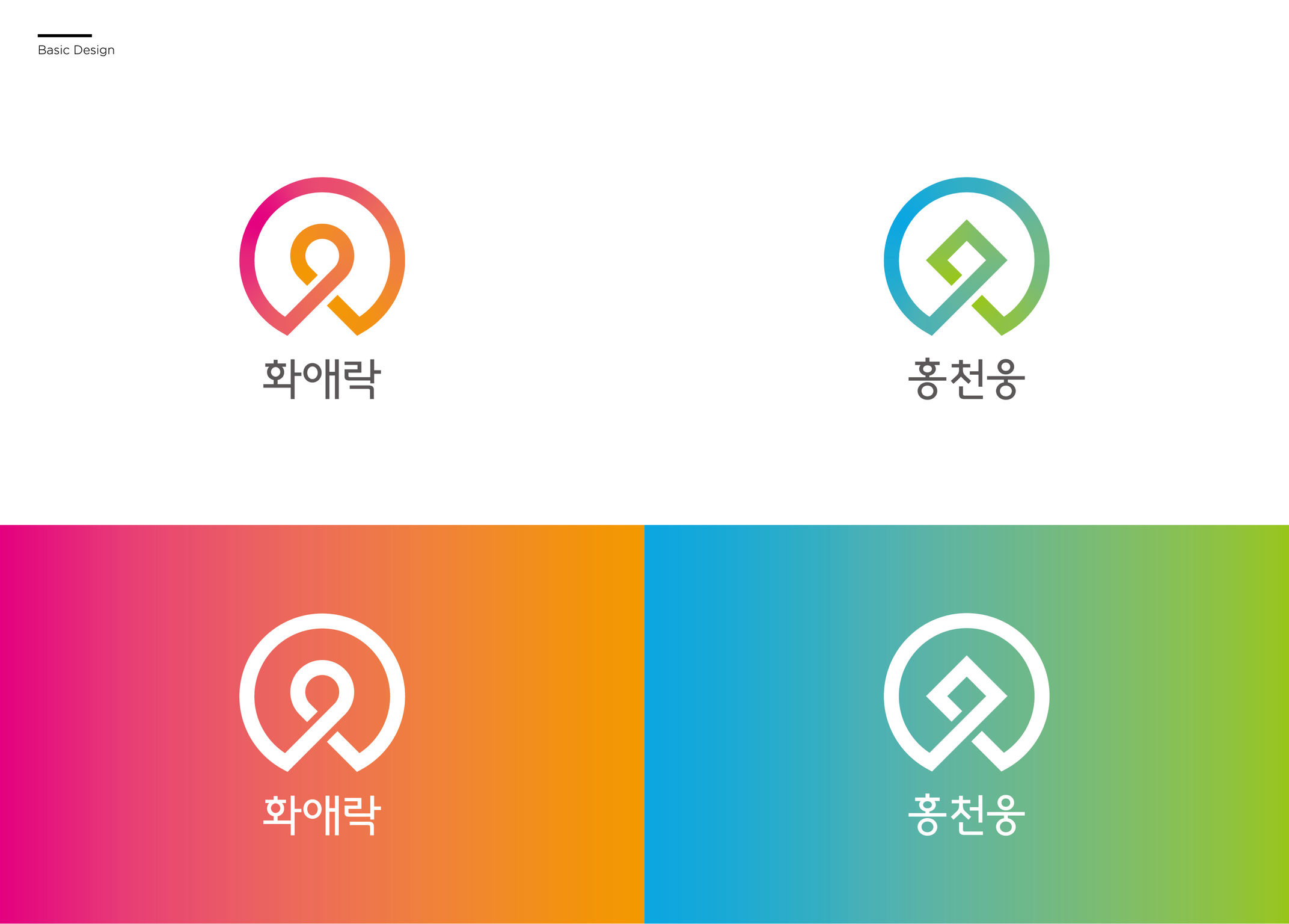
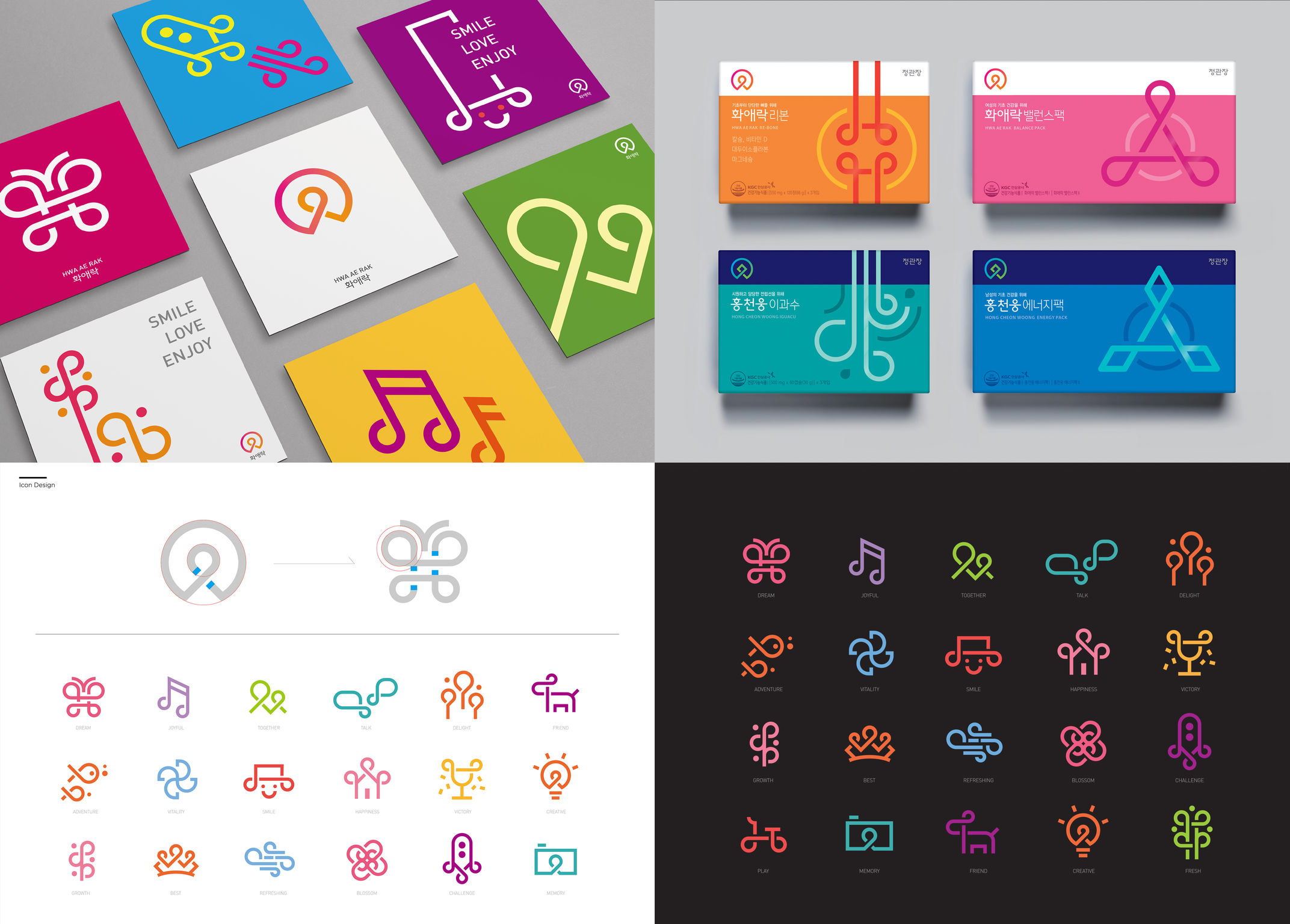
The brand identities for the women's brand Hwa Ae Rak and the men's brand Hong Cheon Ung were designed together to complement each other. Today, we no longer think of middle age as a time of aging, but as the "golden age," the most beautiful time in life, where people are closer to reaching their dreams and goals. The new brand logos represent the discovery of a person's golden age, casting the individual as the heroine or hero. While the two logos' outer shapes are identical, their centers diverge: a flower petal is the middle point of the Hwa Ae Rak logo while the Hong Cheon Ung logo uses a diamond. The gradient colors represent the ever-changing and transforming power of happiness and success.
Client / Manufacturer Design
Korea Ginseng Corporation
Seoul, KRallcommunications
Seoul, KRKOREA GINSENG CORPORATION KGC Design Division
Seoul, KRDate of Launch
2017
Development Time
13 - 24 months
Target Regions
Specific country/region: Republic of Korea
Target Groups
Consumer / User