HwaHae
Brand Identity design
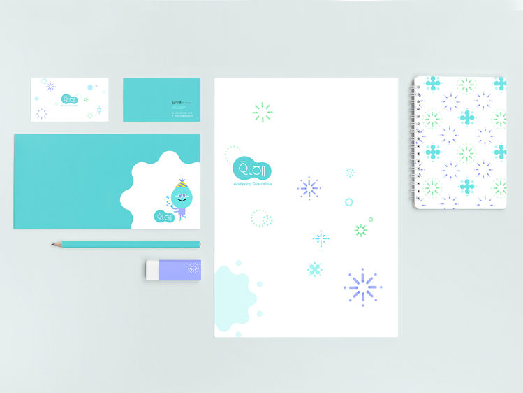
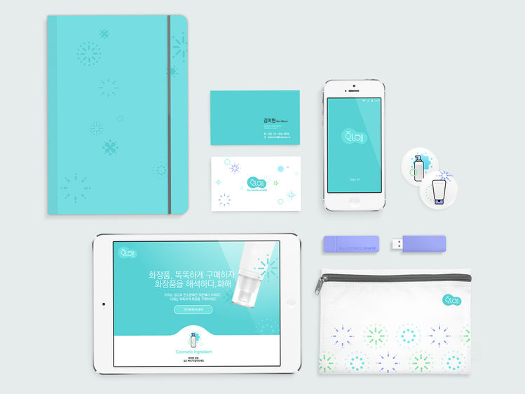
The brand identity of the HwaHae has been designed with clear mint color and water drop shape to match our brand values. The application pursues healthy beauty, and therefore encourages people to choose the right product by checking every ingredient in cosmetics. Logotype presents formative characteristics of Hangul, a Korean alphabet system. It not only delivers visual delight but also intuitively reminds people of the brand name. Furthermore, we have developed round-shaped style UI and characters to express soft look and feel, which effectively delivers the sophistication and the friendliness of our app service to women in 20s and 30s, our main users.
Client / ManufacturerDesign
Birdview
Seoul, KRBirdview
Seoul, KRDate of Launch
2016
Development Time
up to 12 months
Target Regions
Asia
Target Groups
Consumer / User