IKU'S
Japanese sake
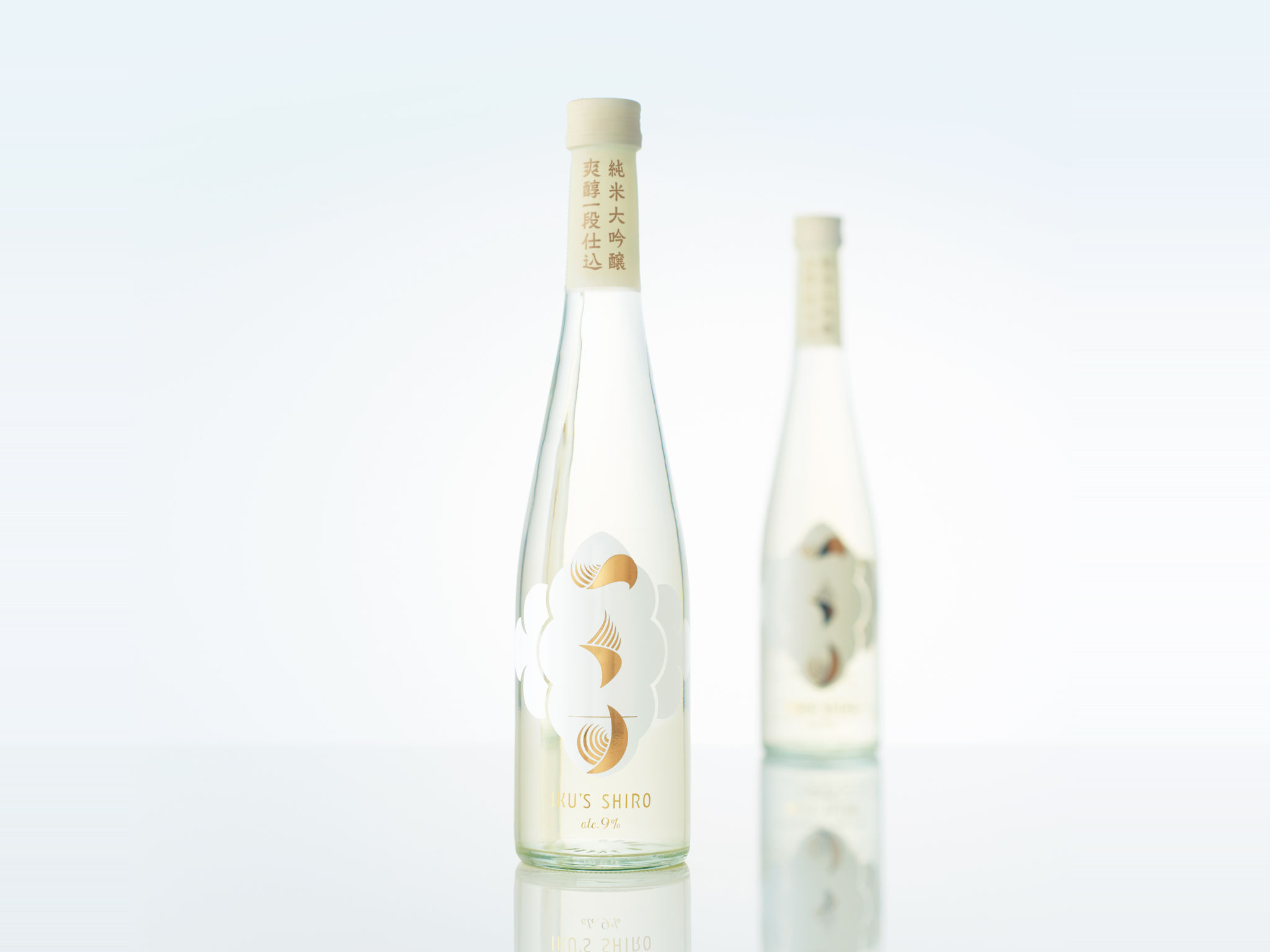
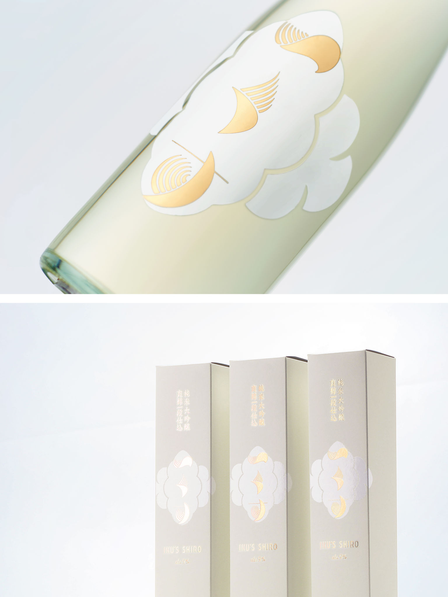
This is package design for the Japanese sake brand IKU’S. Combination with a design motif: ears of rice and clear water weaving in the wind, the logotype consists of the Japanese Hiragana characters and gives a soft impression to express the sake’s smooth texture. The logo mark takes a shape of a cloud sea, having an association with the product’s name SHIRO. This brings a soft, yet elegant mood to the design as a whole. Overall, the package represents the fresh taste and clear color of the product, and this simple design would consequently attract attention, even from sake beginners.
Client / ManufacturerDesign
Inata Honten
Yonago-shi, Tottori, JPEIGHT BRANDING DESIGN
Minato-ku, Tokyo, JPDate of Launch
2015
Development Time
13 - 24 months
Target Regions
Asia
Target Groups
Consumer / User, Trade / Industry