iti Itaú
Branding
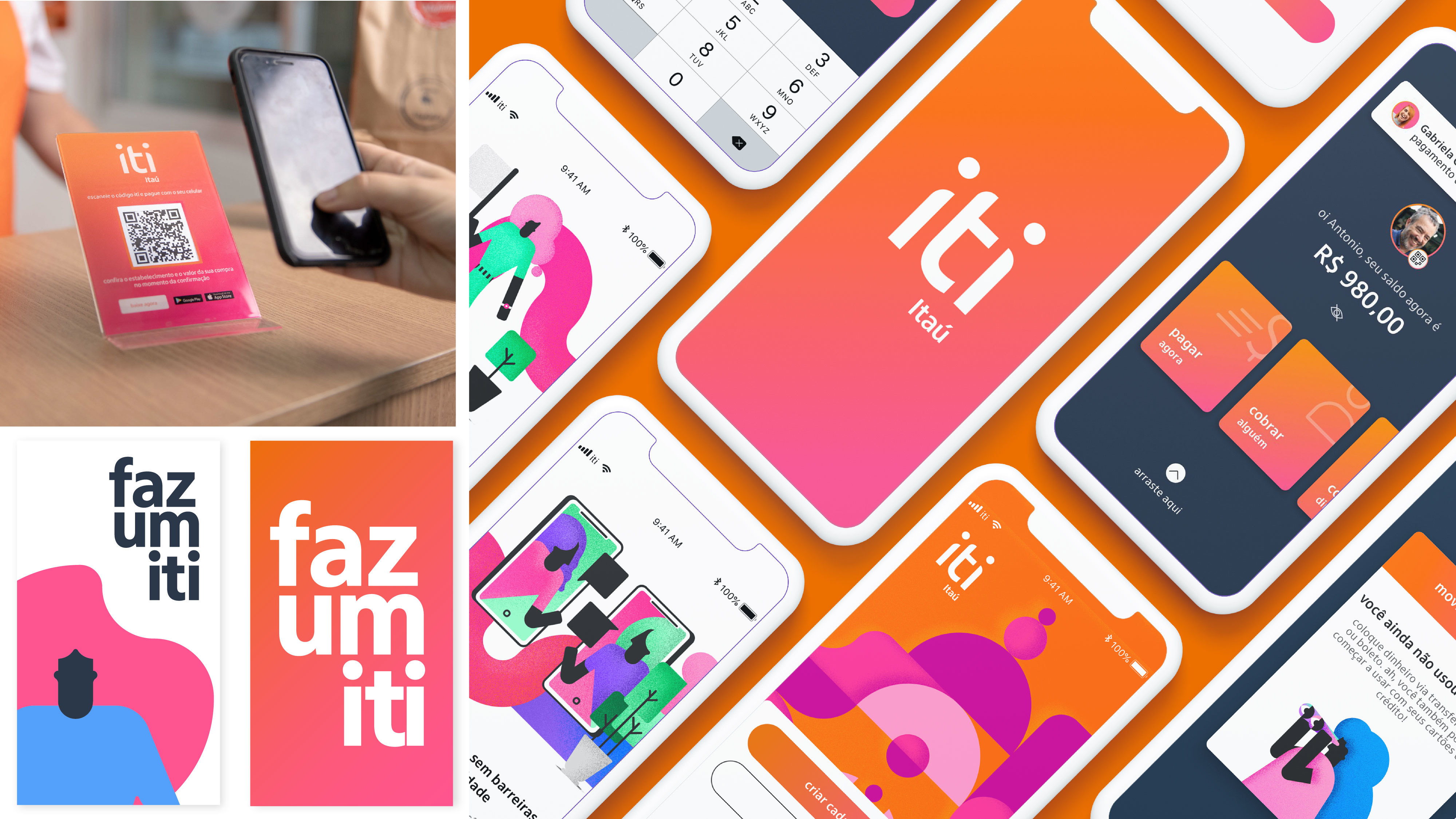
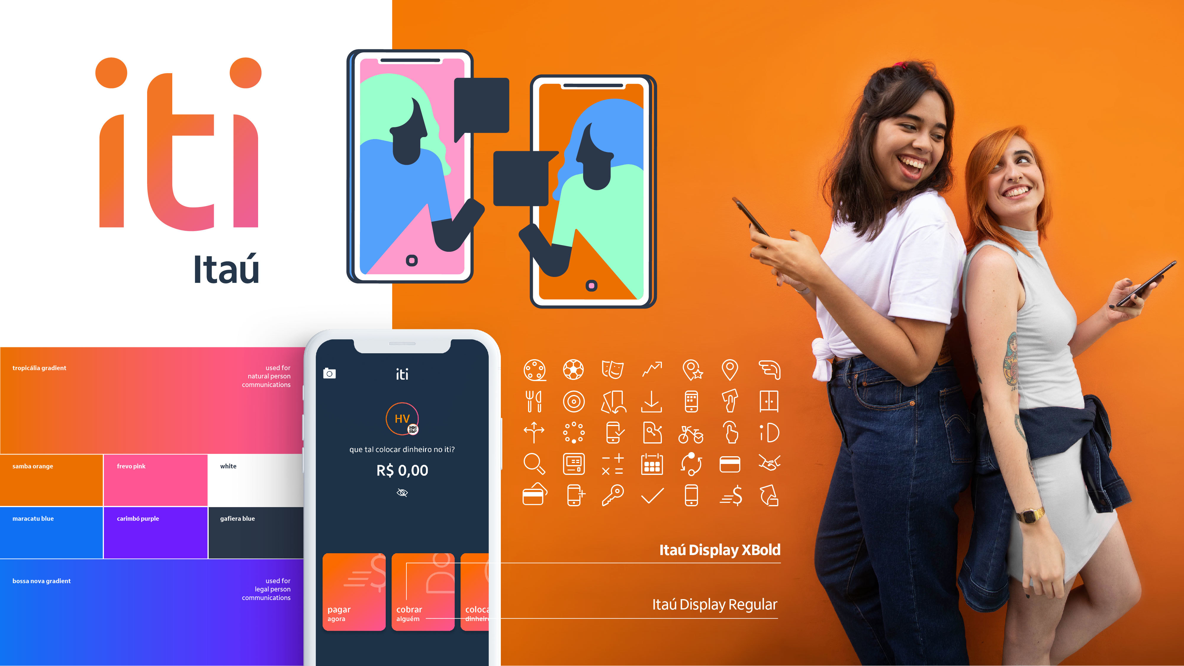
Iti has come to revolutionize the way we exchange money, products and experiences in Brazil. Based on the pillars of the brand, a typographic logo was developed which represents two people trading, with curves that bring fluidity and warmth. The chromatic palette is shaed in a gradient from orange - Itaú's proprietary color – to pink; symbolizing connection. The entire palette is accessible. The typography is the official Itaú font. It is used in lower case, to create intimacy with the user and to demonstrate its digital character. For illustration, we opted for a more didactic and inclusive style, without gender or race distinctions.
Date of Launch
2019
Development Time
up to 12 months
Target Regions
South America
Target Groups
Consumer / User, Trade / Industry