

Jakob Jung Wine label
Wine label design
Weingut Jakob Jung
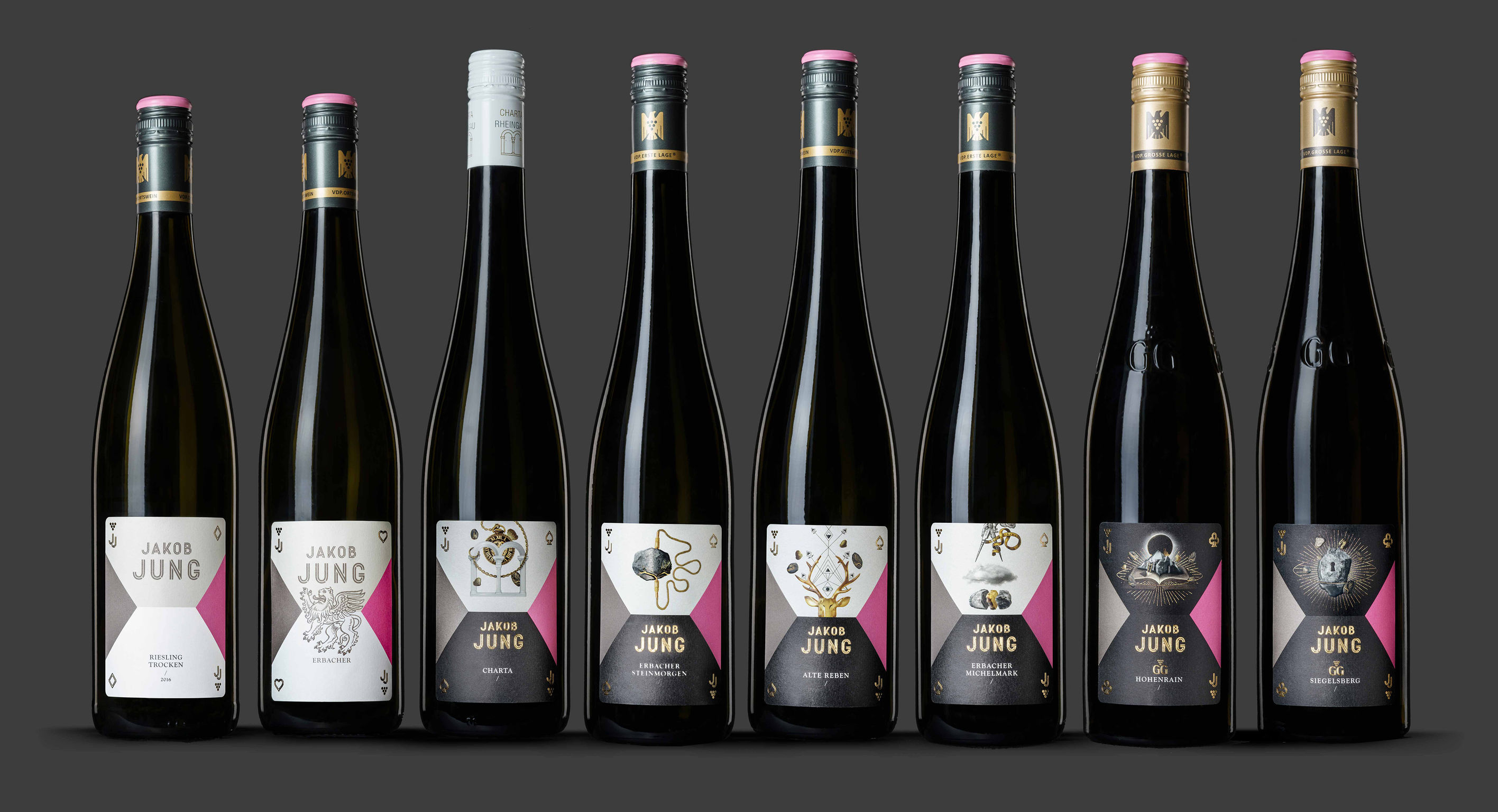
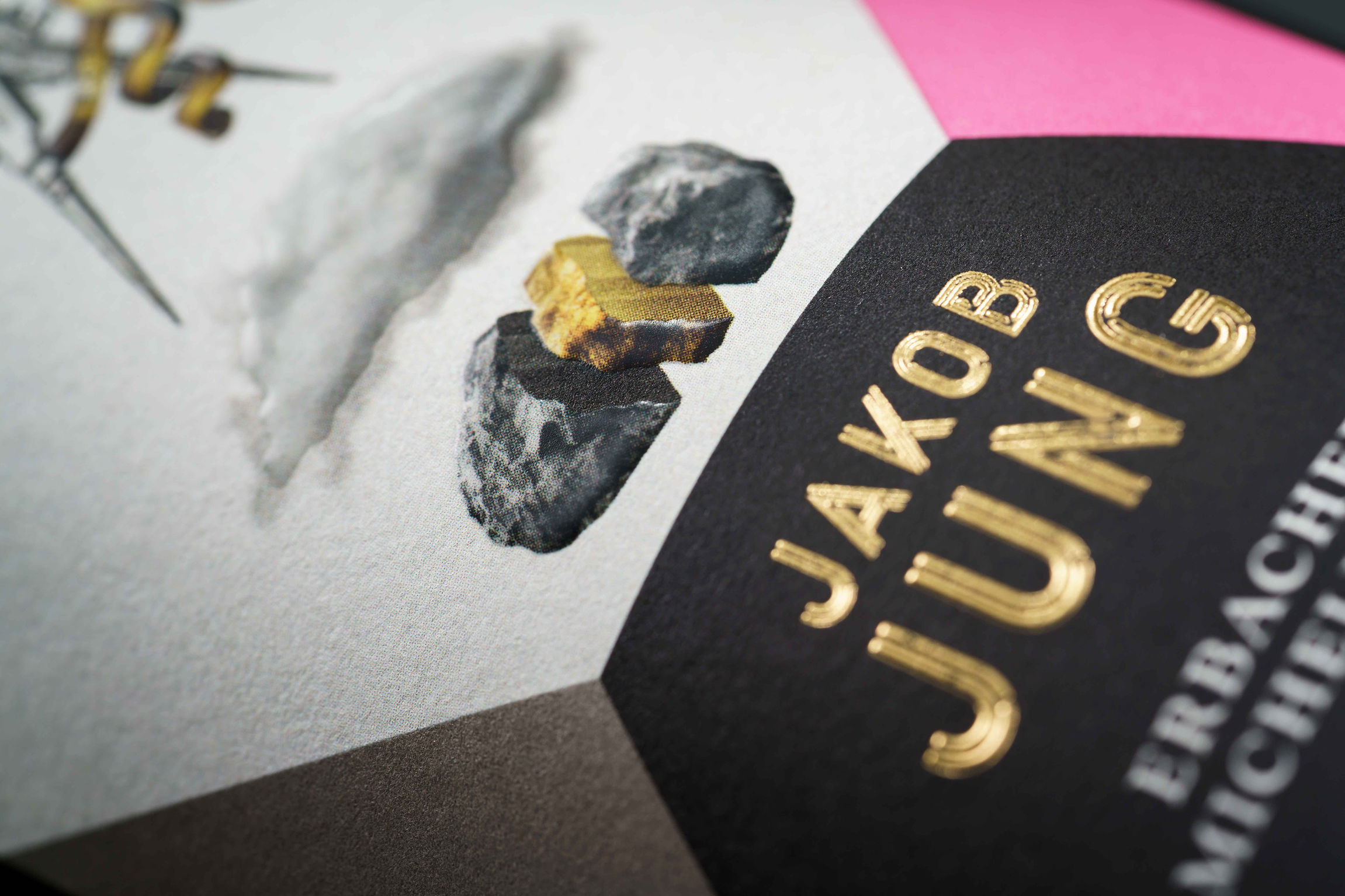
The winery needed a complete new presentation since the design turned out to be exchangeable and without any recognition value. Strong market presentation is essential in the highly competitive German and international wine market. The initials JJ inspired us and we had a brilliant idea: JAKOB JUNG is the Jack of Rheingau. And so we were right in the middle of the world of playing cards. We developed an extremely modern basic layout using the already existing CI-Colors pink and grey. White, grey and black backgrounds communicate the different quality levels of the wines.
Client / ManufacturerDesign
Weingut Jakob Jung
Erbach im Rheingau, DERuska, Martín, Associates GmbH
Berlin, DEDate of Launch
2017
Development Time
up to 12 months
Target Regions
Europe
Target Groups
Consumer / User