

Jubiläum 60 / 20
Logo
Presse- und Informationsamt der Bundesregierung
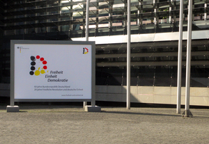
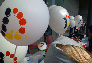
In 2009, the Federal Republic of Germany celebrated its 60th and the peaceful revolution as well as the following reunification marked their 20th anniversary. Therefore, a competition was arranged to find a logo that was as state-supporting as citizen-friendly. The winning logo by wirDesign consists of a D formed by several dots, whose colors stand for the six decades of the Federal Republic (red and yellow), the 40 years of the German division (black), and the 20th anniversary of the reunification (yellow). By the end of 2010, this logo will be used for all external communications of the Federal Government and its constitutional bodies.
Client / ManufacturerDesign
Presse- und Informationsamt der Bundesregierung
Berlin, DE