KANEBO SKINCARE ON.& IN.
Cosmetics bottles
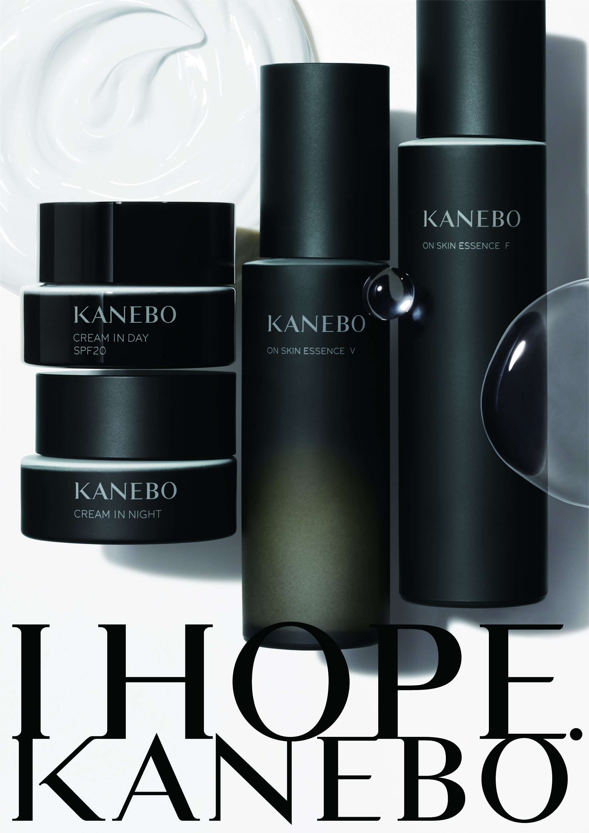
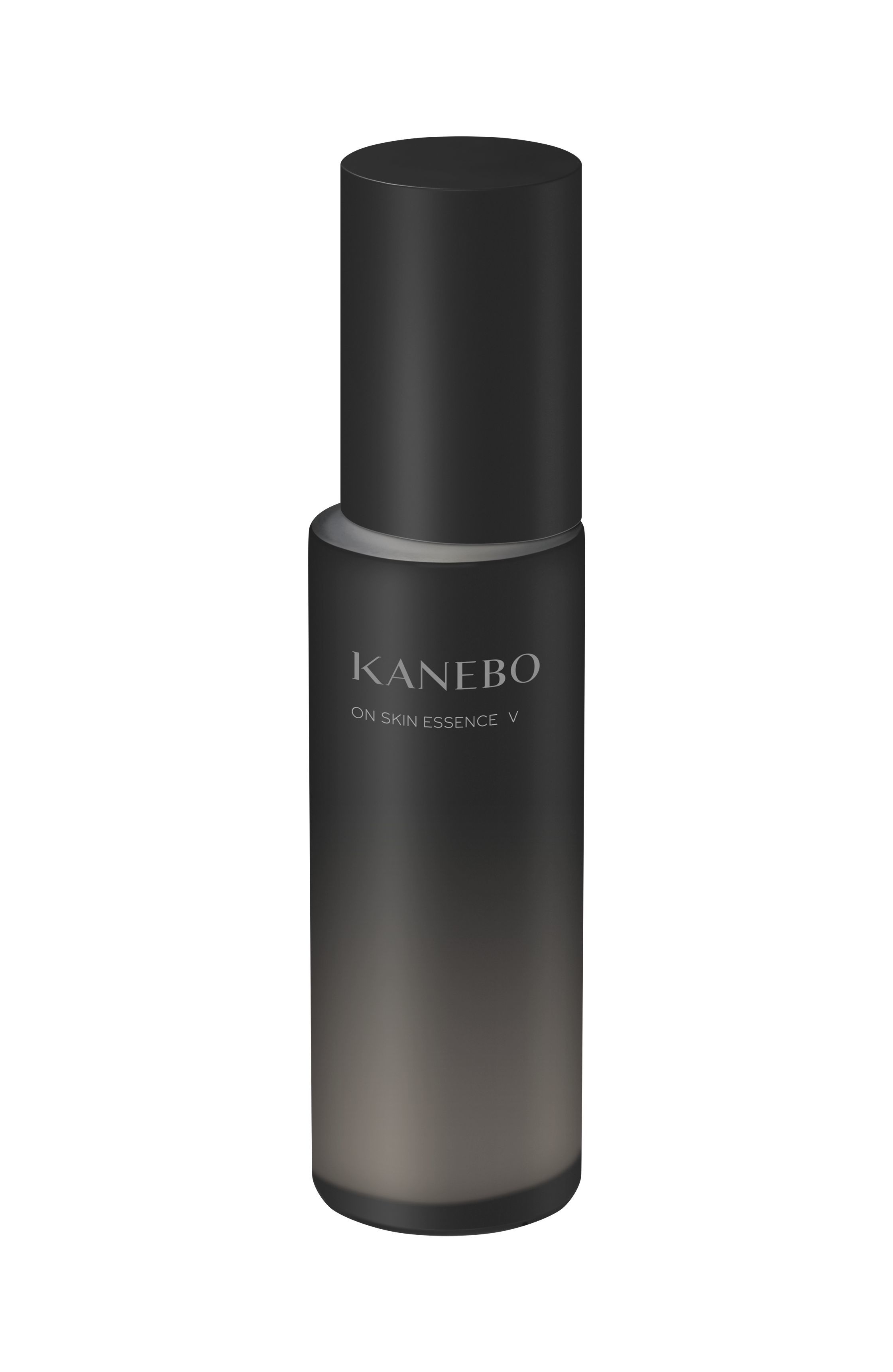
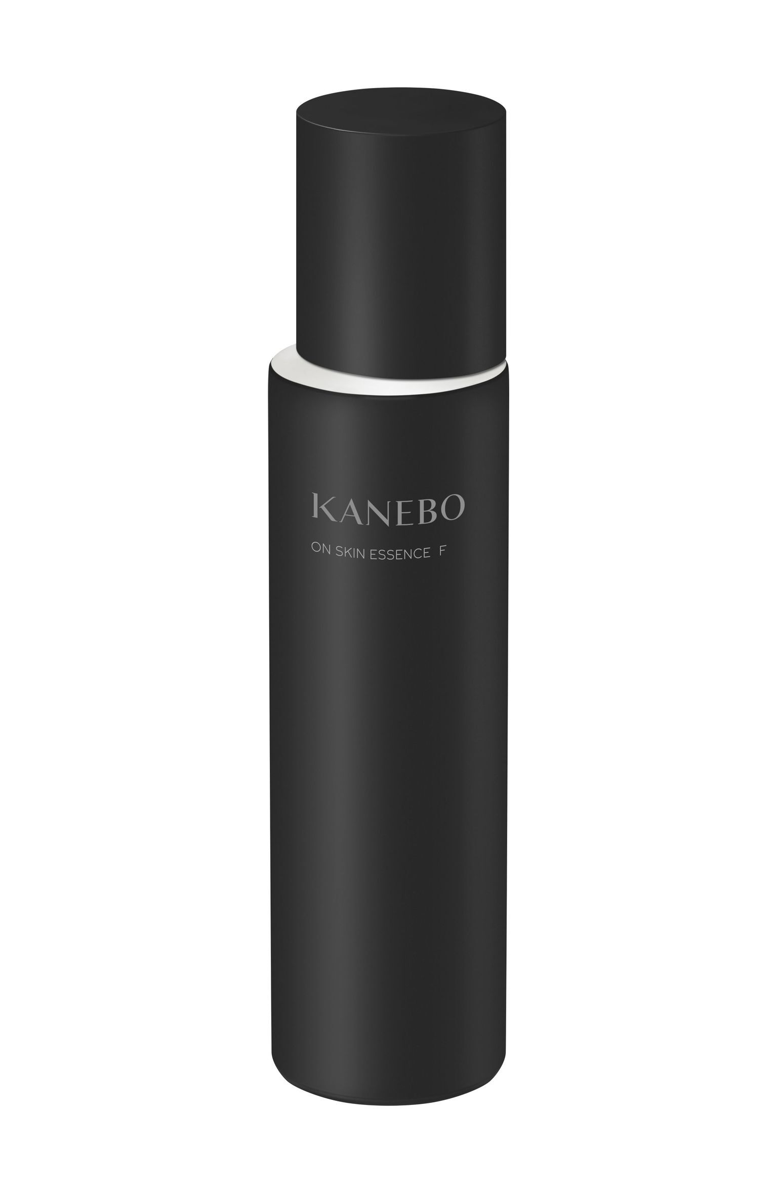
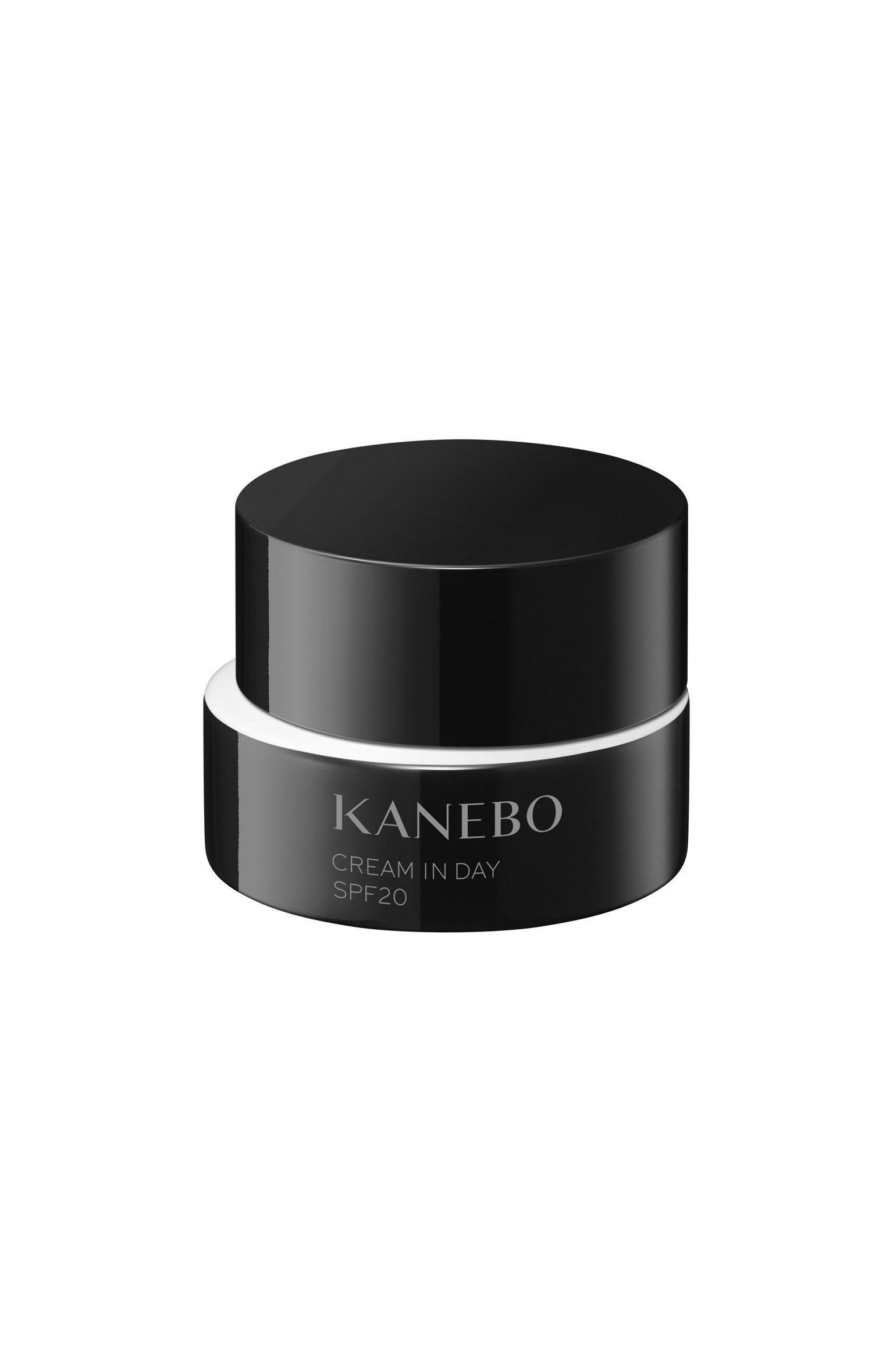
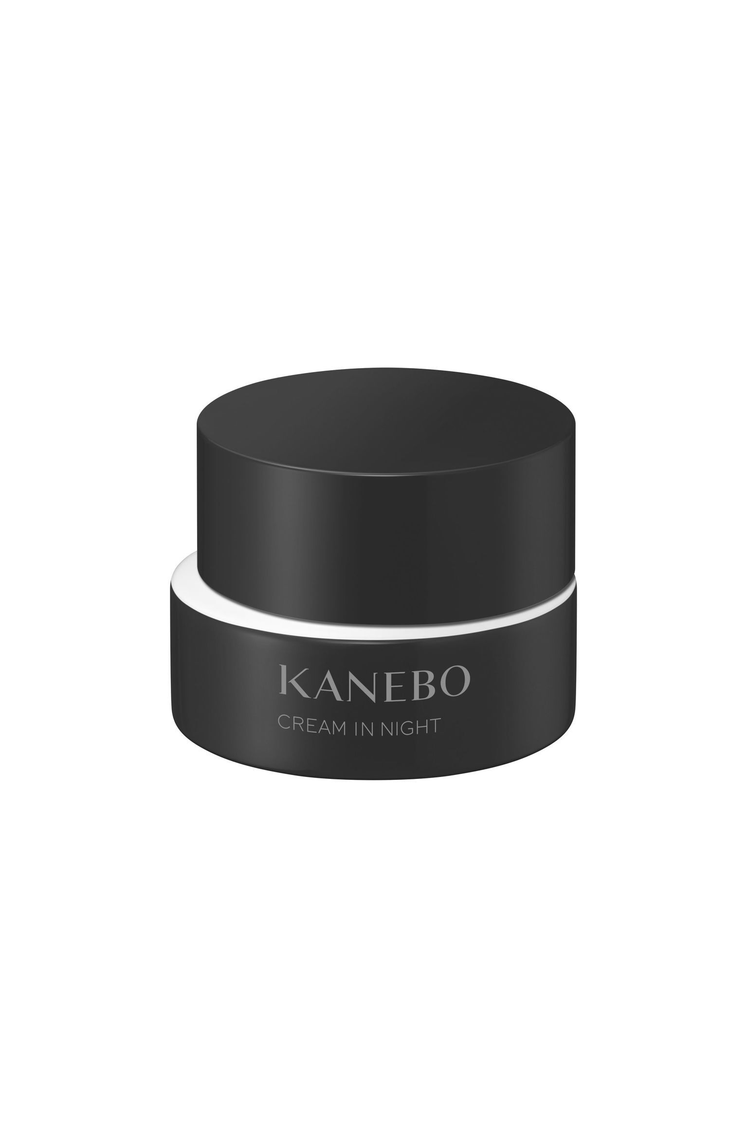
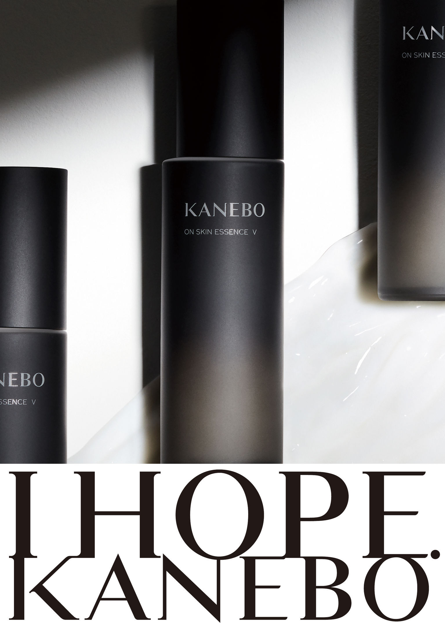
Japanese cosmetic brand KANEBO wants to communicate not just beauty but also hope. Based on the brand concept "I HOPE.", this new packaging design called "SHELL OF HOPE" features a bottle designed to represent a shell embracing hope. The packaging's carefully selected color scheme, predominantly black, expresses strength and elegance but also black's energy and vitality. Contrasting white, the color of light, is used to communicate hope. The designers intentionally chose to create asymmetric containers with an offset space between the cap and bottle or jar, the shape of which expresses a ray of hope. This iconic design and the unique shapes are also comfortable to hold and easy to use.
Date of Launch
2020
Development Time
25 - 36 months
Target Regions
Asia
Target Groups
Consumer / User