Kaywon
Promotional identity
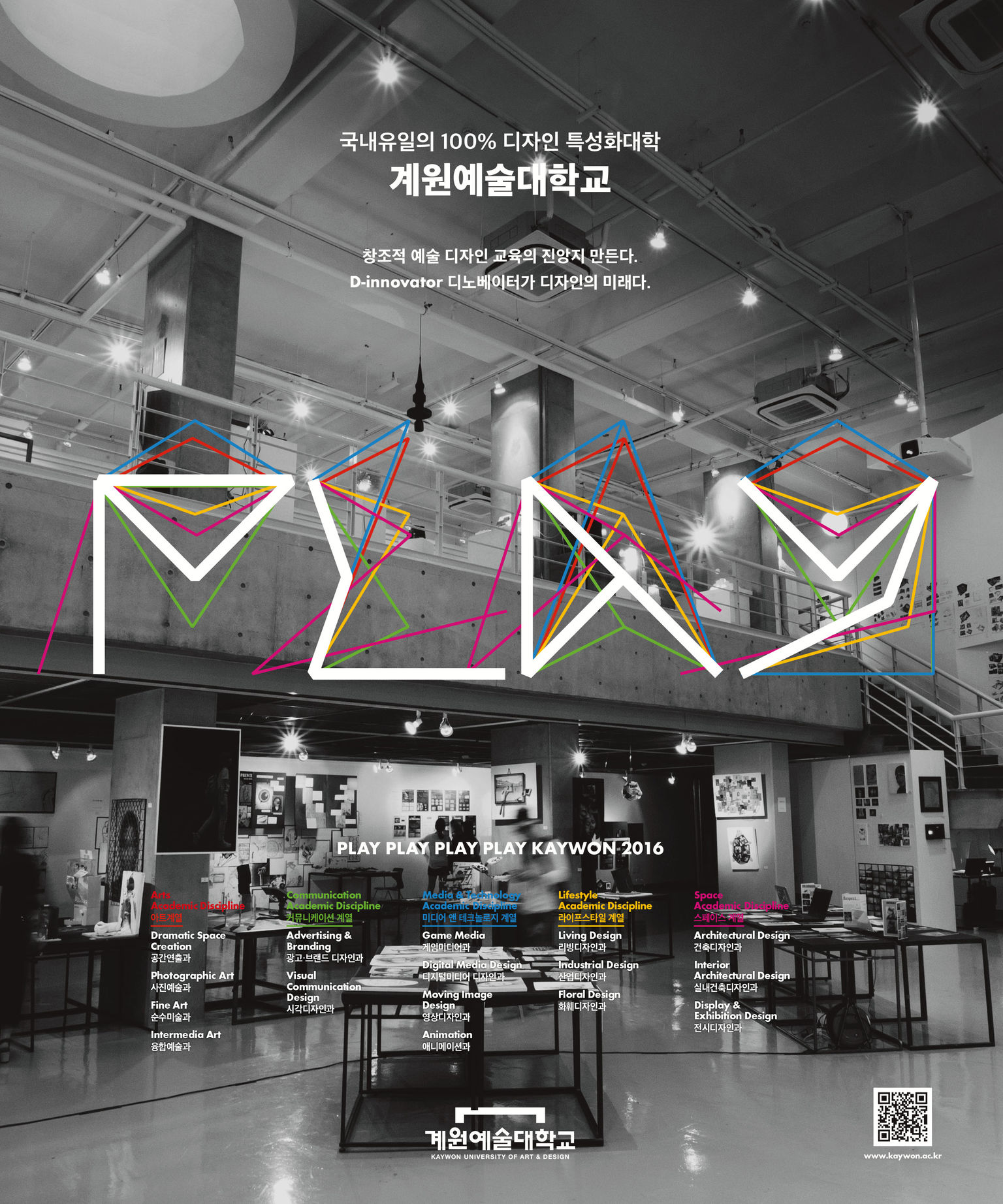
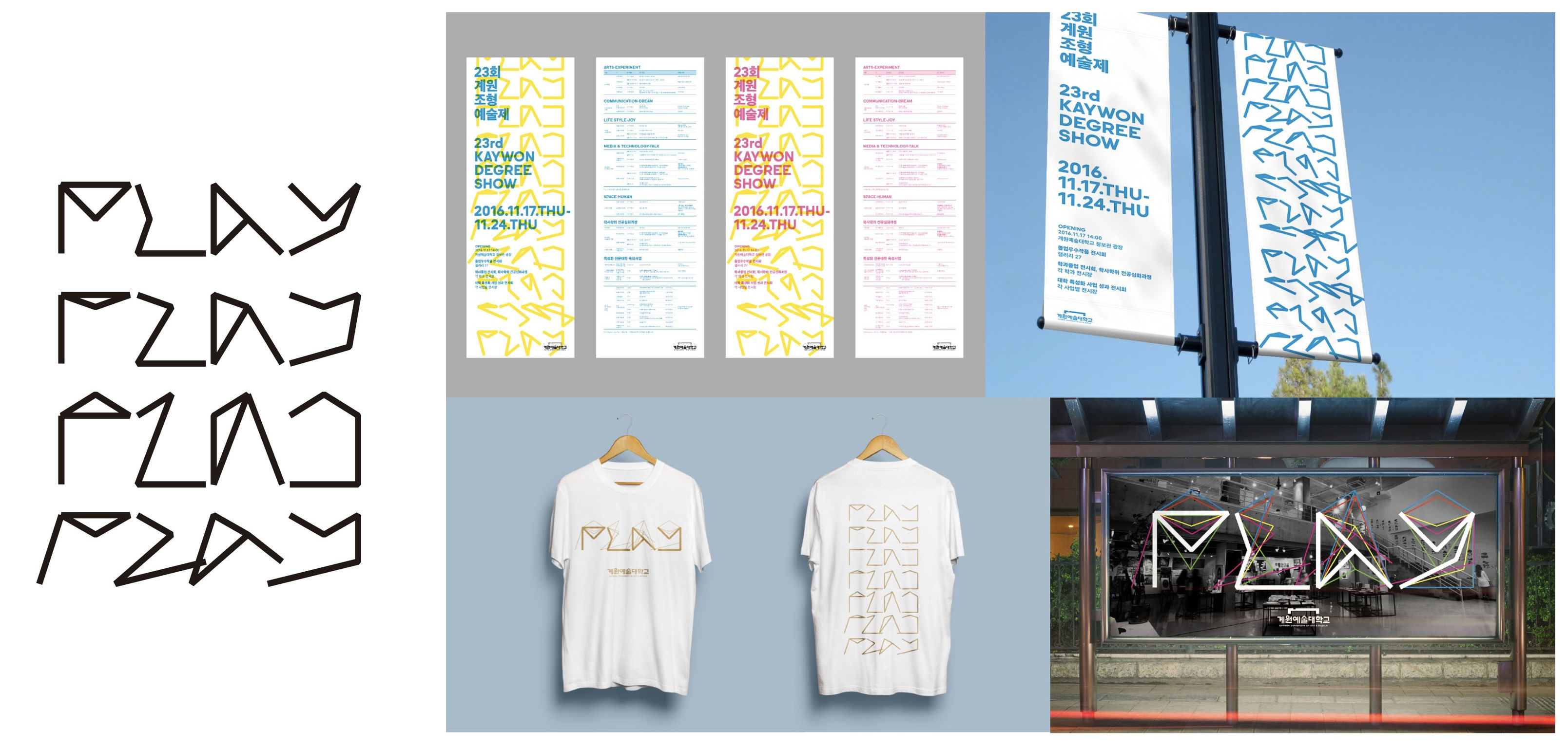
Kaywon University has based its promotional identity (PI) on the phrase “Kaywon-PLAY“ since 2013. The PI was updated to “Kaywon-PLAY 3.0“ in 2016. S/O Project developed a bespoke font style to create the word “PLAY“ with five vertexes, each representing one of Kaywon's five academic disciplines. The intention was to enhance the meaning of activeness, convergence, and expansion, and to utilize both flat and 3-D spaces. The word PLAY is expanded and converged through the four-directional movements of the five vertexes.
Client / ManufacturerDesign
Kaywon University of Art and Design
Uiwang-si, KRs / o project
Seoul, KRDate of Launch
2016
Development Time
up to 12 months
Target Regions
Asia
Target Groups
Other target groups: Art School Students / Designers / Public interested in Design Field