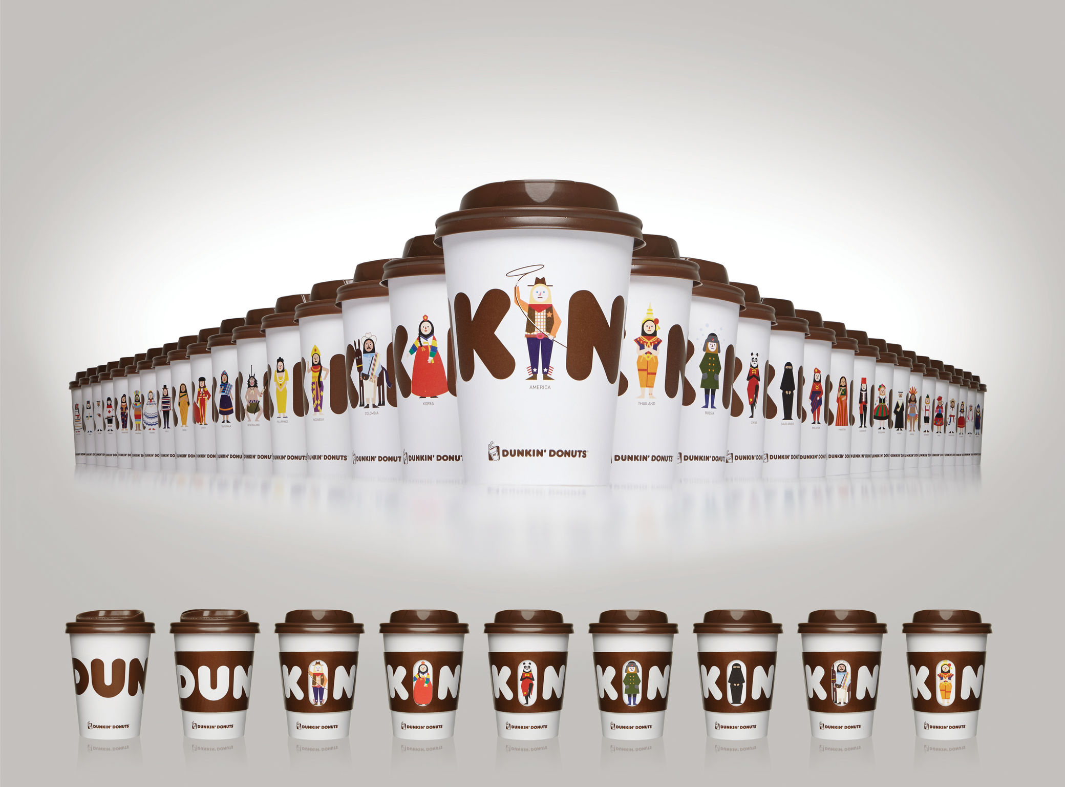
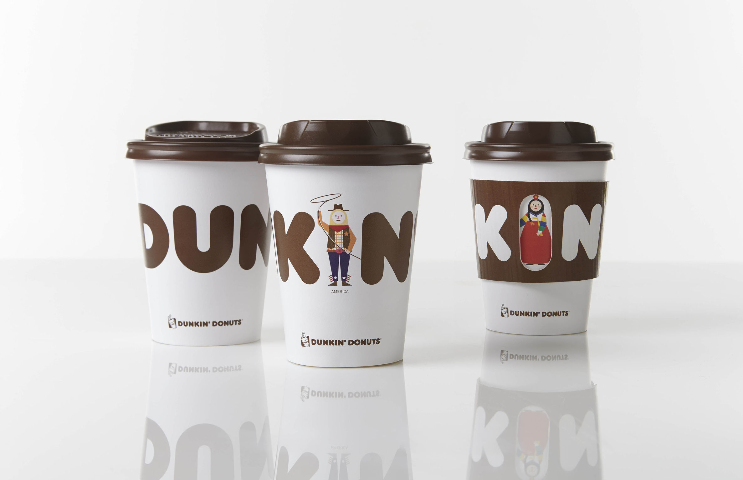
Cookies and the protection of your data

We use cookies to improve the functionality of the website, to offer you a better website experience and to provide social media features. You give your consent by clicking on “Accept all Cookies” or as part of your individual settings. Please find detailed information on the use of cookies on this website in our Data Privacy Statement.

Functional Cookies

These cookies are necessary for the operation of the site and enable security-relevant functions. In addition, we determine whether you want to remain logged in and to make our services available to you when you change between this and other websites.

Statistical Cookies

These cookies are used for analyzing user behavior on our website with the aim of improving user navigation. All data collected is evaluated anonymously. Further information is available on our data protection site.

Marketing Cookies

These cookies are used to deliver relevant advertising or to limit how many times you see an ad. Marketing cookies can share that information with the advertiser (third-party cookies). The legal basis for the data processing is the consent of the user.

KIN CUP
KIN CUP
KIN CUP
KIN CUP
2015

Share:

KIN CUP

Beverage packaging

BR Korea

The packaging design of the “Dunkin' Donut” coffee assortment comprises 34 different take-out cups. To convey that the brand is well known all over the world, the illustration-style design features a variety of characters from all countries where this coffee is sold. The highly detailed design communicates the international brand identity: the letter “I” in the name Dunkin' is replaced by a cartoon-like character with country-specific clothes and traditional accessories. The motif series triggers buying impulses and encourages customers to collect the cups.

Client / Manufacturer
BR Korea

BR Korea

Seoul, KR
Design
BR Korea

BR Korea

Seoul, KR

RELATED PROJECTS