

KinnSuann
Beverage packaging
Tanway International Trade Co., Ltd.
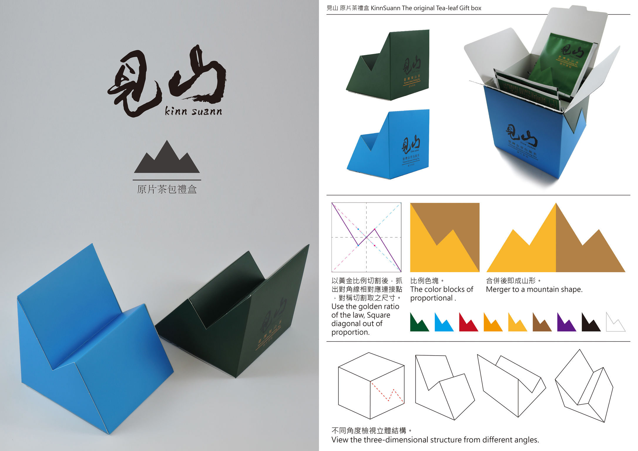
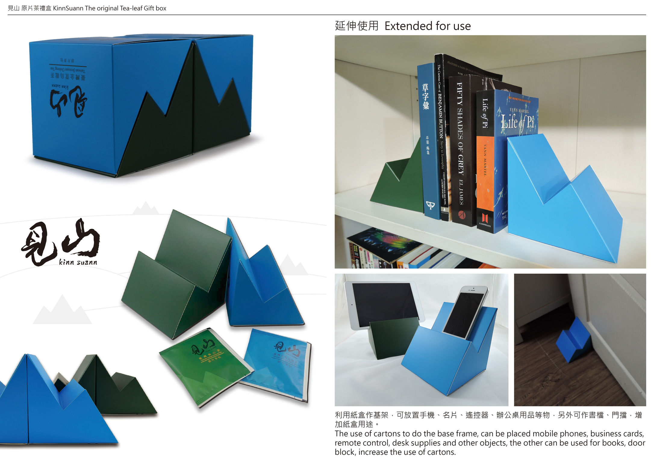
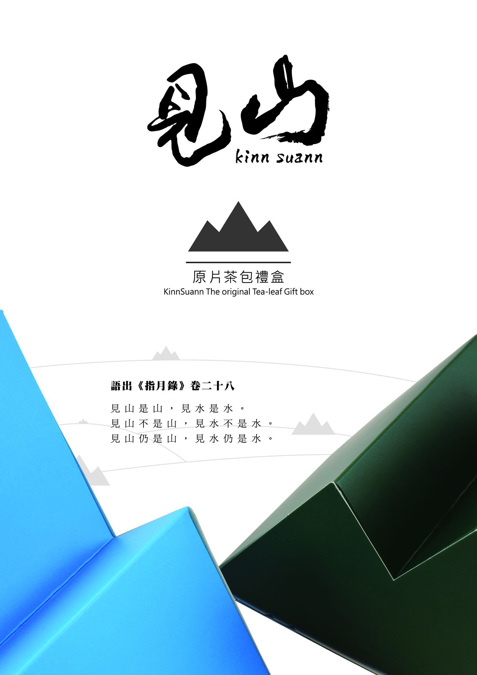
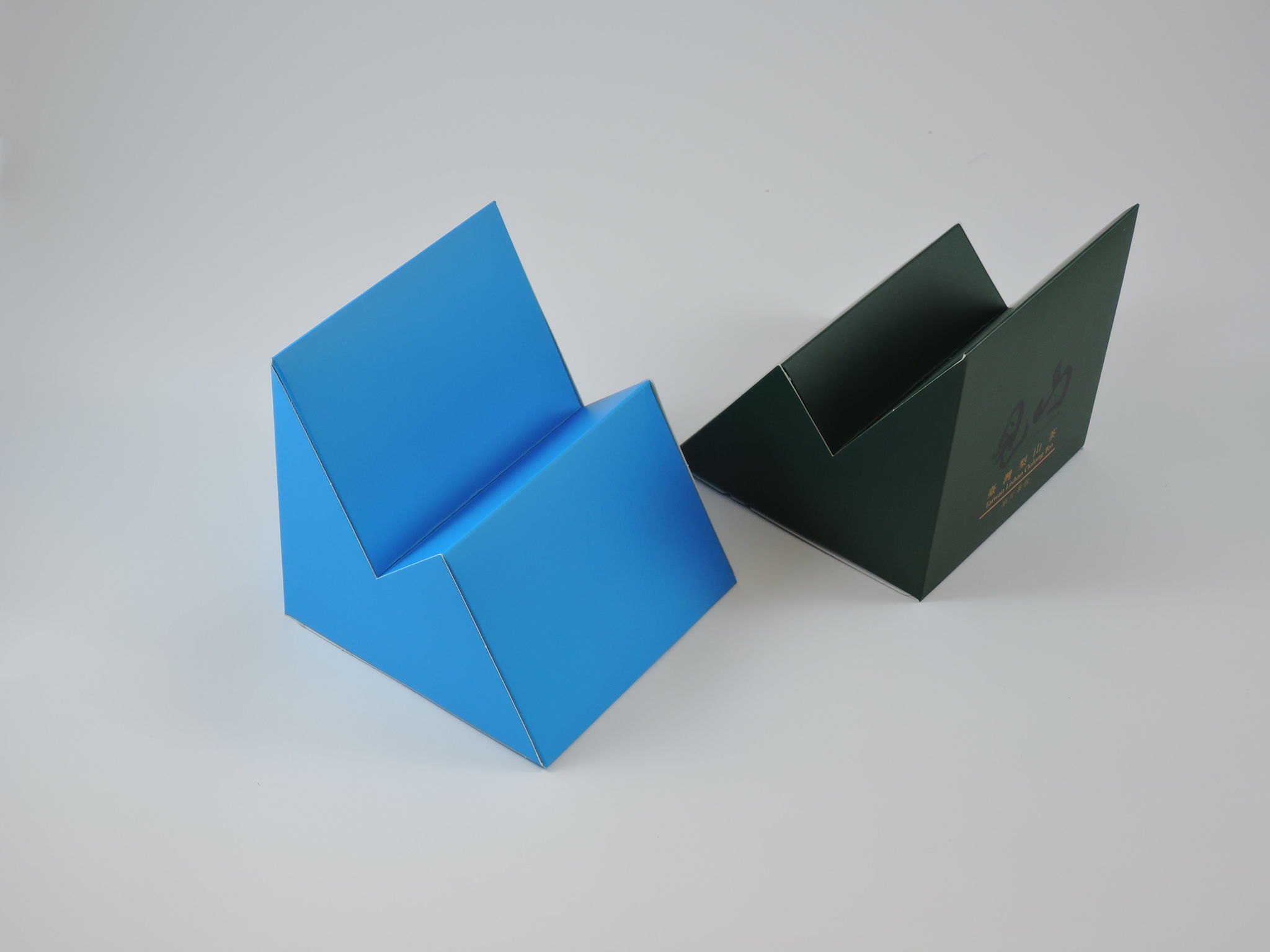
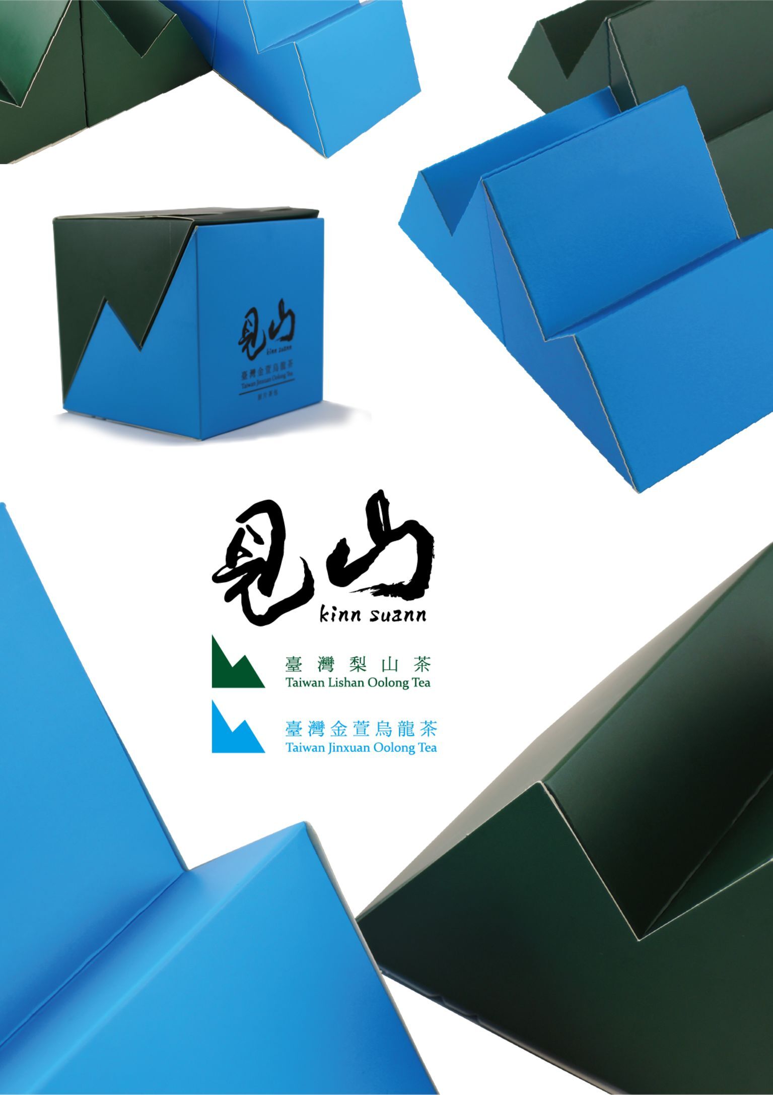
This innovative packaging employs the golden ratio, a fundamental principle in art and architecture. The packaging for Kinn Suann tea consists of two asymmetrical forms that resemble a mountain silhouette or billowing waves. The two sections may be positioned apart to accentuate the mountain effect, or slotted seamlessly together, mimicking the yin-yang symbol from Chinese Taoist philosophy. Yet, this packaging is not only visually intriguing; it is also eminently practical, as the separate halves make elegant bookends or cellphone/tablet holders.
Client / ManufacturerDesign
Tanway International Trade Co., Ltd.
Taipei, TWArdentspot Media Group. Co., Ltd.
Taipei, TWDate of Launch
2016
Development Time
up to 12 months
Target Regions
Africa, Asia, Australia/Oceania, Europe, North America, South America
Target Groups
Consumer / User, Trade / Industry, Public Sector / Government