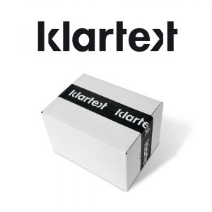
Klartext
Corporate Design
The service portfolio offered by Klartext GmbH does not only include the core competencies advertising media production and logistics. The corporate design aims at bringing these different services under one umbrella in order to stand out from the myriad of competitors. As its German name implies the logo is plain and cuts right to the chase. As for its typographic design its bracket-shaped letters X and K surround the numerous services offered by the company. The communication is implemented in black and white and focuses on core values. The strong but contrasty reduction enables a concise design and allows a high degree of recognition.