

KOKO Bank
Corporate identity
KOKO Bank
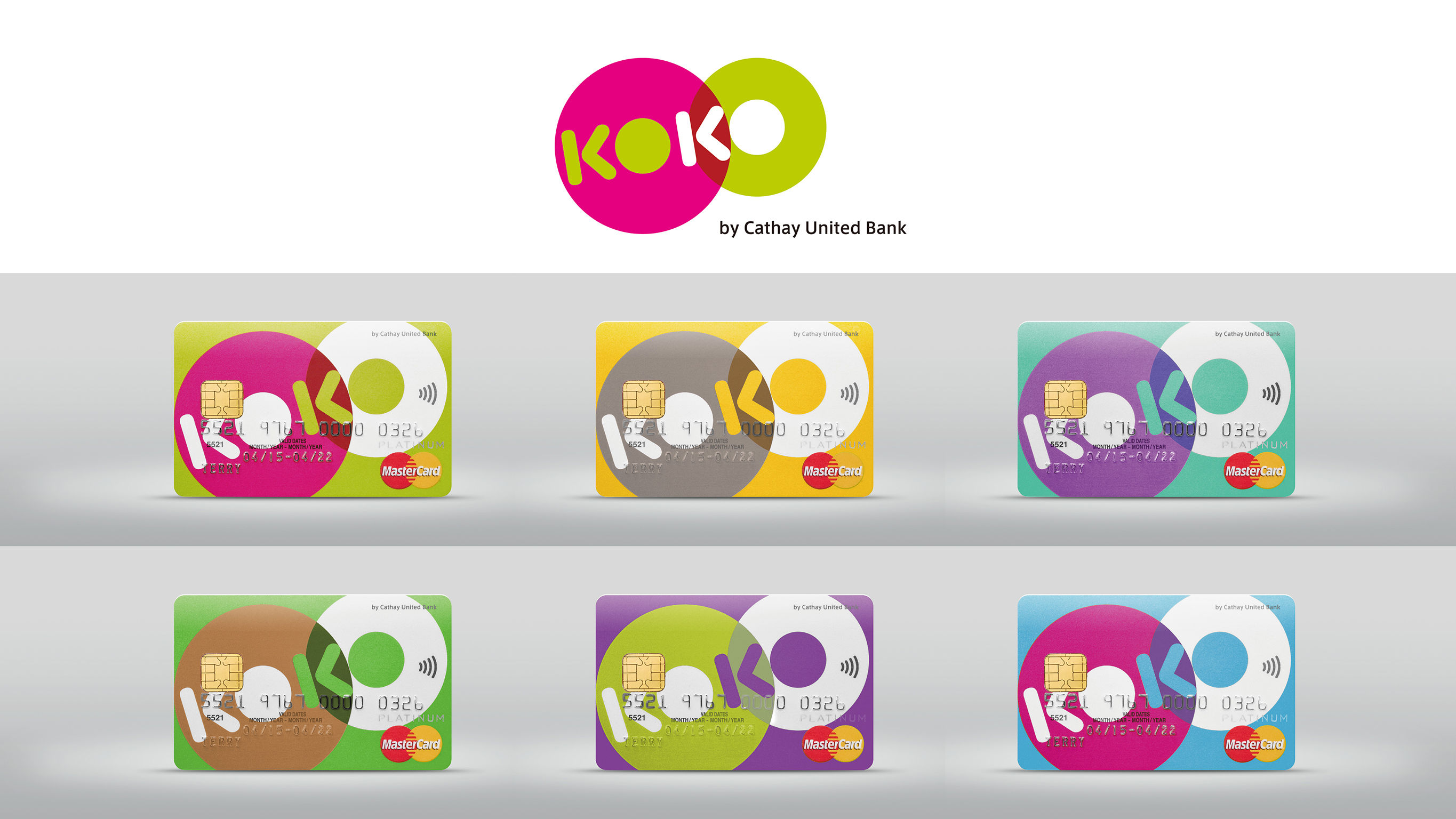
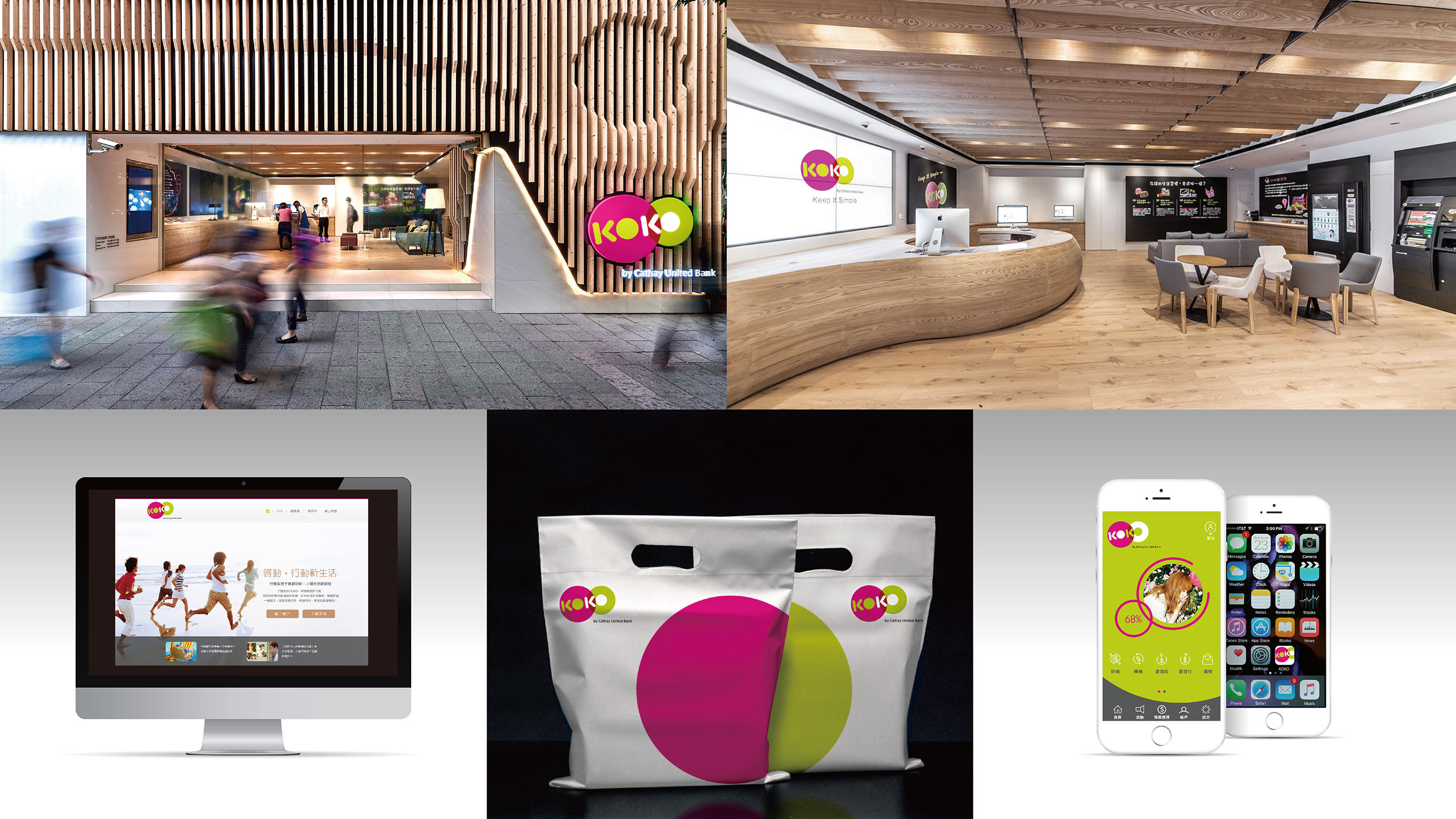
“KOKO” means “money” in the slang Taiwan’s younger generation, thus KOKO was chosen as the name for a new online bank. Using imagination and innovation, KOKO has introduced new financial services that are more instantaneous, interesting, and simple. The overall design of the KOKO logo consists of two enlarged O’s which resemble overlapping coins. Magenta and Mustard Green are the principal color elements. Coordinated with a variety of other colors, they evoke a cool, fun, trendy and smart brand personality that combines brilliance and fun.
Client / ManufacturerDesign
KOKO Bank
Taipei, TWHogarth & Ogilvy
Taipei, TWDate of Launch
2015
Development Time
up to 12 months
Target Regions
Asia
Target Groups
Consumer / User