KOREA NATIONAL OPERA CI
Brand design
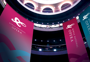
One of the main keywords that define opera is harmonization; the harmonization of people, music and stage. With that in mind, our goal in creating Korea National Operas new identity was to visualize operas classy beauty and captivating energy as well as expressing Koreas national identity simultaneously. G-clef was chosen as the main visual motif, because of its musical representation and embracing shape. The line-shape was 3-dimensionally redrawn to express operas powerfully enchanting charm. The infinitely connected lines and the red-blue color harmony represent Taegeuks (that means the concept of Yin and Yang) fundamentals and philosophy.
Client / ManufacturerDesign